
Looker Studio Tutorial #12 — How to Build Area Charts

Area charts are one of my favorite ways to show trends over time and the share between multiple segments. In this tutorial I walk through how to build clean, readable area charts in Looker Studio, style them for clarity, and decide when to use an area chart instead of a line or time series chart. If you prefer a step-by-step walkthrough, watch the tutorial here:
Step 1: Place a supporting table next to your chart
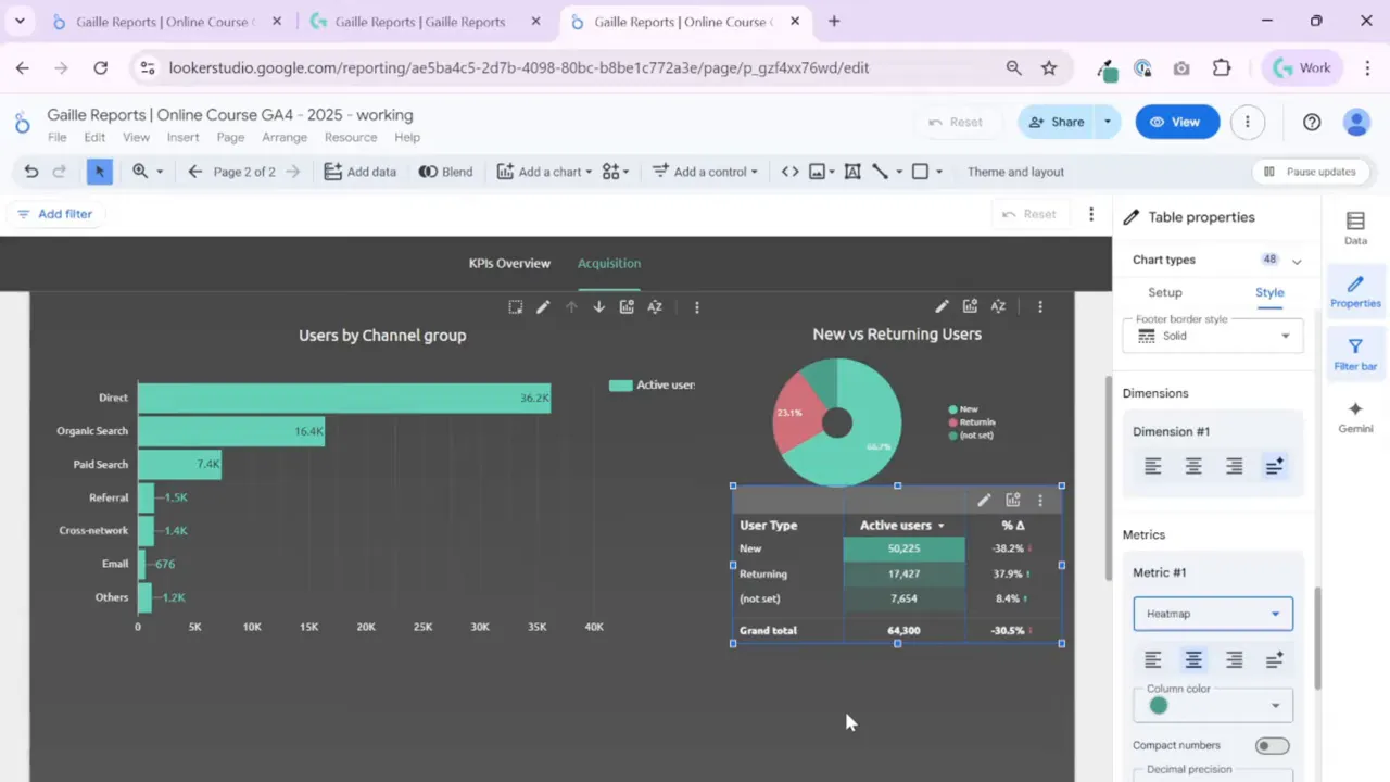
I usually pair a pie or area chart with a compact table that gives exact numbers and the period-to-period comparison. A visual chart shows trend and share, but stakeholders often want to see raw counts and the difference versus the previous period.
To speed up layout work, copy an existing chart and paste it as a table. I often copy a formatted table from another page and then paste style only to keep a consistent look across the dashboard.

Clean up unnecessary style rules after pasting. Remove conditional color rules you don’t need, hide pagination for tiny tables, and enable the comparison column so the table shows the change versus the previous period.

Step 2: Choose the right metrics and optional metrics
For channel breakdowns I show both total users and active users as optional metrics. That way you can toggle new users, 7-day active users, or any other metric without rebuilding the chart. Keep the primary metric visible and add only a couple of optional ones to avoid clutter.
Resize the columns to match the number of data points. If your channel table has only three rows, hide row numbers and make the table compact. Align the table’s columns with the adjacent chart to create a tidy tile.

Step 3: Create and configure an area chart
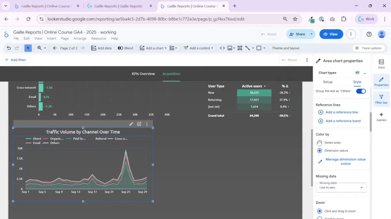
Select Area from the chart options when you want to show both the total and the composition of that total across segments. The area chart works best when you track how different channels contribute to the total users over time.

Use Breakdown dimension to split the series (for example, Default Channel Group). Set the Date dimension for the X axis and the user metric for the Y axis. If you want to highlight the composition, enable stacking so the top edge represents total users and each color band shows share.
Step 4: Decide between area, time series or line charts
Pick a line chart when you only care about trend lines and individual series. Use an area chart when you want to emphasize the total and show how the parts add up to that total. If your main question is “what share did each channel have on this date”, a stacked area or 100% stacked view will answer it clearly.
Consider these options:
- Stacked area to show absolute totals and composition.
- 100% stacked to show relative share changes over time.
- Line chart when comparing trends without summarizing to a total.

Step 5: Enable interactivity and choose zoom behavior
Looker Studio offers cross-filtering and zooming for time charts. I prefer click-and-drag zoom on the X axis so I can inspect spikes and small changes. Remember that area charts do not always support the same zoom behavior as line charts, so test the interaction you need.

Add a reset zoom control or instruct users how to return to the full time range. For dashboards that multiple stakeholders will use, a small note or a static reset button helps avoid confusion.
Step 6: Styling tips for readability
Keep the design readable and avoid too many series. Aim for three to seven series at most. If you have many small channels, group them into an Others bucket so the chart remains interpretable.
Use color strategically: choose distinct hues for major channels and a neutral color for “Other”. You can also apply a heat map in adjacent tables to highlight high and low values visually.
Avoid adding data labels on high-density time series. Labels create noise when there are many points. Reserve labels for summary charts or when you display only a few data points.
Step 7: Use reference lines and cumulative options when appropriate
Reference lines and bands help communicate targets, thresholds, or typical ranges. If you track conversions or purchases, the cumulative option may show monthly progress and running totals. For traffic share, cumulative series usually do not add value; stick with daily or weekly breakdowns.
Step 8: Add a drill-down table and pivot table for details
After visual exploration, add a table below the charts so stakeholders can inspect specific channels and dates. I often place a compact table below each chart tile and a pivot table for deeper, cross-dimensional analysis.

The pivot table becomes the place to answer specific questions such as which channel drove the spike on a given day and what the week-over-week difference looked like. Keep the table columns aligned with the charts above for visual consistency.
Wrap-up and quick workflow checklist
Here is the condensed checklist I follow when adding area charts to a dashboard:
- Decide if the chart should show totals and composition or only trends.
- Choose Area or Line based on that decision.
- Set Date, Metric, and Breakdown dimension.
- Enable stacking and 100% view if needed for share analysis.
- Style the chart and adjacent table for clarity and alignment.
- Add zoom and reference lines where they help interpretation.
- Provide a detailed table or pivot table for exact numbers and comparisons.
Use grouping for minor channels and avoid more than seven visible series to keep dashboards readable.
Recommended follow-up tutorials and resources
If you want to build cleaner dashboards or dive into related visual types, these pages on my site will help:
- Subscribe and explore the blog for tips and tricks: https://gaillereports.com/subscribe/
- Header and dashboard layout guidance: https://gaillereports.com/subscribe/
- How to add scorecards and KPIs: https://gaillereports.com/subscribe/
- Time series and table best practices: https://gaillereports.com/subscribe/
Tools I Use
Windsor.ai — simple connector for GA4, Google Ads, Facebook Ads and more.
Get 10% off with promo code gaillereports
Supermetrics — powerful connector for agencies and multi-channel reporting.
Compare the best connectors for Meta Ads here:
Top Facebook Ads Connectors for Looker Studio — How to Choose the Right One
More Articles You Might Like
How to Make Your Looker Studio Dashboard Look Professional (Header Setup Guide)
How to Set Theme and Layout in Looker Studio and Connect Your GA4 Data
Build Professional Tables in Looker Studio — Setup, Styling & Best Practices
Looker Studio Tutorial #10 — How to Build and Style Bar Charts
How to Visualize Data Over Time in Looker Studio Reports
Summary
Area charts are great when you want to show both the total and the share between multiple segments over time. Keep the design simple, limit the number of series, and pair your area chart with a compact table for exact numbers. Use stacking when you want to highlight composition, and use a line chart instead when you only need the trend.
Tool I use for Looker Studio connectors
If you’re building dashboards in Looker Studio and need data from ad platforms, this is something I personally use quite often.
Windsor.ai connectors for Looker Studio let you pull marketing data directly into your reports so everything updates automatically.
If you decide to try it, they also offer a 10% discount with the promo code gaillereports.
Tool I use for marketing dashboards
A tool I’ve used many times for marketing dashboards is Supermetrics.
It helps pull data from different marketing platforms into tools like Google Sheets, BigQuery, or Looker Studio so your reports can update automatically.

