
How to Make Your Looker Studio Dashboard Look Professional (Header Setup Guide)

If you want a clean, client-ready top section for your Looker Studio dashboard, this step-by-step guide will walk you through building a polished header: add a logo, create a clear title, add an interactive date range control, and align and style every element so the report looks consistent across pages. If you prefer watching the full walkthrough, watch the video tutorial here.
Step 1: Add your logo and make it report level
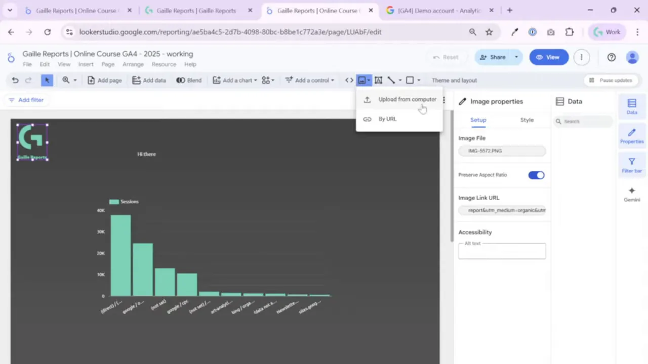
I always start the header with the logo. In Looker Studio, adding an image is simple: go to the image icon and upload the file from your computer. I usually copy and paste the logo box to keep sizes consistent, but you can simply insert one image and resize it.
Two important tips when placing a logo:
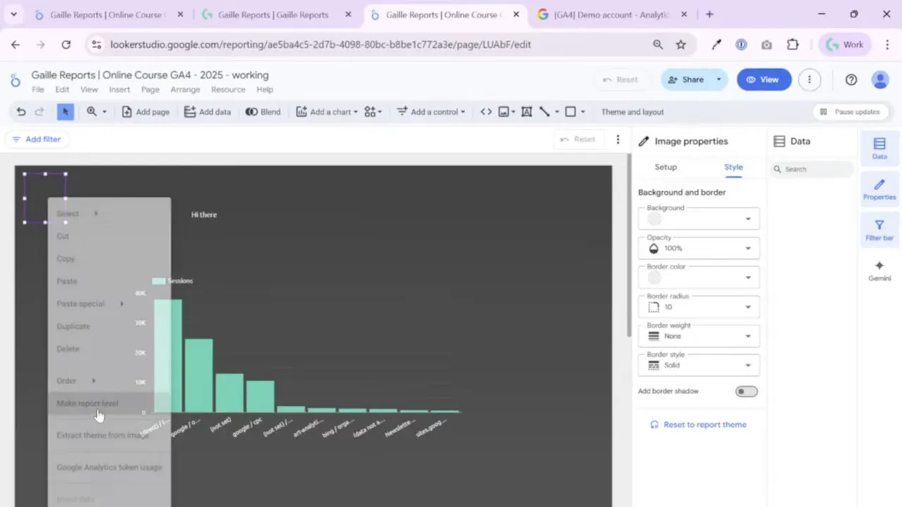
- Set the element to report level if you want the logo to appear in the exact same position across all pages. Right click the image and choose Make report level. You will see the purple outline which indicates report level.
- If you want the logo to link out, use the URL property to add UTM-tagged links. This is useful when you want report viewers to reach the brand site or documentation directly from the header.
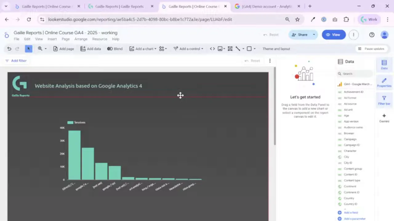
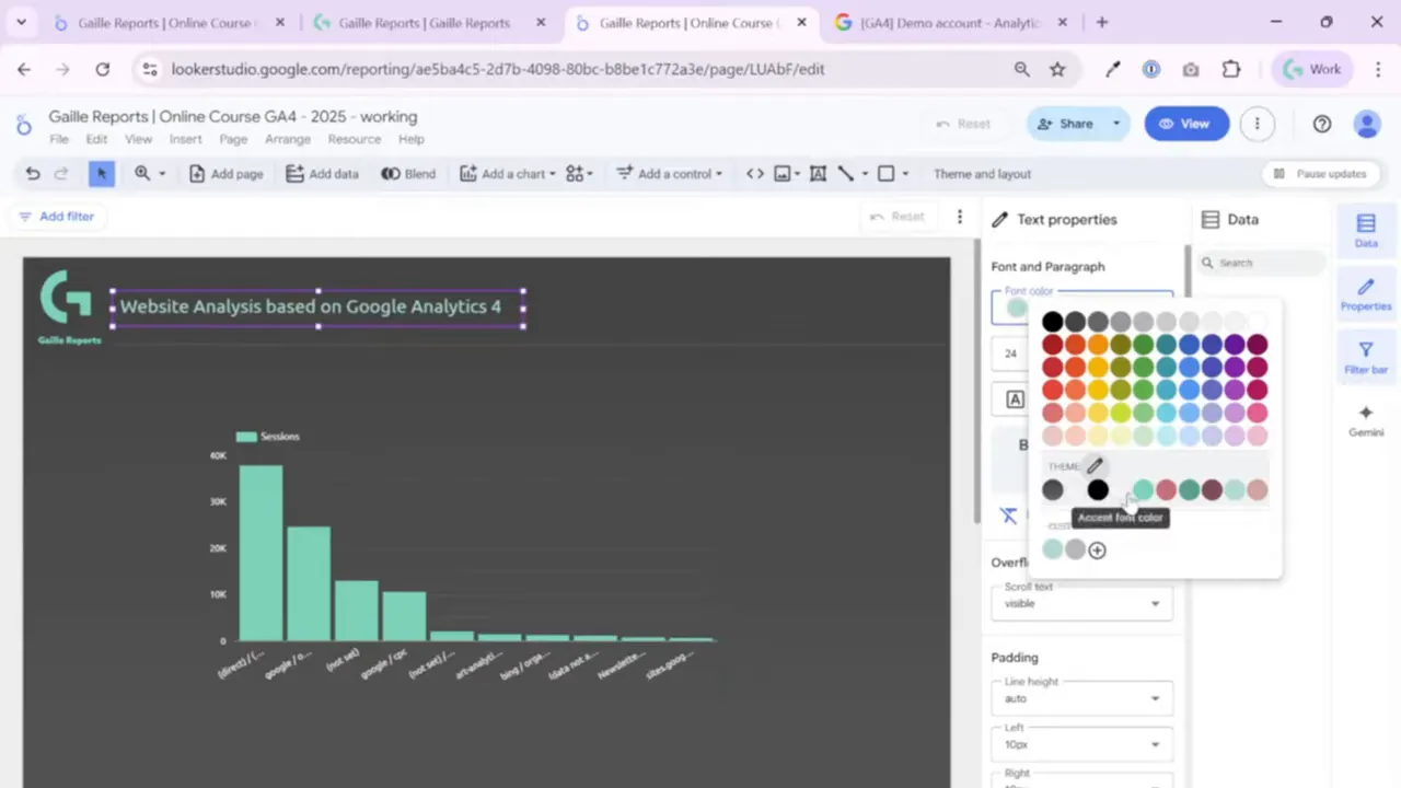
Step 2: Add a title with text and align it precisely
I add the dashboard title using the Text component. You can type a new title or copy an existing one to preserve style. When you move the text box you will see red alignment guides; these help you snap the title to the center or to other elements for pixel-perfect alignment.

Styling best practices for titles:
- Use theme colors rather than styling every element manually. This saves time when you need to update the look across the whole dashboard.
- Keep font sizes readable without forcing viewers to scroll inside the title box. Dashboards are for storytelling with data, not micro typography exercises.
- Use the Remove formatting button if something is inconsistent and then reapply your theme styles.
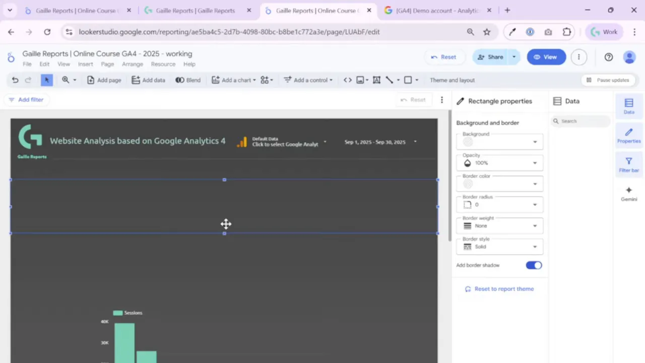
Step 3: Add a divider line or rectangle to separate the header
A thin line or a subtle rectangle improves visual hierarchy and clearly separates the header from the charts. I usually draw a line right below the title and logo. Another option is to add a rectangle with a slight shadow or a contrasting color and send it to the back so it acts like a header band.
My typical approach:
- Add a rectangle or line aligned with the logo bottom.
- Set the rectangle to transparent or use a muted color so it does not compete with the charts.
- Apply a border radius for a softer look when needed.
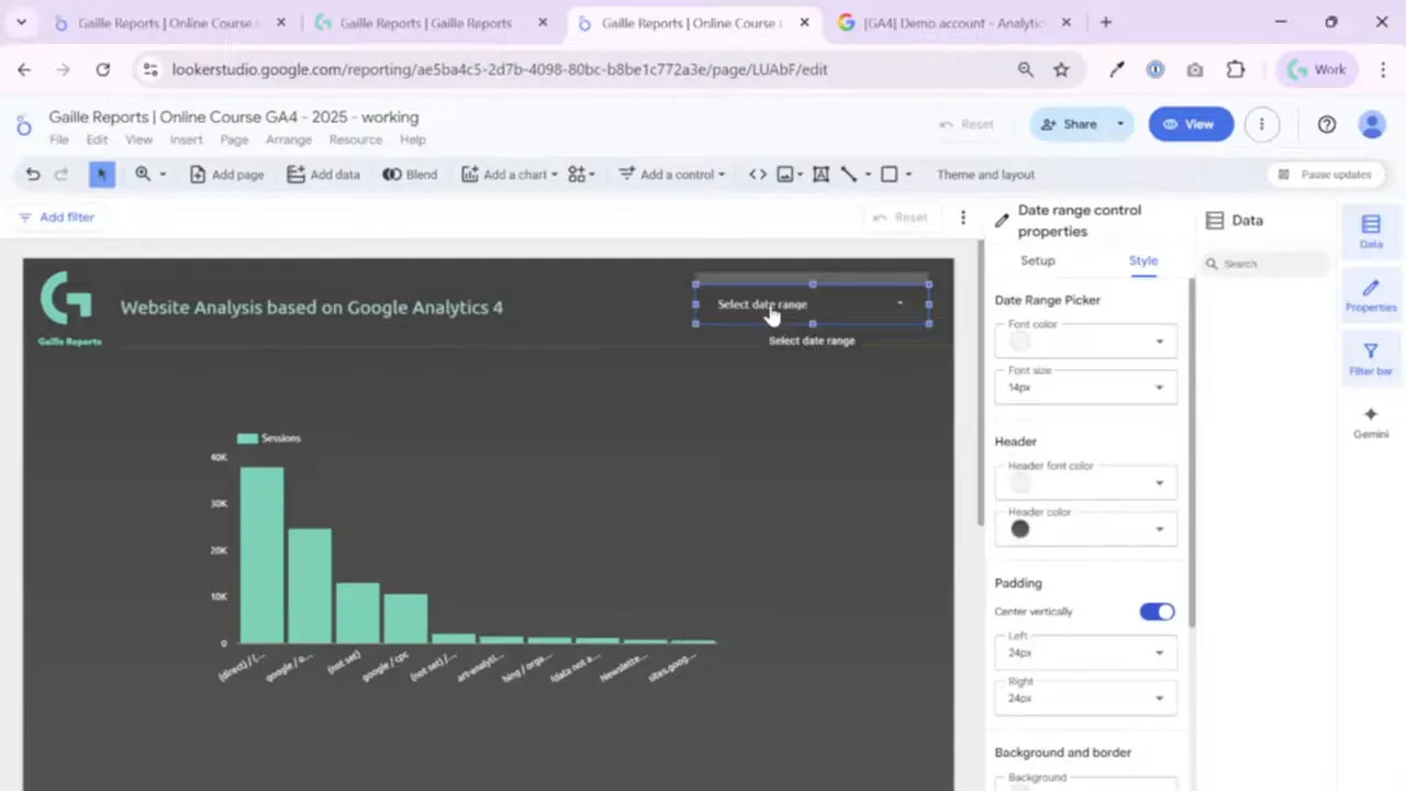
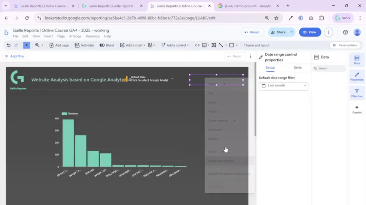
Step 4: Add a date range control for interactive filtering
An interactive date range control belongs in the header. It becomes the default data range for the charts on the page and helps viewers change the timeframe across the whole report. Insert it via Add control > Date range control.
Important settings to know:
- Auto data range defaults to the last 30 days. For many dashboards I prefer Last month or Last 7 days depending on the use case.
- Advanced date configuration allows you to mix fixed and relative ranges. For example, you can keep the start date fixed to May 1 and set the end date to Today minus one day. This is useful for month-to-date comparisons while anchoring the timeframe.
- Style the control so it is readable. The default control can be very light and hard to see, so adjust font color and background (I usually set the background transparent and choose a clear font color).

Step 5: Use theme colors and text settings for consistency
Setting up theme and layout early saves tons of time. When the title, subtitle, and controls all reference your theme palette, changing the look later becomes a single click job. In the text style panel you can choose font, size, bold, italic, and palette-based colors.
Keep these rules in mind:
- Use theme palette colors for all header elements. If you later need a new color, change it in the theme, not on each element.
- Avoid long text that forces inner scrolling. If a text box shows a scroll bar, shorten or reflow the text so everything fits on screen.
- Reset padding or other settings to the report theme when you want uniform spacing.
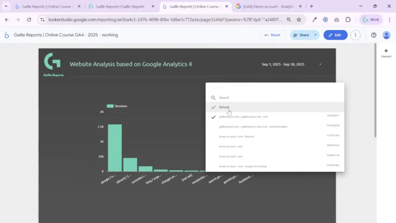
Step 6: Add data control so users can switch GA4 properties
If your dashboard uses GA4, add the data control to let viewers swap the underlying property with their own account. This is especially powerful for templates and shared reports. Note that data control works only with certain connectors – mainly Google data sources like Google Analytics.

How it behaves:
- When the viewer opens the report, the data control lists all accessible GA4 properties from their Google account.
- Selecting a different property updates all charts in the report instantly, because the control is applied at report level.
- This is perfect when you publish a template or a sample dashboard and want other users to test it with their own GA4 data.
Step 7: Make header controls report level and style them
For elements that should appear on every page, set them to report level. This includes the logo, the title, the date range, and the data control in most cases. Once set to report level you will see the purple outline. I make all header elements report level so users experience consistent navigation across pages.
When styling the header controls, I typically:
- Use transparent backgrounds or subtle fills to keep attention on the charts.
- Set border radius to 10 for softer controls when a rectangle is used.
- Match font color to the theme’s header color so the header feels integrated.
Step 8: Align elements and copy styles across multiple objects
Alignment and distribution make the header look professional. Select multiple elements, right click and use alignment tools – for example Align vertically in middle. You can also distribute elements evenly if you have several controls in one line.
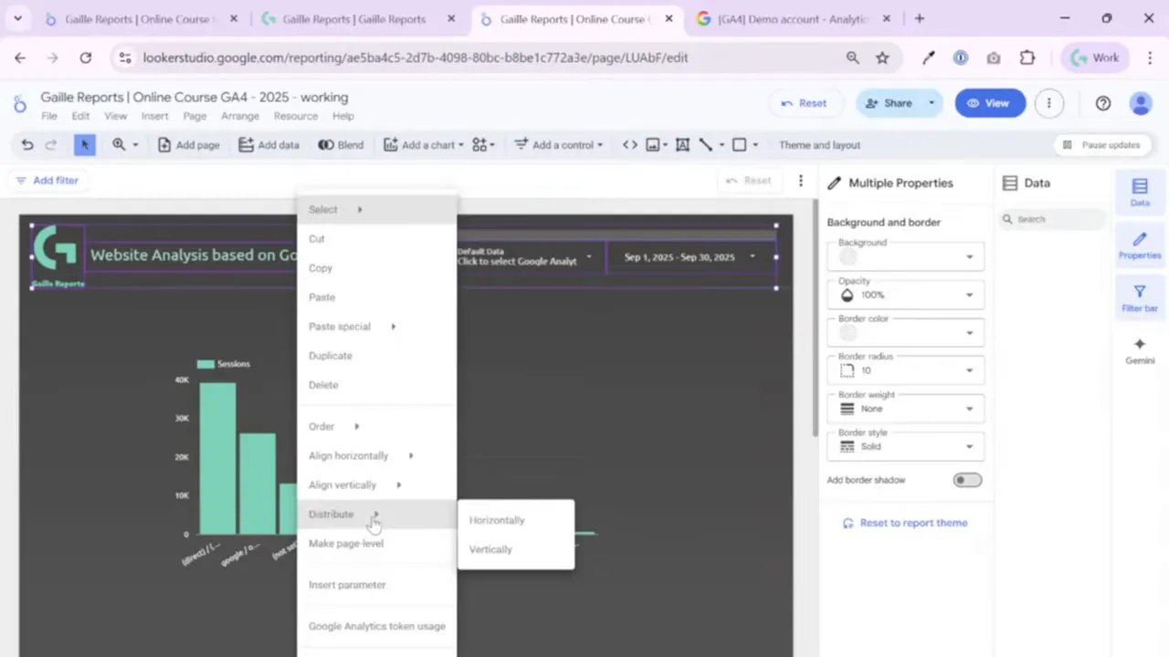
Useful right click options:
- Copy and paste style only. If you change the look of one element and want others to match, copy the style and paste it to the others.
- Bring forward or send to back for layering rectangles and lines.
- Duplicate or delete elements when iterating on layouts.
Step 9: Header design patterns and variations I use
I follow a few simple patterns depending on the dashboard purpose:
- Minimal header: a small logo, centered title, and a thin divider line. This is great for embedded dashboards or compact reports.
- Prominent header band: a rectangle with a solid or slightly translucent color, logo on the left, title in the center, and controls on the right. Use shadow and border radius to lift it visually.
- Filter-heavy header: thin band with multiple filter controls below the header line. I sometimes add five or six filters in a second row for interactive exploration.
I usually choose the minimal or band option depending on how many interactive controls the dashboard needs. The band works well when you have platform filters or source-medium filters that should always be visible.
Step 10: Quick checklist before publishing
- All header elements that should repeat across pages are set to report level.
- Date range control is configured (auto, last month, or an advanced fixed+relative option as required).
- Text uses theme palette and no box shows internal scrolling.
- Logo links are set with UTM parameters if external navigation is desired.
- Alignment and distribution are consistent so the header looks balanced on different screen sizes.
Final thoughts and recap
Headers are small but powerful. They provide context, allow global filtering and data selection, and give the dashboard a unified look. I build headers first because they set the tone for the whole report. Use report-level elements for repeatable items, rely on the theme palette for consistent styling, and place user controls like date range and data control in the top right for easy access. Keep the header clean and readable; your audience should instantly know what the dashboard reports and how to change the timeframe or source.
If you want to keep exploring Looker Studio, here are some related articles and resources from my blog that go well with this tutorial:
3 Ways to Connect Facebook Ads to Looker Studio (2025 Guide + Free Template) — find the article and template.
Send Ad Data to BigQuery with Supermetrics – Easy Setup — details and step-by-step guide
How to Use SQL with GA4 in BigQuery: 10 Real Examples for Marketers — practical SQL examples
How to Automate GA4 Reports in BigQuery with Scheduled Queries — automation tips
Try these next: build the KPI row, add charts and explore filter panes, or convert an existing report into a reusable template. If you found this helpful, watch the video tutorial for the step-by-step demonstration and to see every click in real time.
Looker Studio Connectors I recommend:
- Supermetrics — my go-to when budget allows. It’s polished, well-documented, renames fields into readable labels, and has fast support.
- Windsor.ai — my favorite recent pick for projects that need BigQuery without the enterprise price tag. They grow quickly, support many connectors, and their documentation is improving. Use promo code “gaillereports” for a 10% discount.