
How to Visualize Data Over Time in Looker Studio Reports

If you want to build time-based charts that highlight trends, peaks, and seasonality in your data, this guide walks you through the exact steps I use when creating time series charts in this Looker Studio Tutorial. I cover selection, formatting, breakdowns, drill-downs, optional metrics, metric sliders, styling options, cross-filtering, and how to handle many series or messy labels.
Watch the full video walkthrough here:
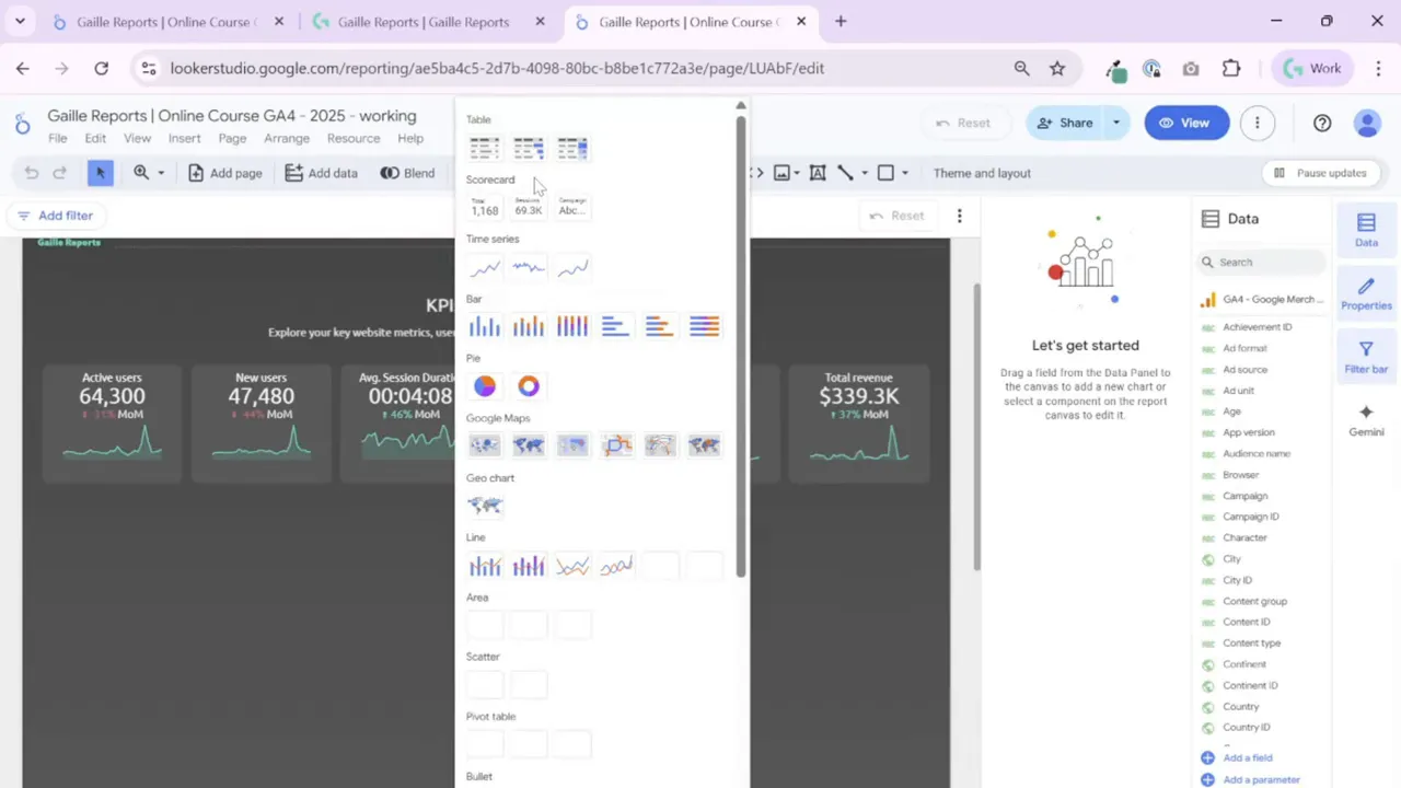
Step 1: Add a Time Series Chart and pick the basic layout
I start by inserting a time series chart and sizing it to fit half the page, typically under my scorecards. Looker Studio gives three time series variants that behave similarly. Pick the one you like visually and you can switch later if you need to.
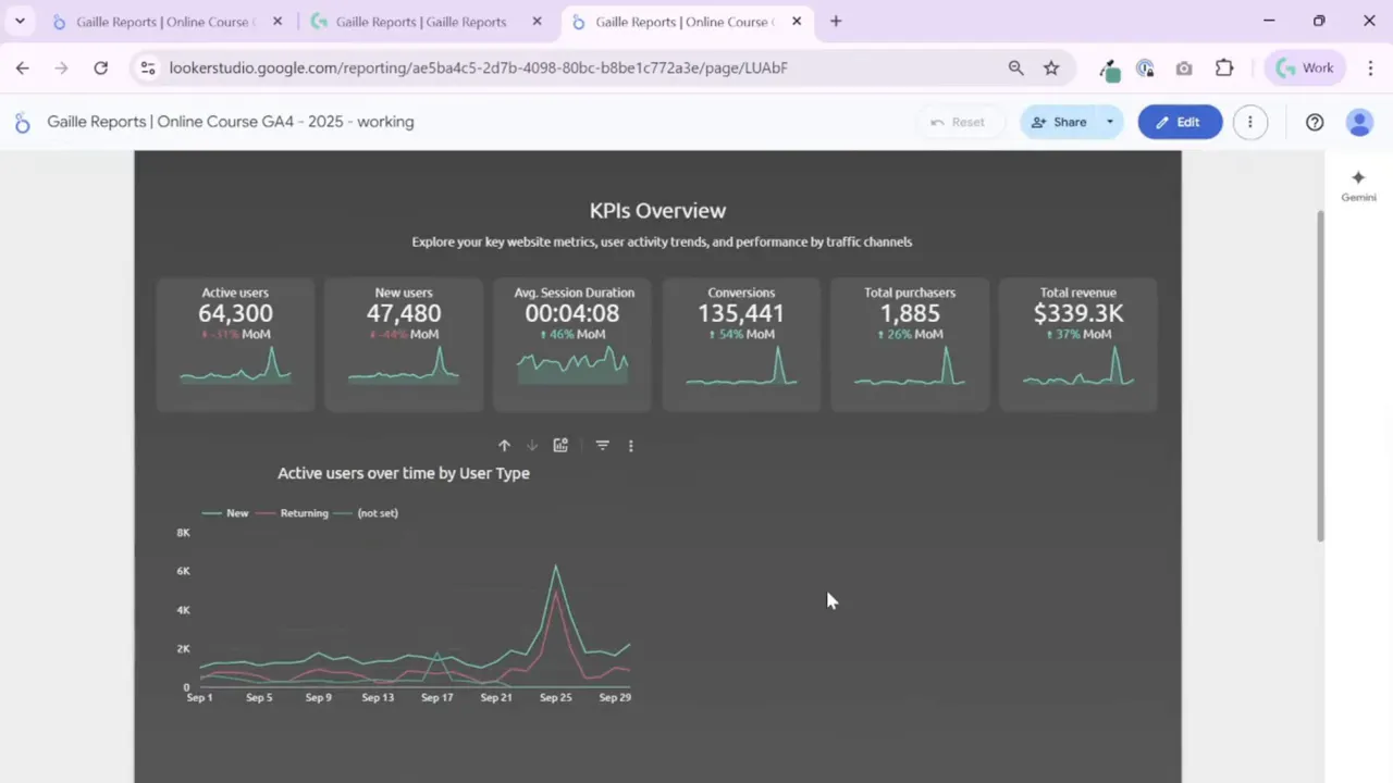
Initial data setup is straightforward: set the Date dimension, add your main metric (for example, Active Users), and choose whether you want a single metric line or multiple metric lines.
- If you add two or more metrics, Looker Studio will draw multiple lines and it will disable the Breakdown dimension for that chart.
- If you keep a single metric, you can use a Breakdown dimension to show multiple series inside that single metric (for example, Active Users split by user type).
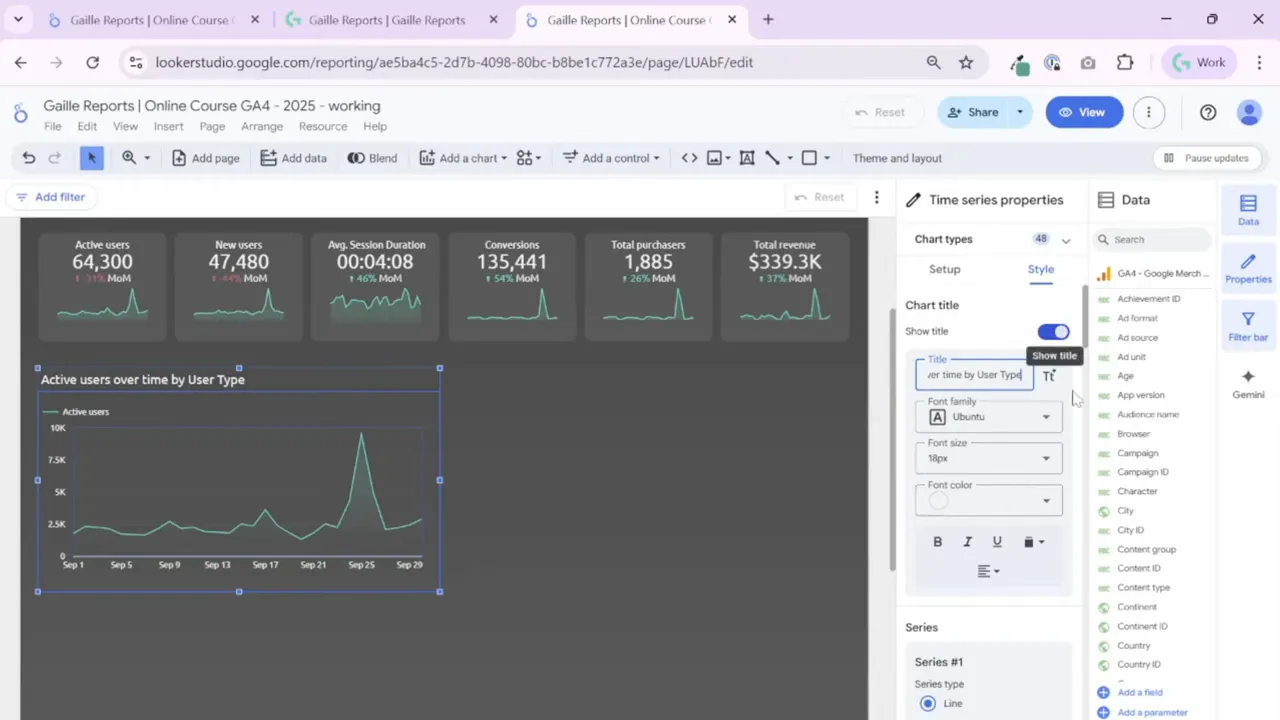
Step 2: Clean up titles and alignments
Small visual details matter. I always show the chart title and manually edit it rather than relying on auto-generation. Then I align the title to match the rest of the dashboard. If your header, scorecards, and charts are centered, center the chart title as well. Consistent alignment makes dashboards look polished and easier to scan.
Adjust font size and color to match your theme. These defaults pull from your theme and layout settings, so set those first if you want consistent typography across pages.
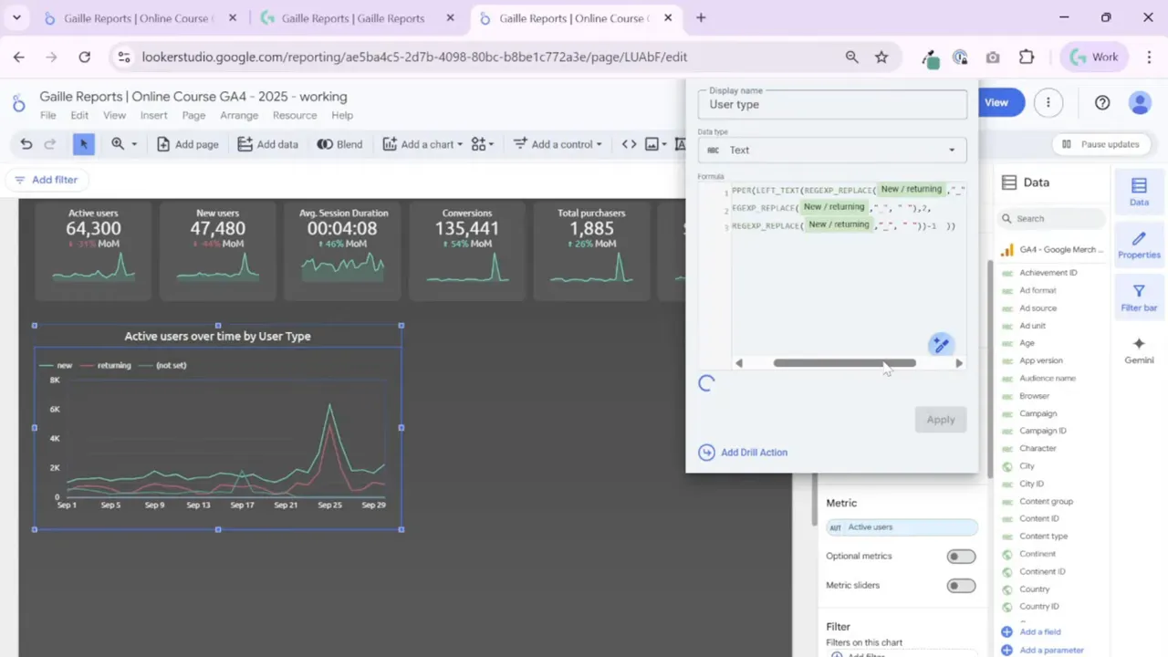
Step 3: Add a Breakdown dimension and create a calculated field for cleaner labels
When I want to show one metric split by categories, I add a Breakdown dimension. For GA4 user types the raw field often returns values like new_user or returning_user with underscores or lowercase. I always create a calculated field called User Type to tidy labels.
My calculated field does two things:
- Replace underscores with spaces so labels read naturally.
- Capitalize the first letter so labels look professional (for example, “New” instead of “new”).
That little transformation makes the whole chart easier to read. I keep the formula handy and reuse it across charts. If your breakdown labels look messy, a calculated field will fix that quickly.
Step 4: Configure drill-down levels and make the chart header visible
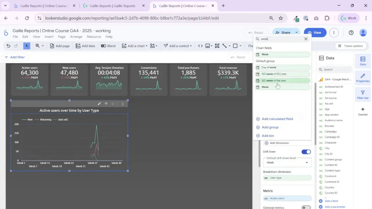
Time series charts let you set drill-down dimensions such as Date, Week, Month, Quarter, and Year. The default drill-down level is usually Date, but you can replace or reorder levels depending on the story you want to tell.
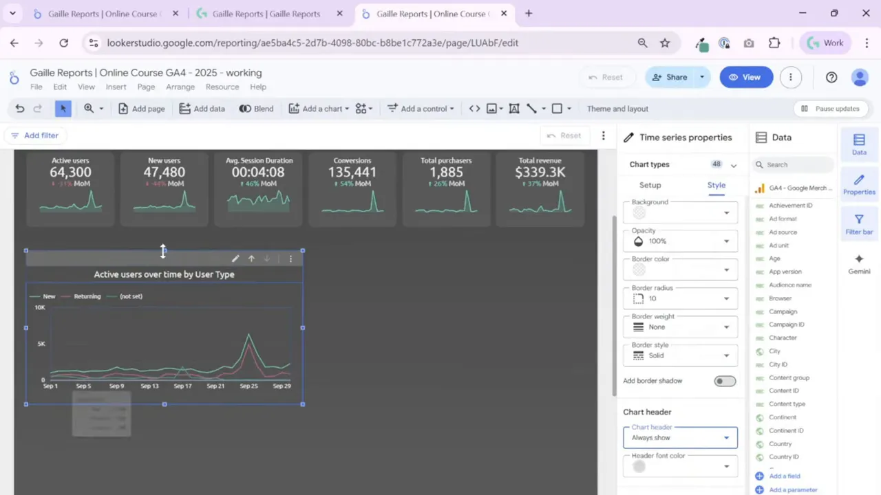
I prefer to make the chart header always visible when a chart supports drill-down or interactivity. By default Looker Studio shows the header only on hover. Changing the chart style to “Always show” makes it obvious to dashboard viewers that they can interact with the tile. This small change increases discoverability and makes your dashboard more user friendly.
Step 5: Choose the right time grain as the default drill level
Think about the cadence your stakeholders want. If your manager reviews weekly performance, set ISO week of year or week as the default drill level. If they want monthly trends, use Month as a step in the drill hierarchy.
I rename the drill step labels where needed so they read simply in the header (for example, rename “Year-Month” to “Month”). Test switching between drill levels in the view mode to ensure you get a smooth experience.
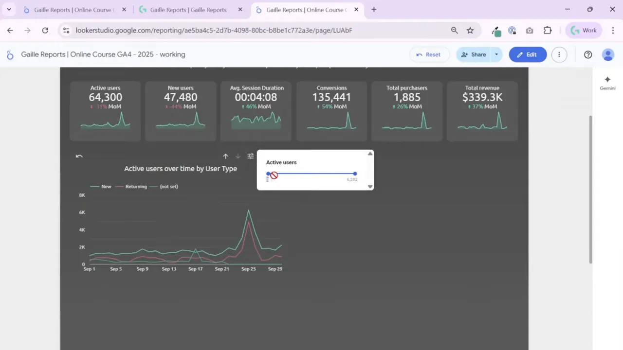
Step 6: Understand metric slider vs optional metrics
Looker Studio offers two helpful interactive features for time series charts: metric slider and optional metrics. You can use one or the other but not both on the same chart.
- Metric slider lets viewers filter the chart by metric value. For example, you can slide to see only dates with Active Users above a threshold. This is handy for spotting outliers or focusing on high-volume days.
- Optional metrics provides a small icon that lets viewers swap the chart’s main metric to one of several metrics you predefine. Use this when viewers might want to compare Active Users, Total Users, or 7-day Active Users without cluttering the interface.
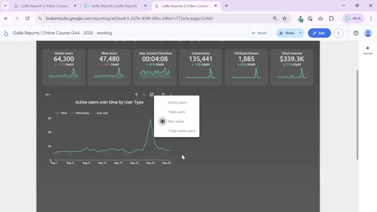
I usually add optional metrics for small, frequent comparisons and reserve the metric slider for data exploration when I suspect there are interesting spikes or rare events.
Step 7: Sort, filter, and set a default data range
Sorting matters when you use a Breakdown dimension. Choose to sort series by metric value or alphabetically. For date-based charts, set a sensible default date range—auto is okay, but for recurring reports I often set “Last 12 months” so the chart always shows the same timeframe.
Layer in tile-level filters, page-level filters, and report-level filters as needed. These filters let you reuse the same chart layout for different slices of data.
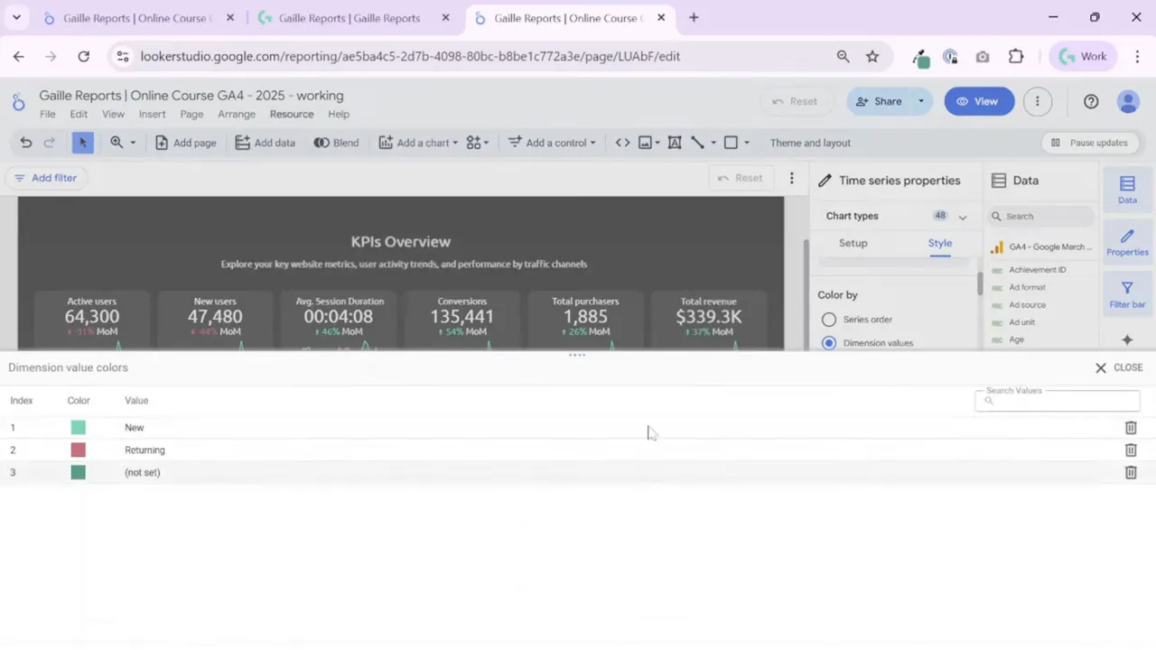
Step 8: Style series, colors, and legend
Make a consistent color scheme for dimension values using Manage Dimension Value Colors. I prefer this over manual per-series coloring because it enforces uniform colors across multiple charts.
Series options include:
- Line, bar, or a combination of bars and lines. Use lines when comparing subgroups of the same metric. Use bars+line when comparing metrics that differ in scale or meaning (for example, impressions as bars and CTR as a line).
- Gradient fills and smoothing. Gradients look nice for cumulative or area charts. Smoothing can make noisy time series easier to interpret but avoid over-smoothing if you need precise values.
- Line weight and highlight. Increase weight or brightness for the most important series so it stands out.
- Legend position. Keep legends in the same place across the dashboard—top center often works well when the layout is centered.

Step 9: Use cumulative mode, trendlines, reference lines and points sparingly
Cumulative mode is great for showing running totals, like cumulative sales or cumulative signups. Trendlines are useful to communicate direction and growth over time; choose linear, exponential, or moving average depending on your needs.
Reference lines and bands help you compare actuals against targets. Add a constant reference line for daily or monthly targets so viewers can instantly see which periods exceed or miss the goal.
Step 10: Cross-filtering, zoom, and interactive exploration
Cross-filtering lets chart selections filter other tiles on the page by the selected period. I enable cross-filtering when I want the dashboard to act as an exploration tool rather than static reporting.
Zoom is an alternative to cross-filtering. Zoom allows selecting a area on the chart to magnify and then resetting back. Note that Looker Studio does not allow enabling both cross-filtering and zoom on the same chart, so pick the interaction that matches your user’s workflow.
Step 11: Handle many series — maximum series and grouping
If your Breakdown dimension returns dozens of categories, limit the number of visible series with the “Maximum number of series” setting. Group the remaining values into “Other” so the chart remains readable.
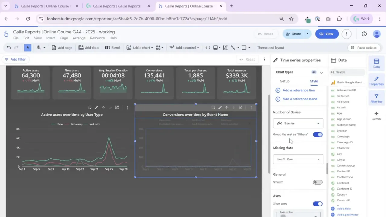
Set the maximum to a reasonable number (I often use 5 or 10) and show the rest as Others. This highlights the top contributors while preserving overall context.
Step 12: Deal with missing data
The chart offers three options for missing data: line breaks, interpolate, or connect to zero. Choose according to how your data behaves. For time series where missing days truly had zero values, “line to zero” makes sense. For sporadic gaps, interpolation might better reflect a trend estimate.
Step 13: Practical tips and quality-of-life tweaks
- Keep titles consistent and descriptive: “Active Users over time by User Type” reads better than the raw field name.
- Always test interaction in View mode. Some options appear only on hover unless you change the header to always show.
- Create and reuse calculated fields for label cleanup. Small label fixes dramatically improve readability.
- Use dimension value color management rather than per-chart series coloring to simplify global updates.
- Avoid too many chart decorations. Don’t show data labels or points if the chart has many lines; they create noise.
Summary
Time series charts in Looker Studio offer powerful ways to reveal trends and patterns, but small settings often decide whether a chart is useful or confusing. Start with a clear metric and date grain, clean up labels with calculated fields, then fine-tune interactivity and styling.
Use optional metrics for quick swaps and the metric slider for deeper exploration. Always make chart headers discoverable and keep your color and typography consistent across the dashboard.
If you want to practice, recreate two charts on your page:
• One focused on users (Active Users split by User Type)
• One focused on events or conversions
Use grouping and the maximum series setting when events explode into dozens of names. And always convert underscores and lowercase values into clean labels — that small detail makes a big visual difference.
Tools I Use
To connect any data source to Looker Studio, I use:
- Windsor.ai – simple connector for GA4, Google Ads, Facebook Ads, and more.
Get 10% off any plan with my promo code gaillereports - Supermetrics – an advanced connector for agencies and large datasets.
More Articles You Might Like
• How to Set Theme and Layout in Looker Studio and Connect Your GA4 Data
• How to Make Your Looker Studio Dashboard Look Professional (Header Setup Guide)
• Looker Studio Report Tutorial #5 — Add Scorecards with KPIs (Setup, Styling & Metrics Explained)
• Looker Studio Tutorial 2025: Clean Dashboards Made Easy (Lesson 2)
• Top Facebook Ads Connectors for Looker Studio — How to Choose the Right One