Show real examples of marketing dashboards and explain how each one is structured.
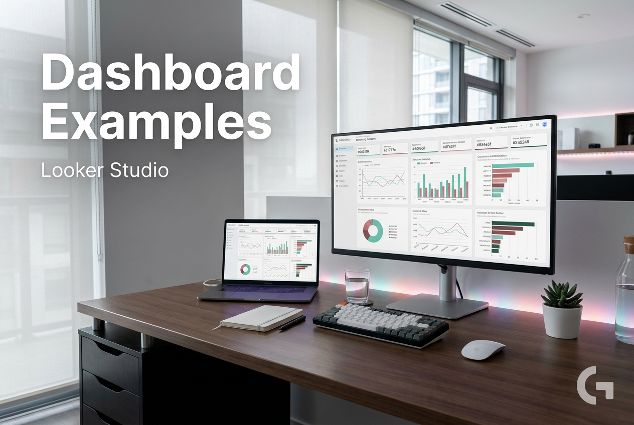
Marketers often look for looker studio dashboard examples when they are tired of piecing reports together by hand and still ending up with dashboards that are hard to explain. The problem usually is not the chart itself. It is the structure behind the report.
A marketing team can have data in GA4, Google Ads, CRM tools, ecommerce platforms, spreadsheets, and other connectors. When all of that gets pushed into one report without a clear purpose, the dashboard becomes cluttered fast. You might see lots of metrics, but not a clear answer to a real question like: Are paid campaigns generating efficient leads? Is organic traffic improving? Which products are driving sales?
This is why so many dashboards feel slow and confusing to use. Teams often mix top-level KPIs with detailed campaign tables on the same page. They build around whatever data is available instead of the decision the report should support. On top of that, different stakeholders usually want different levels of detail, which makes one-page “do everything” dashboards hard to read.
How to Use Looker Studio Dashboard Examples the Right Way
Looker Studio is used to visualize data from sources like GA4, Google Ads, CRM systems, ecommerce platforms, and spreadsheets. For many marketing teams, the real value of studying looker studio dashboard examples is not copying a design. It is understanding the layout patterns that make reports easier to use.
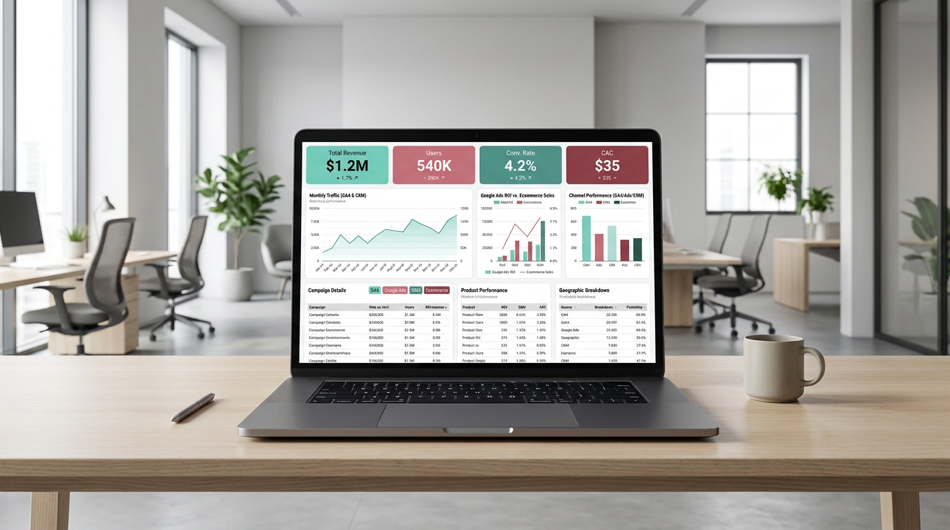
A good example usually follows a simple hierarchy:
- KPI scorecards at the top
- trend charts in the middle
- detailed tables or breakdowns lower on the page
- separate tabs for different channels or use cases
A useful dashboard starts with the main question, not the maximum number of metrics.
That structure works because it matches how people actually review performance. First, they want the summary. Then they want trends. After that, they want to drill into campaign, keyword, landing page, or channel detail.
The same rule applies across reporting types. A paid media dashboard may begin with cost, clicks, conversions, CPA or CPL, and ROAS or revenue. An SEO dashboard often centers on organic traffic, impressions, clicks, landing pages, and query performance. Ecommerce reporting usually brings together sales, sessions, conversion rate, and product performance.
The practical takeaway is simple: build one page around one main use case. Keep the overview clean, use charts to show movement over time, and push detailed breakdowns lower in the report or onto separate tabs. That is usually the point where a dashboard starts becoming useful instead of just visually complete.
A Tool I Use to Connect Marketing Data to Looker Studio
If you’re building dashboards in Looker Studio and need data from ad platforms, this is something I personally use quite often.
Windsor.ai connectors for Looker Studio let you pull marketing data directly into your reports so everything updates automatically.
If you decide to try it, they also offer a 10% discount with the promo code gaillereports.
Practical workflow ideas from looker studio dashboard examples
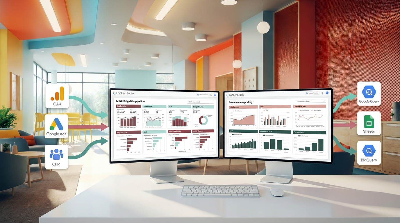
Once the structure is clear, the next step is getting the data into a reporting flow that is easier to maintain.
For many marketing teams, that means using a simple stack where each tool has a clear role. Google Sheets can help with cleaning or staging smaller datasets. GA4 can provide website and conversion data. BigQuery can support larger or more complex marketing datasets. Looker Studio is where the dashboard design and sharing happen. Teams that need governed modeling may also use Looker and LookML. Automation tools like Make.com and marketing data connectors can help reduce manual exports and keep reporting workflows more consistent.[6][7][8][9]
The important part is not using every tool. It is choosing a workflow that fits the reporting problem you are trying to solve.
Step 1: start with the reporting question
Before adding charts or connectors, define what the page needs to answer.
- A paid media page might answer whether campaigns are generating efficient leads or revenue.
- An SEO page might answer whether organic visibility and traffic are improving.
- An ecommerce page might answer which products are driving sales and how conversion rate is changing.
- A CRM or email page might answer how campaigns are influencing leads, pipeline movement, opens, clicks, or conversions.[2][3][4]
This step keeps the dashboard focused. It also makes it easier to decide which metrics belong on the page and which ones should stay on another tab.
Step 2: choose only the data sources needed for that question
A common reason reports become hard to use is that teams combine too many sources too early. Instead, bring in only the sources that support the dashboard goal.
For example, an ecommerce report may combine GA4 and store data to show sales, sessions, conversion rate, and product performance.[1][3] A paid advertising report may focus on ad platform data and conversion data that supports cost, clicks, conversions, CPA or CPL, and ROAS or revenue.[2][3][6]
If the data needs light cleanup or staging, smaller datasets can be prepared in Google Sheets before visualization. If the reporting setup becomes larger or more complex, BigQuery may be a better fit for handling the dataset.[6][7][8]
Step 3: build the page in the order people read it
This is where many useful looker studio dashboard examples are worth studying. The best ones usually follow the same reading pattern:
- scorecards first
- trend charts second
- detailed tables or breakdowns last
The top of the page should answer the summary question fast. The middle should show whether performance is rising, falling, or stable. The lower section should help the reader investigate what is driving the result.[2][5][6]
For a lead generation dashboard, that could mean cost per lead and conversion rate at the top, campaign performance in the middle, and search term or channel breakdowns lower on the page.[1][2][6]
A clear reporting flow helps people understand the result before they start digging through detail.
Step 4: separate overview reporting from channel detail
One of the simplest ways to improve a dashboard is to stop forcing everything into one page.
An overview page should stay focused on top-level performance. Channel-specific details should sit on separate tabs or lower sections where users can drill in only when needed.[2][5][6]
This matters because different stakeholders want different levels of detail. A founder may want headline KPIs and trends. A channel manager may need campaign or landing page breakdowns. Using separate pages or sections makes the report easier for both groups to use.
Useful dashboard structures by reporting type
The layout should change based on the use case. That is why copying a design without understanding the business question usually leads to weak reporting.
Paid advertising dashboard
Paid media dashboards usually start with cost, clicks, conversions, CPA or CPL, and ROAS or revenue. After that, the report can move into campaign and keyword breakdowns.[2][3][6]
This structure works well because it shows efficiency first, then performance drivers.
- Top: cost, conversions, CPA or CPL, ROAS or revenue
- Middle: trend charts for spend and conversion performance
- Bottom: campaign or keyword detail tables
SEO dashboard
SEO dashboards often center on organic traffic, impressions, clicks, landing pages, and query performance.[3][4]
That makes it easier to separate visibility trends from page-level or query-level investigation.
- Top: organic traffic, impressions, clicks
- Middle: trend charts over time
- Bottom: landing page and query breakdowns
Ecommerce dashboard
Ecommerce reporting usually combines sales, sessions, conversion rate, and product performance.[1][3]
When this is organized well, the dashboard helps teams see not just how much revenue they generated, but which products and traffic patterns are shaping that result.
- Top: sales, sessions, conversion rate
- Middle: trend charts for traffic and sales
- Bottom: product performance detail
CRM and email dashboard
CRM and email dashboards often track leads, pipeline movement, open rates, clicks, and conversions by campaign.[2][3]
This kind of report is easier to use when engagement metrics and downstream outcomes are shown in the same reporting flow, instead of scattered across separate unrelated pages.
How to make dashboards easier to maintain
A dashboard can look good on launch day and still become painful to manage later. A more practical approach is to simplify the reporting pipeline from the start.
In practice, teams often use marketing data connectors to pull ad platform and CRM data into one reporting layer. That helps reduce manual exports and supports automatically refreshed reporting workflows.[6][7][9]
For smaller reporting needs, Google Sheets can serve as a staging layer for cleaned or combined datasets before they are visualized. For larger or more complex cases, BigQuery can support the underlying dataset used in reporting.[6][7][8]
If a team needs more advanced semantic structure or governed modeling, Looker and LookML may be part of the workflow.[9] But for many marketers, the biggest improvement comes from something simpler: reducing manual steps, cleaning up the page structure, and making sure each report answers one clear question.
Simple rules that help over time
- Keep one main use case per page.
- Put the most important KPIs at the top.
- Use charts to show trends, not just totals.
- Move detailed tables lower on the page or to separate tabs.
- Use consistent date ranges and filters across pages.
- Keep channel-specific metrics out of the overview if they distract from the main story.[2][5][6]
These are small choices, but together they make dashboards faster to read and easier to explain.
Additional resources for building better reports
If you want to go deeper, additional tutorials or resources can help you improve your reporting workflow, data organization, and dashboard structure.
- tutorials on building cleaner Looker Studio dashboards
- resources on connecting marketing data sources for reporting
- guides for organizing GA4, spreadsheet, CRM, and ad data into one reporting flow
- practical examples for simplifying recurring marketing reports
Conclusion
The most useful looker studio dashboard examples are not the ones with the most charts. They are the ones built around a clear question, a clean layout, and a reporting flow that moves from summary to detail.
If you are building dashboards for a marketing team, start by deciding what decision the page should support. Then choose only the data sources that help answer that question, organize the page so people can read it quickly, and keep deeper detail in the right place. That approach makes reports easier to maintain, easier to explain, and far more useful in day-to-day marketing analysis.
When you apply that structure to your own reporting workflow, Looker Studio becomes much more than a place to display data. It becomes a practical tool for understanding performance and deciding what to check next.