
Looker Studio Tutorial 2025: Clean Dashboards Made Easy. Lesson 2

If you want a practical, step‑by‑step guide to take your first Looker Studio report from “blank canvas” to a usable, shareable dashboard, this article walks you through the exact workflow I use.
Note: This is the second lesson in my Looker Studio beginner series.
If you missed the first lesson, start here: Looker Studio Beginner Guide — First Steps
I recorded a short video tutorial that demonstrates every click and setting — watch it here to follow along visually:
Step 1: Name your report so it stays tidy
When I open a new report, the first thing I do is give it a clear, searchable name. I use a descriptive title like “YouTube Looker Studio Lessons template” so I can quickly identify the file later. If you build multiple dashboards, vague names become a time sink; clear names save you and your stakeholders time.
Tip: make the name reflect scope and audience — for example, “Monthly YouTube Performance — Marketing Team” — then the file list stays readable and you avoid accidentally sharing the wrong report.
Step 2: Understand sharing and permission levels
Next, I review the Share settings. Looker Studio uses the same basic permission model as Google Docs and Sheets:
- Owner — full control (including changing access and deleting the report).
- Editor — can usually do what an owner can do, except for some ownership-specific actions.
- Viewer — can’t open the report in edit mode; they can view, copy (unless prohibited), and interact with controls.
There are useful share modes you should know:
- Restricted — limits access to your domain or explicitly invites people.
- Unlisted — people with the link can open the report; the report won’t show in public search results unless you publish it.
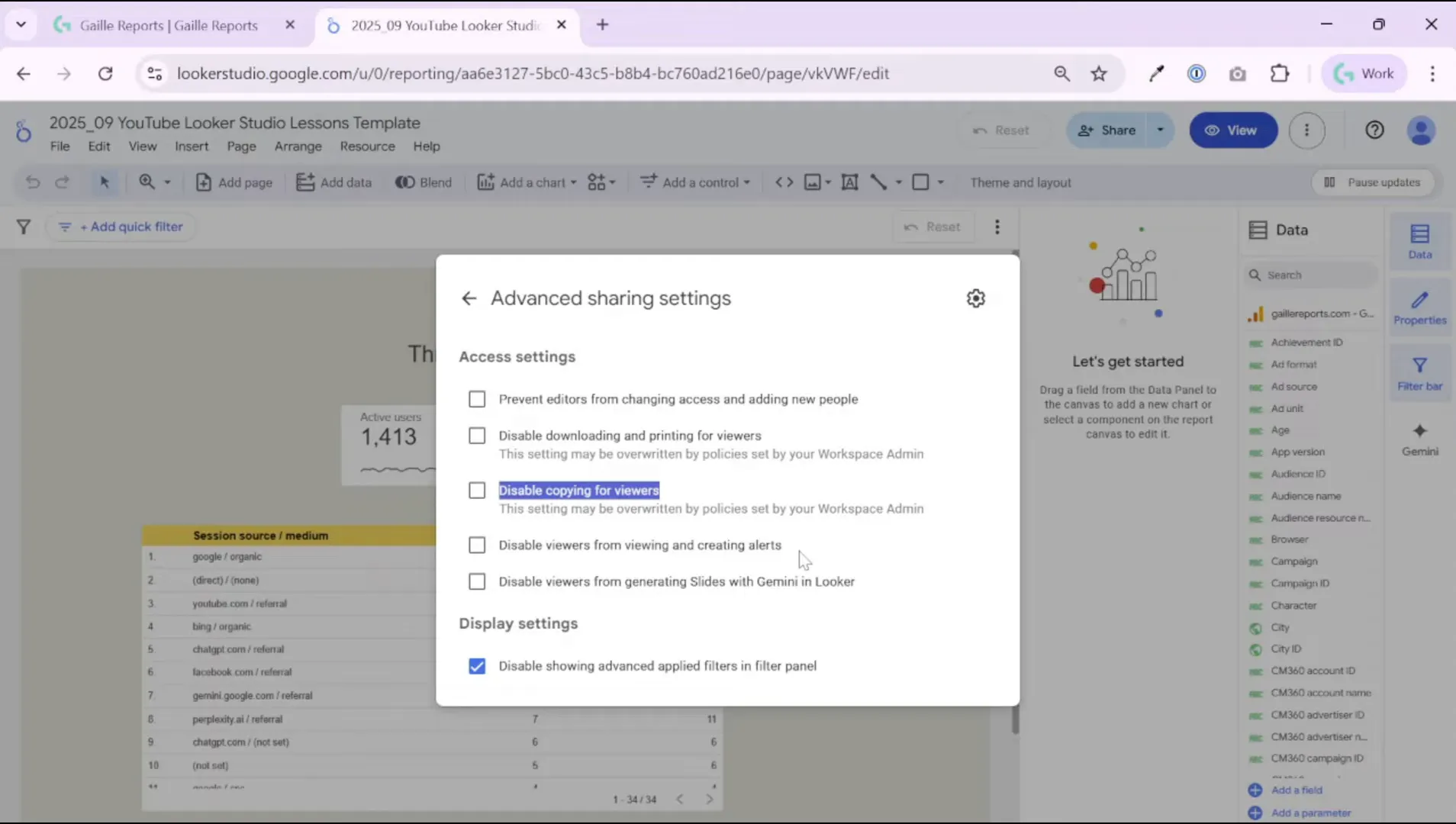
I also enable or disable several viewer restrictions depending on the audience:
- Disable downloading and printing for viewers (if you want to keep data within the interactive report).
- Disable copying for viewers (prevents others from creating derivative reports).
- Disable viewers from creating alerts or generating slides with Gemini (the latter is only relevant if you have the Pro features enabled).
Those small toggles give you a lot of control over how the report lands with different stakeholders.
Step 3: Schedule deliveries and create personal links
I often set up scheduled deliveries to automate communication. Looker Studio allows scheduling daily, weekly, or monthly email deliveries — and you can apply filters that tailor the emailed content for specific teams.
Example: Use data source filters so an SEO specialist receives only SEO traffic data, while the PPC owner receives only paid search metrics. You can also create personal report links: those capture current filters and date ranges so a stakeholder lands on a pre-filtered view.
Scheduling reports and personal links reduce back‑and‑forth and makes your dashboards actionable.
Step 4: Add a data range control — make the report flexible
The first control I add to every interactive dashboard is a Data Range control. Place it at the top of the page (I prefer the right corner) so users can choose the period they want to analyze.
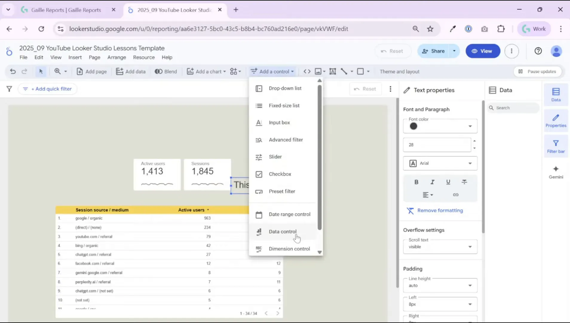
By default, Looker Studio uses the last 28 days. I usually change it to a sensible default for the report’s rhythm — for example, “This month” or “Last month” if I build a monthly report. That small change ensures the dashboard opens with the most relevant period visible.

Step 5: Tune the data range control style
After placing the control, go through the Setup and Style tabs. I remove the shadow and set the background transparent so the control sits cleanly on the header. Then I adjust font color and size so the control matches the report’s theme.
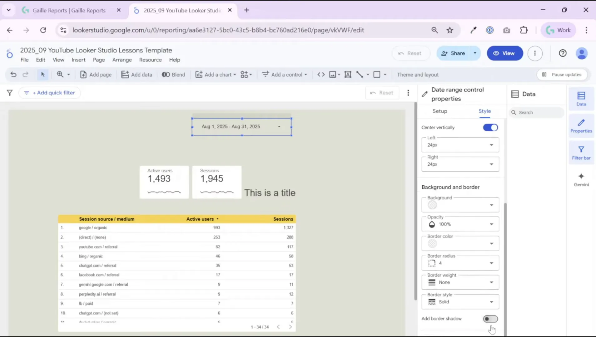
Key style choices I make:
- Background: transparent to blend with the header background.
- Shadow: remove to keep the look flat and modern.
- Font color and size: choose contrast for readability; subtle gray often works well for a calm, professional look.
- Border radius: small radius for a modern rounded look.
These small visual tweaks make your filters feel like part of the design rather than an afterthought.
Step 6: Add a logo and link it to your site
I always add my brand logo to the top-left of dashboards. Upload the image and set the background to transparent (if the logo file has a transparent PNG, it looks best). Then add the link to your website so viewers can click the logo and open your site in a new tab.
In the image settings you can control opacity and link behavior. I set the logo to 100% opacity and target “open in a new tab” so users who click don’t lose the report they were viewing.
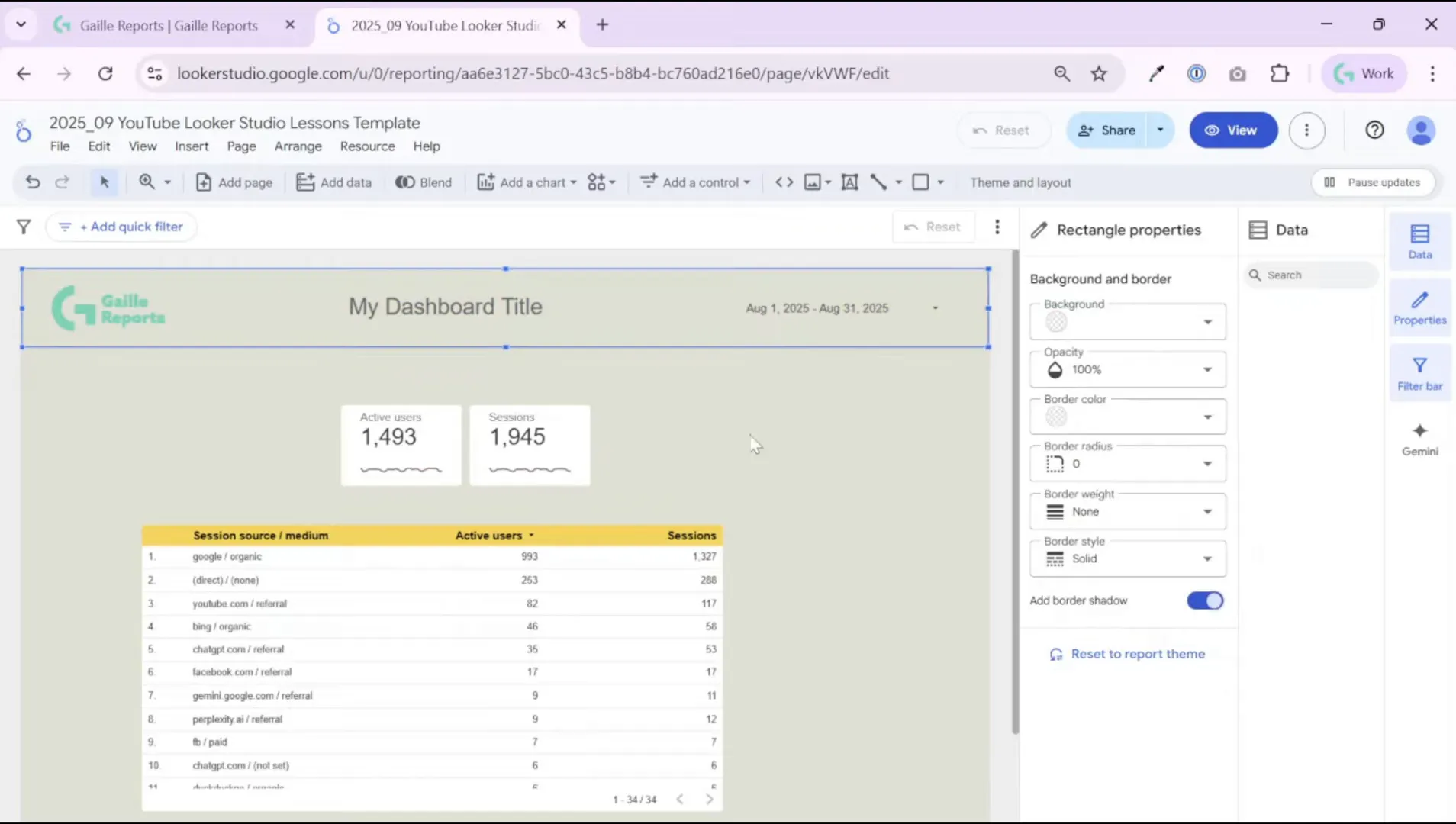
Step 7: Build a clean header with title and alignment
For the title, I use a simple text box and style it to match the brand. In a typical repor,t I choose a medium font size (for example, 24–28px) and a subtle color like dark gray. Keep the title concise — a short phrase telling what the dashboard covers (for example “Monthly YouTube Performance”).
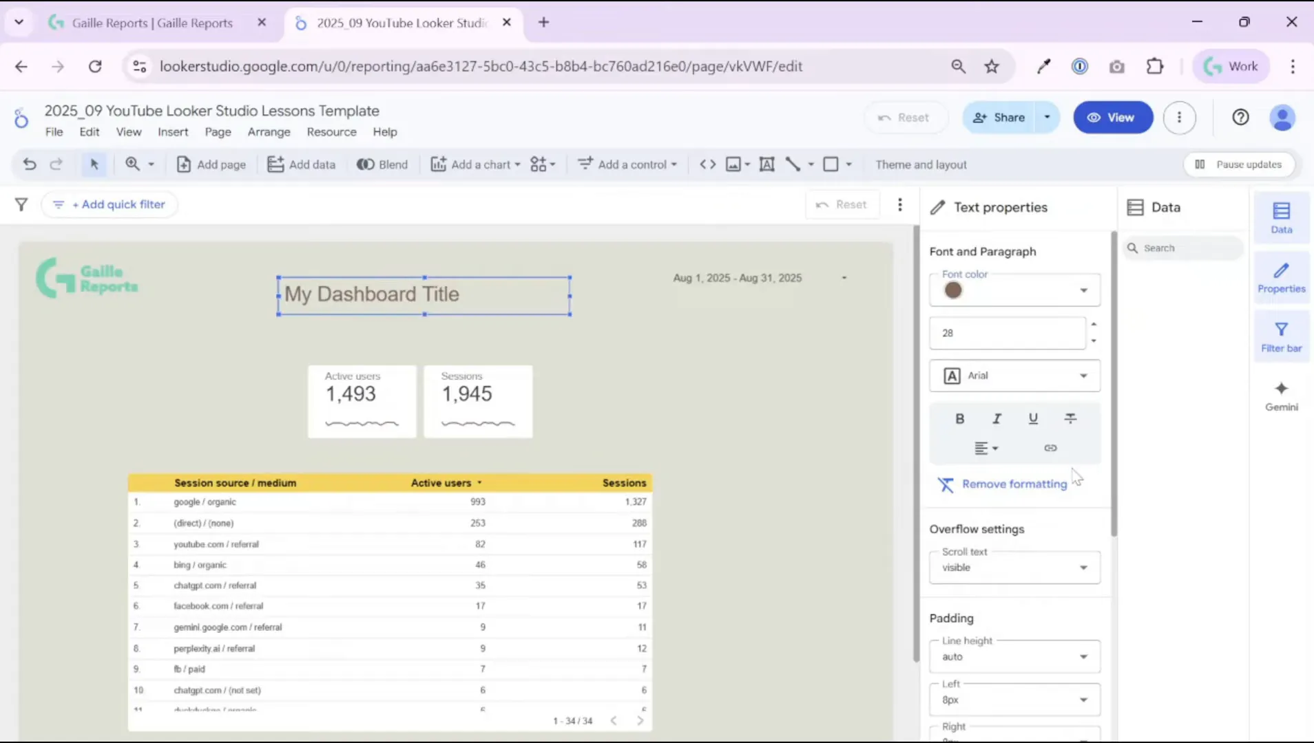
Then I select the logo, title, and any background shape together and use the context menu to align them. I usually distribute horizontally and vertically center them so the header feels balanced. If you add a background shape, make it subtle: set transparency and a gentle border shadow instead of a bold color block.

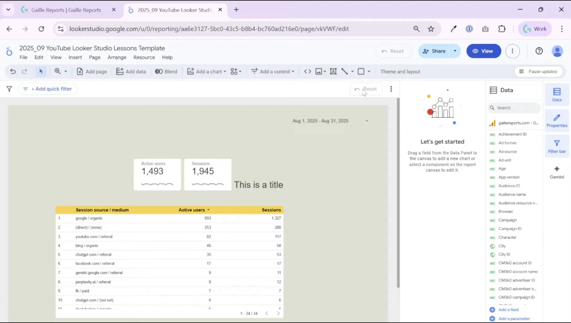
Step 8: Add decorative shapes, but keep them subtle
A small background shape behind the header can help the title pop, but avoid strong colors. I typically:
- Add a rectangle behind the title.
- Make it fill transparent and add a soft border or shadow.
- Bring the title and logo forward and center everything.
Stylish restraint helps users focus on the data instead of the design.
Step 9: Final checks and what to do next
Before handing the report off, I run a quick checklist:
- Does the default date range make sense for the audience?
- Are sharing settings appropriate for the recipients (restricted vs unlisted)?
- Did I disable downloads or copying if necessary?
- Is the logo linked, and does it open in a new tab?
- Do filters and controls use clear labels and default sensible values?
Once I finish this cosmetic and permissions pass, I start building the content panels (KPI cards, time series, traffic source breakdowns) while keeping the same style settings for consistency.
Quick recap — what you’ve done in this session
In this walkthrough, you learned how to:
- Name and organize Looker Studio reports so they remain easy to find.
- Configure sharing and viewer restrictions to protect raw data and control access.
- Schedule regular email deliveries and create personal report links for stakeholders.
- Add and style a data range control to make the dashboard flexible.
- Add a logo, title, and subtle decorative elements for a professional header.
- Run a final checklist to ensure the report opens with the right defaults and permissions.
These steps turn a basic report into a polished, shareable dashboard that stakeholders will actually use.
Recommended next reads from the blog
If you want to expand on the topics covered here, check these related articles on my site (they’re excellent follow‑ups for building dashboards and automating reporting):
- How to Use Looker Studio: Beginner Guide (2025)
- Free GSC Report Template for Marketers in Looker Studio
- Send Ad Data to BigQuery with Supermetrics – Easy Setup
- BigQuery GA4 Users Sessions Tutorial: How to Identify Your Top Traffic Sources
Final thoughts and next steps
I build dashboards to answer specific questions. If you focus on the audience and make the report easy to open (right date range, clear title, and sensible permissions), you will increase adoption dramatically. Small design choices — transparent backgrounds, subtle shadows, and consistent fonts — go a long way toward credibility. Automating deliveries and using personal links keeps stakeholders engaged without extra manual work.
If you enjoyed this walkthrough, watch the step‑by‑step video embedded at the top to follow along in real time. If you have questions or want a template to speed up your workflow, explore the resources on the site and subscribe to the newsletter for updates and free templates.
If you want to connect data from different platforms directly into Looker Studio or BigQuery, reliable API connectors save a lot of time.
- Windsor.ai supports Google Ads, Facebook, LinkedIn and more. Use promo code
gaillereportsfor 10% off any plan. - Supermetrics offers advanced connectors for marketers with direct integrations to BigQuery, Looker Studio, and other destinations.