
Show best practices for visualizing marketing data.
Marketing data visualization sounds simple in theory: turn raw numbers into charts and dashboards that people can actually use. In practice, many marketers still end up with cluttered reports, scattered data, and dashboards full of metrics that look impressive but don’t help anyone decide what to do next.
This usually shows up in a familiar way. You pull data from GA4, ad platforms, maybe a CRM, and start building a report. But instead of answering a clear business question, the dashboard becomes a collection of whatever data was available. Stakeholders see CPM, CPC, and conversion charts, but still ask, “So what should we change?”
Why marketing data visualization often goes wrong
The biggest problem is that teams often start with data instead of decisions. They collect every metric they can access before defining what the dashboard is supposed to answer. That leads to overloaded pages, vague charts, and reporting that feels busy but not useful.
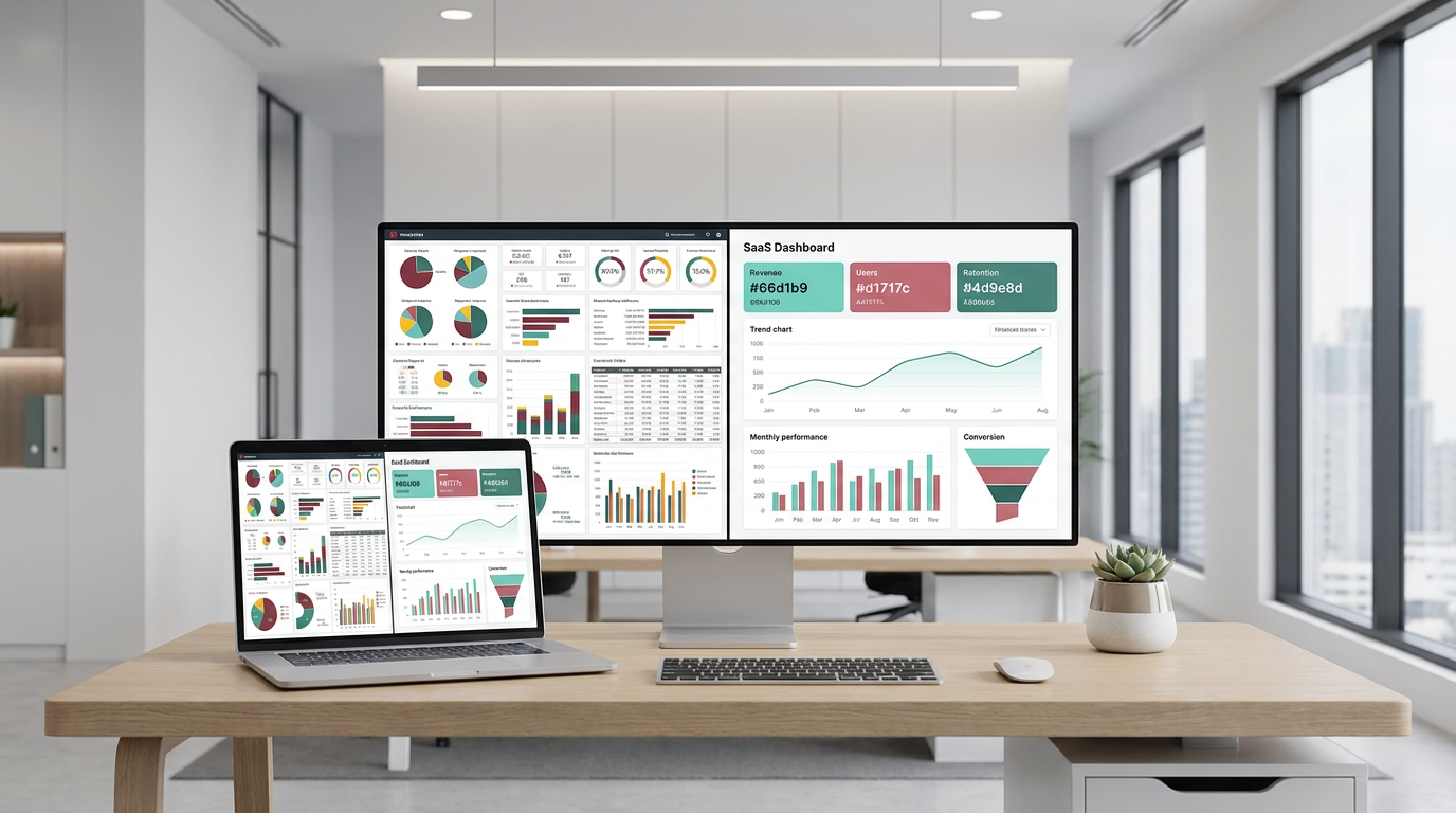
Another common issue is chart choice. A line chart works well for trends over time, like weekly conversions. A bar chart is better for comparing channels or campaigns. But when the wrong chart type is used, even accurate data becomes harder to understand. Pie charts are a good example here: once you add too many slices, they stop being useful.
Data quality also matters. If tracking is incomplete, conversion setup is wrong, or campaign naming is inconsistent, the visuals may look polished while still telling the wrong story.
A dashboard should answer a question, not just display data.
A better approach to marketing data visualization
Good marketing data visualization starts before the dashboard is built. First, define the business question. For example: which channel drives the most qualified leads? Or where are users dropping off in the funnel? That question should guide every metric and every chart you include.
From there, keep the structure simple. Use KPI cards for high-level numbers, line charts for trends, bar charts for comparisons, and funnel charts for conversion paths. Group related visuals together, such as spend, channel performance, and campaign results. Clear titles also help, especially for non-technical stakeholders. “Cost per Lead” is easier to read than “CPL.”
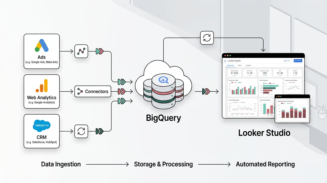
Tools like Looker Studio, Google Sheets, BigQuery, Supermetrics, Windsor.ai, and Make.com can support this workflow by helping teams connect data sources, automate refreshes, and build interactive dashboards. A simple sketch on paper before you build can also help you organize the page: top KPIs first, then trends, then deeper breakdowns.
Just as important, keep each page focused. Around six key metrics per page is often enough to make the message clear without overwhelming the reader.
A Tool I Often Use to Pipe Marketing Data Into Dashboards
## Windsor.aiWhen I need to move marketing data from ad platforms into BigQuery or Looker Studio, I often use Windsor.ai.
It saves a lot of time because it can automatically pull data from platforms like Facebook Ads, Google Ads, TikTok Ads and send it straight into your reporting stack.
If you decide to try it, they also offer a 10% discount with the promo code gaillereports.
How to make marketing data visualization more useful in real reporting workflows
Once the page structure is clear, the next step is making sure the dashboard actually works for the people who use it. This is where many teams can improve their marketing data visualization without changing tools at all.
A good workflow usually starts with one question, then moves through a few simple steps:
- define the business question
- choose the metrics that answer it
- pick the chart type that matches the insight
- group visuals in a logical order
- check data quality before sharing the report
- review the dashboard with stakeholders and improve it over time
That process sounds basic, but it solves most of the reporting problems marketers run into. Instead of building a dashboard around every available metric, you build around a decision.
Start with one reporting goal
Let’s say your team wants to understand which channel drives the most qualified leads. That question already narrows the report. You do not need every traffic metric, every engagement metric, and every campaign detail on the first page.
You might start with KPI cards for high-level numbers, then add a bar chart comparing channel results, and a trend chart showing how conversions change over time. If you also want to understand where users drop off, a funnel chart can help visualize that path.
This keeps the dashboard focused. It also makes stakeholder conversations easier because each chart supports the same question.
Match each chart to the decision
Choosing the right chart is one of the easiest ways to improve clarity.
- Line charts work best for trends over time, such as weekly conversions.
- Bar or column charts are better for comparing channels, campaigns, or other categories.
- Funnel charts help show conversion paths and drop-offs.
- Geo maps can highlight regional performance differences.
- KPI cards or scorecards are useful for headline metrics and quick summaries.
Pie charts are best avoided when there are too many categories. Once a chart has more than a few slices, the comparison becomes harder to read.
This matters because the chart is not just decoration. It controls how fast someone understands the message.
Keep the dashboard simple enough to scan
Most stakeholders do not read dashboards the way analysts do. They scan. They look for the top numbers first, then trends, then anything unusual.
That is why a simple layout works so well:
- top row for KPI cards
- middle section for trends
- lower sections for channel, campaign, or regional breakdowns
It also helps to limit each page to around six key metrics. That creates enough focus to make the story clear without filling the page with vanity metrics or overlapping visuals.
Use clear labels too. A title like “Cost per Lead” is easier for most readers than “CPL,” especially in stakeholder-facing reports.
Build marketing data visualization around the audience
The same data should not always be shown the same way. A dashboard for analysts can include more detail. A report for leadership usually needs fewer charts and more direct takeaways.
Internal reports can use deeper breakdowns when the audience needs to investigate performance. Stakeholder or external reports should focus on high-impact insights with less complexity.
Interactive filters can also help here. Instead of crowding the page with separate charts for every campaign or segment, let users change the view by date range, campaign, or segment when needed.
This is often a better way to keep a dashboard clean while still making it flexible.
Good dashboards reduce questions instead of creating more of them.
Do not skip data quality checks
Even the clearest visual is still misleading if the underlying data is wrong. Before you spend time polishing charts, make sure the data is accurate, complete, and up to date.
For marketing reports, this usually means checking things like:
- whether tracking is working properly
- whether conversion setup is correct
- whether campaign naming is consistent
- whether the dashboard clearly shows where the data comes from
Citing data sources on the dashboard helps build trust, especially when the report is shared across teams.
Tools and workflows that support marketing data visualization
You do not need a complicated stack to build better dashboards. What matters more is having a workflow that reduces manual work and keeps reporting consistent.
Several tools can support that process:
- Looker Studio for interactive marketing dashboards
- Google Sheets for quick reporting and manual exploration
- BigQuery for storing and querying larger marketing datasets
- Supermetrics or Windsor.ai for automating data pipelines from marketing platforms into reporting tools
- Make.com for connecting tools and automating data flows without coding
- Dashboard templates as a starting point you can customize
A practical setup for many teams is simple: connect the source data, automate refreshes where possible, and build a dashboard that updates without manual copying and pasting. That gives you more time to review performance and less time maintaining spreadsheets.
A simple dashboard-building workflow
If you want a repeatable process, this workflow is a good place to start:
- sketch the dashboard structure on paper first
- put top KPIs at the top of the page
- add charts for trends and comparisons underneath
- group visuals by theme, such as spend, channels, or campaigns
- use clear chart titles and readable labels
- remove anything that does not help answer the main question
- test the dashboard with stakeholders and refine it
That paper sketch step is often underrated. It helps you think about information flow before you start dragging charts into a dashboard tool.
Add context so the numbers mean something
One reason dashboards feel unclear is that they show values without context. A number on its own is not always useful. A number compared with last month, a benchmark, or a reference line is easier to interpret.
Simple context can come from chart titles, labels, or trend indicators. Even a short note like “+15% vs. last month” can make a result easier to understand at a glance.
Accessibility also matters here. Use high contrast, readable font sizes, and labels where possible. Color choices should stay easy to interpret, including for users who may struggle with red-green combinations.
Keep improving the dashboard after it goes live
A dashboard is rarely perfect in the first version. Once people start using it, you will quickly see what helps and what gets ignored.
That is why testing and iteration are part of good reporting practice. Share the dashboard, watch how stakeholders use it, collect feedback, and adjust the layout or metric selection when needed.
Sometimes the best improvement is not adding a new chart. It is removing one.
Helpful resources for building better reports
If you want to go further, additional tutorials or resources can help with the practical side of reporting and dashboard design:
- dashboard planning and layout ideas
- report automation workflows
- marketing data source connection guides
- Looker Studio and Google Sheets reporting tutorials
- tips for keeping dashboards clean and stakeholder-friendly
Final thoughts
Effective marketing data visualization is less about making reports look impressive and more about helping people make decisions faster. When you start with a clear business question, choose chart types carefully, keep the layout simple, and verify the data behind the visuals, your dashboards become much more useful.
If you are building reports for your team, clients, or leadership, use that approach as your baseline. Focus each page, automate what you can, and refine the dashboard based on how people actually use it. That is what turns reporting from a monthly task into a reliable part of your marketing analytics workflow.

Want to go deeper into dashboard building?
- Clean dashboards in Looker Studio
- Add KPI scorecards in Looker Studio
- Visualize data over time in Looker Studio
Tool I use for Looker Studio connectors
If you’re building dashboards in Looker Studio and need data from ad platforms, this is something I personally use quite often.
Windsor.ai connectors for Looker Studio let you pull marketing data directly into your reports so everything updates automatically.
If you decide to try it, they also offer a 10% discount with the promo code gaillereports.
Tool I use for marketing dashboards
A tool I’ve used many times for marketing dashboards is Supermetrics.
It helps pull data from different marketing platforms into tools like Google Sheets, BigQuery, or Looker Studio so your reports can update automatically.
