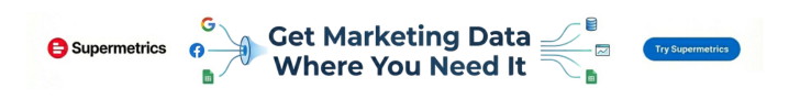
Show examples of dashboards used in analytics.
Marketers looking for data dashboard examples usually aren’t short on data. The real problem is that the data is scattered across platforms, reports are full of too many metrics, and it takes too long to answer simple questions like: What’s working, what’s dropping, and where should we focus next?
This is a common reporting issue in marketing teams. Paid media data sits in ad platforms, website performance lives in GA4, lead and revenue numbers may sit somewhere else, and each source tells only part of the story. When you try to pull everything together manually, the result is often a dashboard that feels busy but still doesn’t help with decisions.
Why Data Dashboard Examples Often Go Wrong
Most dashboard problems come from three simple issues.
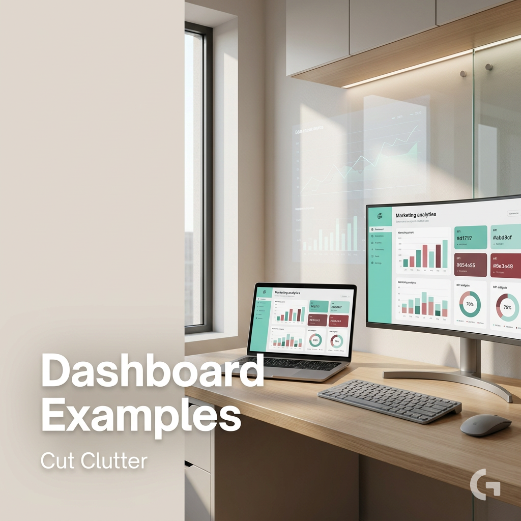
First, there is metric overload. It’s tempting to track everything, but when every number looks important, the real KPIs get buried. A dashboard should make it easy to scan performance, not force people to hunt for the signal.
Second, there are siloed data sources. If Google Ads, Facebook, GA4, and other platforms are all viewed separately, it becomes hard to understand how channels work together across the funnel.
Third, many teams start building before defining the goal. Without a clear objective, dashboards end up mixing useful metrics with irrelevant ones. That makes it harder to answer the most important question: are we on track?
A good dashboard does not show everything — it shows what helps you decide.
What a Good Data Dashboard Should Do
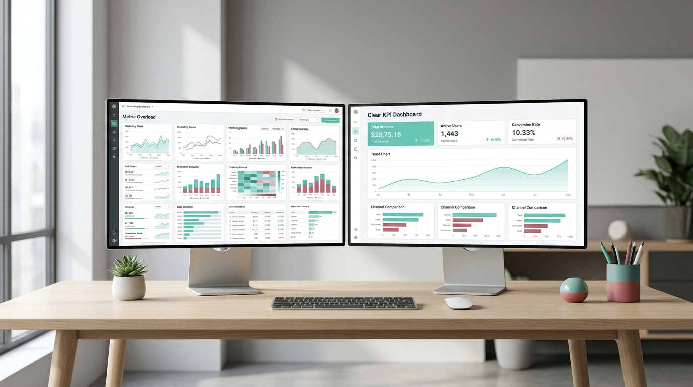
A data dashboard is a business intelligence tool that brings key metrics and KPIs from multiple marketing sources into one view. Instead of relying on static reports, marketers can use dashboards to monitor campaign performance, track ROI, and spot changes faster.
In practice, this means combining data from tools like GA4, Google Ads, and Google Sheets into a clearer reporting layer. For larger datasets or more structured workflows, teams may also use BigQuery as a central warehouse, while tools like Looker Studio help turn that data into visual dashboards.
Start With the Objective, Not the Layout
Before choosing charts or building sections, define what the dashboard needs to answer. For example:
- Do you need to track campaign effectiveness?
- Do you want to visualize the marketing funnel?
- Do you need to monitor website traffic and conversions from GA4?
Once that objective is clear, the dashboard becomes much easier to shape. You can start grouping related metrics together, limit the view to what matters most, and choose chart types that match the question you’re trying to answer.
A Tool I Often Use to Feed Data into Looker Studio Dashboards
If you’re building dashboards in Looker Studio and need data from ad platforms, this is something I personally use quite often.
Windsor.ai connectors for Looker Studio let you pull marketing data directly into your reports so everything updates automatically.
If you decide to try it, they also offer a 10% discount with the promo code gaillereports.
How to Build Better Data Dashboard Examples Step by Step
Once the objective is clear, the next step is to turn that objective into a simple structure.
A practical way to do that is to build the dashboard in layers. Start with the small set of KPIs that answer the main business question. Then add supporting visuals only if they help explain movement in those KPIs.
For example, if the goal is to monitor campaign effectiveness, the main view might include high-level scorecards for leads, revenue, and ROAS. Under that, you can add trend charts for performance over time and comparison charts for channel contribution.
If the goal is to understand the funnel, the layout should follow the funnel itself. A simple flow like sessions, leads, converted leads, and revenue makes it much easier to see where performance is changing.
1. Define the decision the dashboard should support
Before adding any chart, decide what action the dashboard should help someone take.
- If the dashboard is for campaign reporting, it should help you see what is driving results and what is underperforming.
- If it is for leadership, it should show only a few core KPIs, such as lead conversion rate or ROAS change percentage.
- If it is for website reporting, it should focus on traffic, conversions, and user behavior from GA4.
This step sounds simple, but it prevents one of the most common reporting mistakes: building a dashboard that looks complete but does not help anyone decide what to do next.
2. Group related metrics together
Good dashboards are easier to read because similar information sits together.
Instead of mixing traffic, paid media, social, and revenue metrics across the page, create sections based on topic. For example, keep social media data in one area, and place SEO and paid insights together if the goal is to compare channel contribution.
This structure also helps when you are working with several sources. It is much easier to review performance when the layout reflects how marketers already think about their channels.
3. Limit the dashboard to what matters
Not every stakeholder needs the same level of detail.
A detailed reporting view may include sessions, leads by source, converted leads, revenue, and ROAS. A leadership view should usually be much tighter, with only two to four KPIs that show whether performance is on track.
That distinction matters because many data dashboard examples fail when they try to serve every audience at once. One dashboard should not be expected to answer every question for every person.
The best dashboards reduce questions before they add more charts.
4. Choose chart types that match the question
The chart type should make the metric easier to understand, not more impressive.
- Line graphs are useful for trends over time, such as impressions or follower growth.
- Bar charts help compare categories, such as CTR across ad designs.
- Scorecards are useful for headline KPIs like total demo requests.
- Sankey diagrams can be used to visualize top conversion paths and attribution models.
If the dashboard needs to show changes over time, use trends. If it needs to compare sources or campaigns, use comparisons. Keeping that match simple makes dashboards much easier to scan.
Tools That Help Marketers Build Data Dashboard Examples
You do not need a complex setup to start building useful reporting. The research draft highlights a few tools that are commonly used in marketing analytics workflows.
- Looker Studio for free, user-friendly dashboarding with sources like GA4, Google Ads, and Sheets.
- Google Sheets as a trusted analysis layer when supported by governed data marts, rather than as a system of record.
- BigQuery as a central warehouse for storing and transforming larger marketing datasets.
- Make.com for automating data pipelines between apps.
- Supermetrics for connecting paid media, SEO, and social data to Looker Studio or Sheets.
- Power BI for more advanced enterprise and executive reporting.
- GA4 as a primary source for website traffic, conversions, and user behavior.
The right combination depends on your reporting setup, but the pattern is consistent: bring your data into one reporting flow, organize it around business questions, and then visualize only what supports decisions.
Practical Reporting Workflows Marketers Can Apply
If you are looking at data dashboard examples for inspiration, it helps to think beyond the design and look at the reporting workflow behind them.
Once the dashboard structure is in place, reporting tends to improve most when the workflow itself becomes more consistent and easier to maintain.
Use a simple reporting stack
A common marketing workflow is to pull data from tools like GA4, Google Ads, and other marketing platforms into a reporting layer such as Looker Studio or Google Sheets. For larger or more structured setups, BigQuery can act as the central warehouse.
This matters because the dashboard becomes more reliable when the data is organized before it reaches the visual layer.
Automate where possible
Manual reporting is one of the main reasons dashboards become outdated or inconsistent. Automation tools can help move data between apps so the reporting process is less dependent on copy-paste work.
Even a simple automated pipeline can make dashboards easier to maintain because it reduces repetitive tasks and keeps the reporting flow more consistent.
Build one version for operators and one for leadership
This is one of the most practical ways to reduce clutter.
An operator view can include more detailed performance data, while a CMO view can stay focused on metrics like total marketing spend, MQLs, cost per MQL, pipeline created, and ROMI.
Separating those views makes each dashboard more useful because each one matches a real reporting need.
Track the funnel over time
Looking at a single week or month in isolation can hide the bigger pattern. A better approach is to visualize funnel steps over a longer window, such as two to six months.
That makes it easier to spot seasonal drops, conversion bottlenecks, or shifts in channel performance. A sessions-to-leads-to-revenue view is often more useful than a long list of disconnected metrics.
What Strong Data Dashboard Examples Usually Have in Common
When you compare effective dashboards, they tend to share a few traits.
- The most important KPIs are visible immediately, often positioned top-left.
- The dashboard is organized by business logic, not by random charts.
- Metrics are limited to those that support decisions.
- Stakeholders can quickly understand trends, channel contribution, or funnel movement.
- The layout reflects the needs of the audience using it.
That is why strong data dashboard examples are usually simpler than expected. Their value comes from clarity, not from the number of widgets on the screen.
Additional Resources for Building Better Dashboards
If you want to improve your reporting setup further, it helps to keep learning from practical analytics resources and dashboard tutorials.
- Tutorials on building dashboards in Looker Studio
- Guides for organizing marketing data in Google Sheets
- Resources on using BigQuery for larger marketing datasets
- Examples of funnel and leadership dashboard layouts
- Tips for reviewing dashboards with stakeholders and improving them over time
Final Thoughts
The best data dashboard examples do not try to show everything. They help marketers answer a clear question, understand what is changing, and decide what to do next.
If your reporting feels cluttered, the fix is usually not a better chart library. It is a better structure: define the objective, group related metrics, limit the view to what matters, and use the right tools to bring your data together.
Start with one dashboard built around one real decision. Once that works, you can expand the system gradually and create reporting that is easier to trust, easier to maintain, and much more useful for day-to-day marketing decisions.