
Explain the basics of marketing analytics.
Digital Marketing Analytics Tutorial: Start With the Data That Drives Decisions
A digital marketing analytics tutorial should help you solve a very common problem: your marketing data is everywhere, but clear answers are hard to find. You might have website data in GA4, ad results in platform dashboards, email performance in another tool, and lead or customer data somewhere else.
That makes reporting slow, manual, and often inconsistent. A marketer can spend hours pulling numbers into Google Sheets or dashboard tools and still end up with a report that shows clicks and traffic, but not whether those efforts actually helped conversions, lead quality, or revenue.
Why Marketing Analytics Feels So Messy
The biggest issue is not data collection alone. It is that performance is spread across search, paid ads, email, social media, websites, and CRM systems. When each channel is reviewed separately, it becomes hard to understand the full journey from first touch to conversion.
There are a few reasons this happens so often:
- data lives in multiple platforms
- teams track activity metrics without tying them to business goals
- tracking can be incomplete when tags, pixels, or UTM parameters are not set up consistently
- many reports explain what happened, but not why it happened
- beginners often end up with too many metrics and no clear baseline
A dashboard becomes useful when it connects channel activity to business outcomes, not just to more charts.
This is why traffic going up does not always mean marketing is working better. More visits sound positive, but without reliable conversion tracking and clear KPIs, you still cannot tell if that traffic is generating qualified leads or supporting revenue.

A Simple Digital Marketing Analytics Tutorial Workflow
The most practical way to approach marketing analytics is to start with the goal and work backward.
First, define what success means. That could be lead generation, purchases, or retention. Then map the funnel so each stage has a measurable outcome. After that, choose a small set of KPIs that actually reflect performance, such as conversion rate, cost per acquisition, return on ad spend, or lead quality.
From there, the next step is to collect data consistently across your website, ads, email, and CRM-related sources. Tools mentioned in many reporting workflows include GA4 for website and event tracking, Google Sheets for lightweight analysis, Looker Studio for dashboards, BigQuery for larger datasets, and automation tools like Make.com or marketing data connectors to bring sources together.
For many teams, this starts with a simple pipeline: source platforms feed data into a connector or automation workflow, the data is cleaned in Sheets or BigQuery, and the final dashboard in Looker Studio makes the numbers easier to review and act on.
A Tool I Use to Centralize Marketing Data
## Windsor.ai
When I need to move marketing data from ad platforms into BigQuery or Looker Studio, I often use Windsor.ai.
It saves a lot of time because it can automatically pull data from platforms like Facebook Ads, Google Ads, TikTok Ads and send it straight into your reporting stack.
If you decide to try it, they also offer a 10% discount with the promo code gaillereports.
How to Apply This Digital Marketing Analytics Tutorial in a Real Workflow
Once the basic pipeline is clear, the next step is to make it usable in day-to-day reporting. That usually means keeping the process simple enough that your team can trust it, repeat it, and improve it over time.
A practical setup often follows the same sequence:
- collect data from your main marketing sources
- bring that data into one reporting workflow with a connector or automation tool
- clean or organize the data in Google Sheets or BigQuery
- visualize the results in Looker Studio
- review the numbers regularly and make changes based on what you learn
This matters because analytics is not just about having a dashboard. It is about creating a process that helps you move from scattered reports to clear decisions.
Step 1: Define one primary conversion
If you are new to marketing analytics, start with one primary conversion before adding more advanced metrics. This could be a lead, a purchase, or another key action that reflects your main business goal.
Starting small helps in two ways. First, it makes tracking easier to check. Second, it gives your reports a clear center. Instead of reviewing dozens of numbers, you can ask a more useful question: which channels and campaigns are helping drive that conversion?
Step 2: Keep KPI definitions consistent
One of the fastest ways to make reporting confusing is to compare numbers that are not based on the same definitions. Use the same date range and the same KPI definitions across reports so comparisons stay consistent.
For example, if you are looking at conversion rate or cost per acquisition, make sure the team is reviewing those metrics in the same way each time. Consistency makes trends easier to trust and easier to explain.
Step 3: Separate channel metrics from business metrics
Channel metrics such as clicks or traffic are useful, but they should not be the final measure of performance. Business metrics like conversions, lead quality, retention, and ROI are what help you understand whether marketing is actually contributing to outcomes that matter.
This is a simple shift, but it changes how people read reports. Instead of asking, “Did traffic go up?” you start asking, “Did the right traffic lead to better results?”
Building a Marketing Dashboard That Supports Decisions
A dashboard becomes more useful when it is focused. Many teams try to include too much too early, which creates a report full of charts but short on insight.
A better approach is to build around a small set of trusted metrics. This makes it easier to spot trends, explain performance, and decide what to do next.
When building a dashboard, keep these practical ideas in mind:
- show metrics that connect to the main goal
- keep channel data and business outcomes visible together
- use the same structure each time so the report is easy to read
- review trends weekly instead of waiting until the end of the month
Looker Studio is commonly used for dashboards and visual reporting, while Google Sheets can help with lightweight analysis and quick reporting. For larger datasets, BigQuery can be used to store and analyze marketing data. The exact setup can vary, but the principle stays the same: keep the reporting flow simple and reliable.
A clean dashboard with a few trusted metrics is usually more useful than a large report with uncertain data quality.
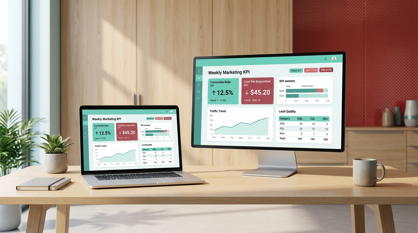
What to look for in a weekly review
A weekly review helps you catch changes earlier. Instead of waiting until month-end, you can look for movement in core KPIs and decide whether action is needed.
For example, a weekly check can help you review whether:
- traffic is increasing or decreasing
- conversion rate is improving or dropping
- cost per acquisition is moving in the right direction
- lead quality appears stable or weaker than expected
This kind of review is where analytics becomes practical. The point is not just to observe trends, but to use them to adjust budgets, improve landing pages, refine creative, or update targeting.
Connecting Marketing Data Sources Without Overcomplicating It
One reason reporting takes so much time is that data is often split across website analytics, ad platforms, email tools, social media, and CRM systems. A useful reporting workflow brings those sources closer together so performance can be reviewed in one place.
Many teams do this with a simple pipeline:
- source platforms provide the raw data
- a marketing data connector or automation workflow moves the data into a reporting setup
- the data is cleaned or modeled in Sheets or BigQuery
- the final dashboard in Looker Studio presents the results
This kind of structure helps reduce manual reporting and makes it easier to compare channel performance using the same framework.
When Google Sheets is enough
Google Sheets is often enough for lightweight analysis, cleaning exports, and quick reporting. If your reporting needs are still simple, Sheets can be a practical place to organize data before building a dashboard.
This can work well when you are still defining KPIs, checking tracking quality, or testing what should appear in a recurring report.
When a larger data setup becomes useful
As reporting grows, larger datasets may be better handled in BigQuery. The research draft identifies BigQuery as a common tool for storing and analyzing larger marketing datasets.
That does not mean every team needs it immediately. The better approach is to start with the smallest setup that gives you reliable answers, then expand only when your reporting process actually needs it.
Improving Data Quality Before Expanding the Report
It is tempting to add more charts, more channels, and more metrics as soon as a dashboard is live. But better analytics usually comes from improving data quality first.
Check tracking setup regularly, especially when campaigns, landing pages, or site structures change. Incomplete or inconsistent tracking can make reports look detailed while still leaving you with the wrong conclusions.
A strong reporting habit includes regular checks for:
- consistent tracking across website, ads, email, and CRM-related sources
- reliable measurement of the main conversion
- consistent date ranges and KPI definitions
- clear separation between activity metrics and outcome metrics
Segmentation is also useful when possible, because averages can hide important differences in audience behavior. Even a simple segmented view can make it easier to understand why overall performance changed.
Additional Resources for Your Digital Marketing Analytics Tutorial Workflow
If you are building your reporting process step by step, it helps to keep a short list of topics to explore next. Additional tutorials or resources can support the next stage of your workflow, especially when you want to make reporting more reliable and less manual.
- guides on setting up reliable GA4 tracking
- tutorials for organizing reporting workflows in Google Sheets
- resources for building dashboards in Looker Studio
- examples of using BigQuery for larger marketing datasets
- practical ideas for automation workflows with Make.com and marketing data connectors
Final Thoughts
The best way to approach marketing analytics is to keep it tied to decisions. Start with a clear goal, track one primary conversion, choose a small set of KPIs, and build a reporting workflow your team can trust.
A useful digital marketing analytics tutorial should make analytics feel less like a technical reporting task and more like a practical system for improving marketing performance. When your data is organized, your dashboard is focused, and your reviews happen regularly, it becomes much easier to see what is working, what is not, and where to improve next.
If your current reports still feel scattered, start smaller than you think. A simple pipeline, a few reliable metrics, and a weekly review habit can go a long way in making your analytics more useful.
