A beginner-friendly tutorial explaining how to build your first dashboard in Looker Studio step by step.
If you’re searching for a practical Looker Studio tutorial, you probably have the same problem many marketers do: your reporting lives in too many places. GA4 shows traffic, Google Ads shows spend, and spreadsheets turn into a messy manual step every time you need to share results.
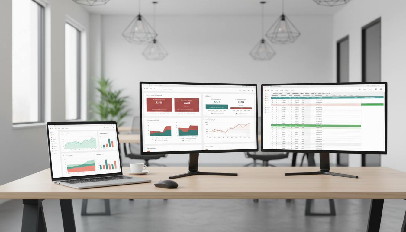
This gets frustrating fast. Weekly reporting often means copying numbers into slides, updating screenshots, and checking formulas in Sheets just to make sure nothing broke. By the time the report is ready, some of the data is already outdated.
Why reporting gets messy so quickly
The biggest issue is that marketing data is split across different platforms. One tool shows traffic, another shows ad performance, and another may hold extra notes or imported CSV data. When you try to combine all of that manually, reporting becomes slow and error-prone.
A few common problems usually show up:
there is no single view of performance
reports take too long to update
stakeholders want interactive reports, not static screenshots
spreadsheets are useful, but they are not ideal for filters or mobile-friendly dashboards
For growth teams, this becomes especially painful during monthly reviews or budget discussions, when everyone wants quick answers from the same set of numbers.
Good reporting is not just about seeing data — it’s about making updates easy and repeatable.
Looker Studio tutorial: what the tool does
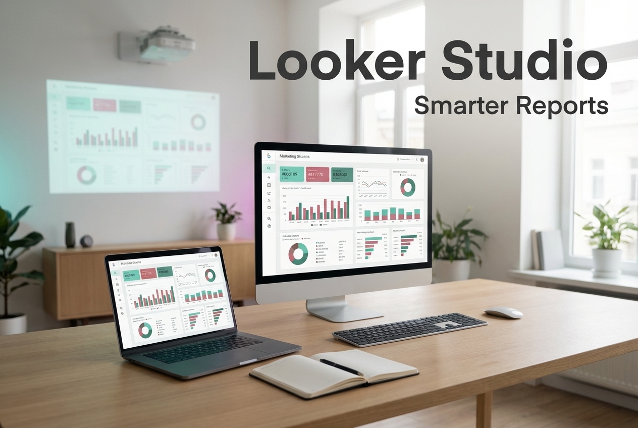
Looker Studio is Google’s free dashboard and reporting tool. It lets you connect data sources such as GA4, Google Sheets, Google Ads, and BigQuery, then turn that data into charts, tables, and filters.
For marketers, that means you can move from static reporting to a live dashboard that updates automatically. Instead of rebuilding the same report every week, you create one reporting view that people can check anytime.
This is especially useful when you want to track campaign performance, website traffic, or ROI in one place. A simple dashboard can already make it easier to spot trends, compare channels, and share results with a team.
The simplest way to get started
The easiest first setup is usually a basic report built from GA4 data. In Looker Studio, you can create a new report, connect your data source, and start adding visuals like scorecards, tables, and time series charts.
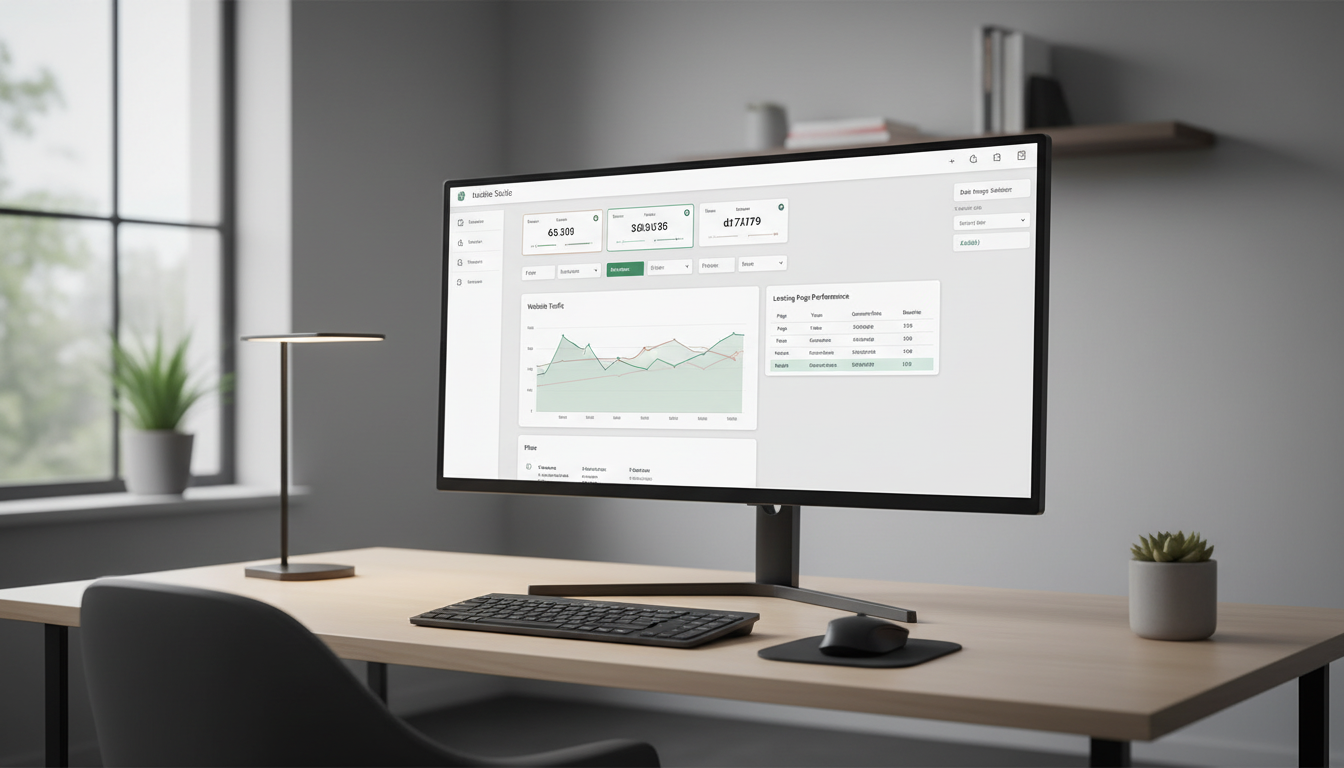
Once the data is connected, the interface is fairly straightforward: a toolbar for adding charts, a canvas for arranging them, and a data panel where you choose dimensions and metrics. From there, you can begin shaping the dashboard around a few important questions, like traffic trends, top channels, or landing page performance.
That’s the point where Looker Studio starts becoming useful in a real marketing workflow.
A Tool I Use to Pull Marketing Data Into Looker Studio
If you’re building dashboards in Looker Studio and need data from ad platforms, this is something I personally use quite often.
Windsor.ai connectors for Looker Studio let you pull marketing data directly into your reports so everything updates automatically.
If you decide to try it, they also offer a 10% discount with the promo code gaillereports.
Looker Studio tutorial: building your first dashboard step by step
A good next step is to turn that basic report into something people can actually use without asking you for a new export every time. The easiest way to do that is to build a simple dashboard with a few clear visuals, a date control, and only the metrics that matter most.
Step 1: Create a new report
Go to Looker Studio and sign in with your Google account. Then click + Create and choose Report. This opens a blank canvas where you can start building your dashboard.
If this is your first report, keep the structure simple. You do not need to design a full executive dashboard on day one. One page with a few charts is enough to start.
Step 2: Connect your data source
After creating the report, Looker Studio will prompt you to add data. A common starting point is Google Analytics for GA4 data. Select your account and property, then click Connect.
Based on the available sources in the research draft, marketers often use:
GA4 for website analytics
Google Sheets for imported CSVs or extra reporting data
Google Ads for ad performance
BigQuery for larger datasets or custom queries
Once permissions are granted, the data can refresh automatically, which is one of the main reasons dashboards save so much time compared with manual spreadsheet reporting.
Step 3: Learn the main parts of the interface
The interface is easier to work with when you know what each area does:
Toolbar: where you add charts, text, and images
Canvas: the main area where you place visuals
Data panel: where you choose dimensions and metrics
Sidebar: where you adjust styling, themes, and pages
For marketers, the most important distinction is usually this: dimensions describe the data, and metrics measure it. For example, Date or Source/Medium can be dimensions, while Sessions or Conversions can be metrics.
Step 4: Add the first charts
Start with a few basic visuals that answer common reporting questions.
You can click Add a chart and choose:
Time series chart for traffic or conversion trends over time
Scorecard for totals like sessions or conversions
Table for breakdowns such as top landing pages
After placing a chart on the canvas, use the Setup tab to define what it should show.
For example:
Time series chart: Dimension = Date, Metric = Sessions
Top pages table: Dimension = Landing Page, Metric = Users
This is usually enough to build a first useful marketing dashboard: one trend chart, one or two scorecards, and one table.
Step 5: Make the dashboard interactive
Static charts are helpful, but filters are what make a dashboard practical for a team.
Two simple features make a big difference:
Date range control, so viewers can switch time periods
Filters, so they can narrow data by things like device type or campaign
These controls reduce back-and-forth questions because people can check the view they need on their own. Instead of sending a separate report for each request, you create one reporting space that adapts.
The best dashboard is the one you do not have to rebuild every week.
Step 6: Clean up the layout
Once the charts are in place, spend a few minutes improving readability. Resize and move elements so the report is easy to scan. Apply a theme if you want consistent colors and fonts across all charts.
Another practical tip from the research draft is to rename fields for clarity. For example, if a label feels too technical, you can rename it in the data panel so stakeholders understand it faster.
This matters more than people expect. A dashboard can be technically correct and still confusing if the labels sound like raw platform language instead of business language.
Useful workflows for marketers using Looker Studio
Once your first report works, the next improvement is usually not adding more charts. It is improving the workflow behind the report.
A few practical setups from the research draft stand out.
Use GA4 as the core reporting source
For many teams, GA4 is the simplest foundation because it already covers website traffic and general performance trends. A basic dashboard built on GA4 can support weekly reviews, campaign check-ins, and monthly reporting without much extra setup.
This works especially well when your first goal is visibility rather than building a full cross-channel system.
Bring in spreadsheet data when needed
If part of your reporting still lives in CSV exports or manual tracking sheets, Google Sheets can help bridge that gap. It is a practical way to include extra business context or imported marketing data in the same reporting process.
This is useful when a team is not ready for a more advanced data setup but still wants a cleaner reporting layer.
Use BigQuery for larger datasets
When reporting grows beyond a small dashboard, BigQuery can be part of the workflow for larger datasets or custom queries. The research draft notes that Looker Studio connects directly to BigQuery, which makes it relevant for teams working with more complex reporting structures.
That does not mean every marketer needs BigQuery right away. It just means the dashboard can scale as the reporting setup becomes more advanced.
Fill gaps with marketing data connectors
If native sources are not enough, marketing data connectors such as Supermetrics can help pull data from additional platforms. The research draft specifically notes these connectors as useful when native connectors fall short.
For marketers, this can be the difference between having one reporting view and juggling several platform exports.
Automate data flows into Sheets
Another useful workflow mentioned in the draft is using Make.com to automate data flows into Google Sheets before visualizing the data in Looker Studio.
This can simplify reporting when the raw data is collected or organized outside the dashboard itself. Instead of manually moving data into Sheets before each reporting cycle, the process can be structured more cleanly before it reaches the dashboard.
Practical tips that make dashboards easier to maintain
Small setup choices often have the biggest impact over time. These are the practical ideas from the research draft that help keep reports useful and manageable:
Rename fields so non-technical stakeholders understand them faster
Use themes to apply styling across the whole report
Test the report on mobile with responsive layout
Use blended data when you need to join GA4 with Ads for a fuller view
Start with templates from the gallery and adjust them to your needs
Set a refresh schedule in data source settings to reduce manual pulls
One especially important point is to avoid overcrowding the report. The draft recommends keeping it to around 5 to 7 charts and focusing on key metrics such as CAC or LTV.
That is good advice for almost every marketing dashboard. More charts do not automatically create more clarity. In fact, too many visuals usually make reporting slower to read and harder to trust.
Sharing the dashboard with your team
Once the report is ready, you can share it directly from the Share button in the top right. From there, you can add viewers, choose permissions, or send a link.
The research draft also notes that PDF emails can be scheduled for stakeholders. That is useful when some people want the dashboard link while others still prefer a regular report delivered to their inbox.
This is often where a basic dashboard starts saving time immediately. Instead of preparing a separate file for every meeting, you can maintain one live version and share access to it.
Additional tutorials and resources
If you want to go further after setting up the first report, it helps to keep learning from examples and repeatable workflows.
Looker Studio template gallery for starter report layouts
Tutorials on connecting GA4, Google Sheets, Google Ads, and BigQuery
Resources on blended data for fuller marketing views
Guides for improving dashboard structure, themes, and field naming
Conclusion
A practical Looker Studio tutorial should help you do one thing well: build a report that is easier to update, easier to share, and easier to understand.
If you start with one clear dashboard built around GA4, add only a few important charts, and make it interactive with filters and date controls, you already solve a big part of the reporting problem. From there, you can expand with Sheets, BigQuery, connectors, or automated workflows as your reporting needs grow.
The best approach is to keep it simple, make it repeatable, and build a dashboard your team will actually use in weekly and monthly reporting.
If you decide to try it, they also offer a 10% discount with the promo code gaillereports.
Tool I use for marketing dashboards
A tool I’ve used many times for marketing dashboards is Supermetrics.
It helps pull data from different marketing platforms into tools like Google Sheets, BigQuery, or Looker Studio so your reports can update automatically.
To provide the best experiences, we use technologies like cookies to store and/or access device information. Consenting to these technologies will allow us to process data such as browsing behaviour or unique IDs on this site. Not consenting or withdrawing consent, may adversely affect certain features and functions.
Functional
Always active
The technical storage or access is strictly necessary for the legitimate purpose of enabling the use of a specific service explicitly requested by the subscriber or user, or for the sole purpose of carrying out the transmission of a communication over an electronic communications network.
Preferences
The technical storage or access is necessary for the legitimate purpose of storing preferences that are not requested by the subscriber or user.
Statistics
The technical storage or access that is used exclusively for statistical purposes.The technical storage or access that is used exclusively for anonymous statistical purposes. Without a subpoena, voluntary compliance on the part of your Internet Service Provider, or additional records from a third party, information stored or retrieved for this purpose alone cannot usually be used to identify you.
Marketing
The technical storage or access is required to create user profiles to send advertising, or to track the user on a website or across several websites for similar marketing purposes.