
Explain what a marketing dashboard should include.
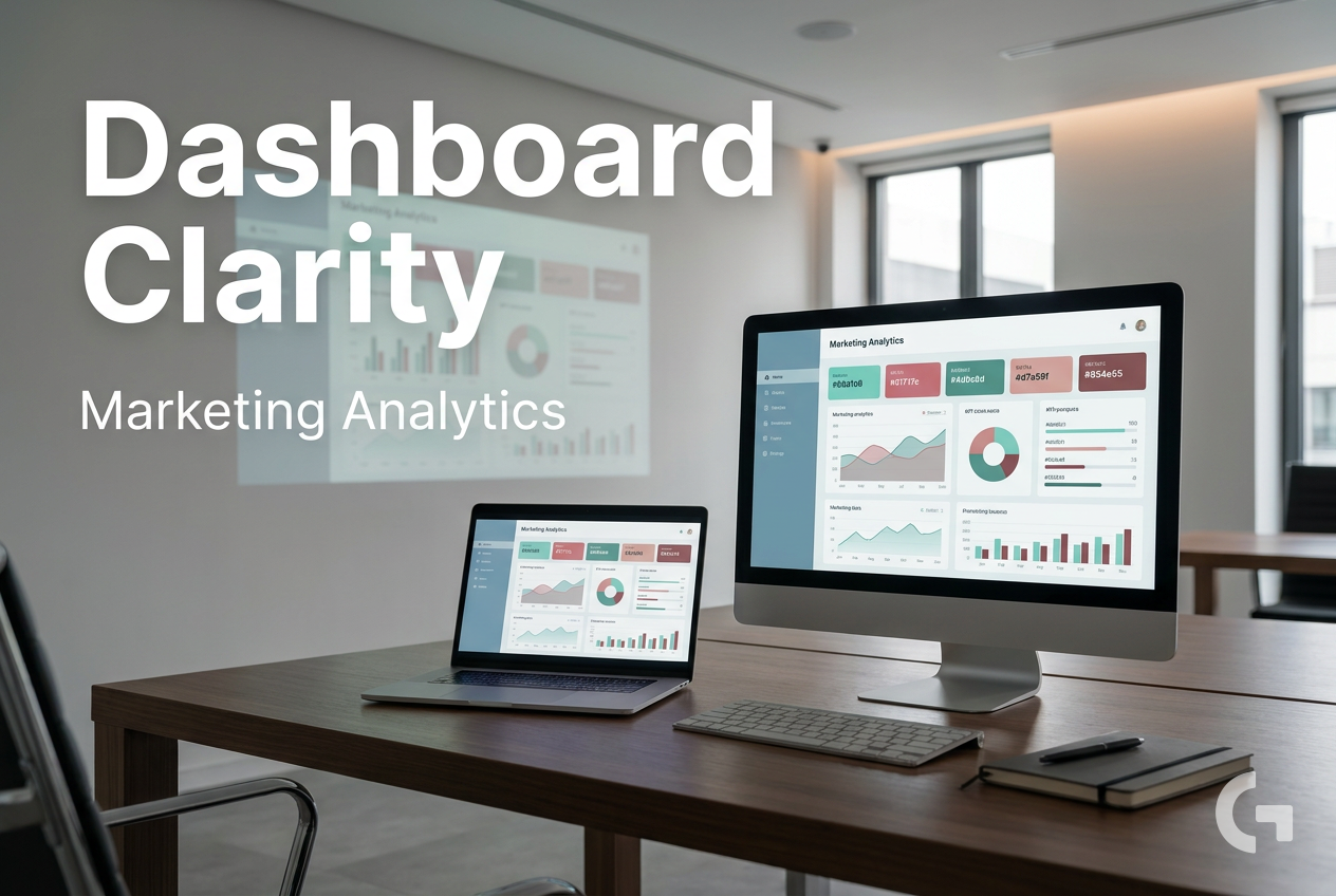
A marketing analytics dashboard should make reporting simpler, not harder. But for many teams, reporting still means jumping between GA4, ad platforms, email tools, CRM reports, and spreadsheets just to understand what is going on.
That creates a very common problem: data is scattered, metrics do not match across platforms, and the final report often takes too much manual work. Instead of getting a quick view of performance, marketers end up piecing together disconnected numbers from different tools. It becomes difficult to compare channels fairly or see the full picture of the customer journey.
Another reason this happens is dashboard overload. Many reports try to show everything at once: too many KPIs, too many charts, too many filters, and no clear priority. When that happens, the dashboard stops being a decision-making tool and turns into a screen full of data that nobody knows how to use.

Manual workflows make this worse. If data is exported and updated by hand, reports can become stale, inconsistent, or simply too time-consuming to maintain. This is why many teams move toward automated data collection and refresh workflows, especially when they are combining multiple marketing sources.
What a marketing analytics dashboard should actually do
A useful marketing analytics dashboard is not just a place to display numbers. Its job is to help marketers answer a small set of business questions quickly: what is happening, why it is happening, and what to do next.
A good dashboard shows the few numbers that support a decision, not every number you can collect.
That changes how the dashboard should be built. Instead of starting with available data, it helps to start with purpose:
- define what the dashboard is for
- decide who will use it
- choose the few metrics that support their decisions
- connect only the data sources needed for those metrics
In practice, that often means pulling together data from sources such as GA4, paid media platforms, email tools, social media, and CRM systems. From there, the main view should stay compact. A small set of KPIs, simple trend charts, and clear context like targets or variance usually makes the dashboard much easier to read.
A clean layout also matters. The most important numbers should appear first, with deeper detail moved into drill-down views or linked pages when needed. If there is an unusual spike, a drop in performance, a product launch, or a tracking issue, annotations can add useful context right where people need it.
This “less is more” approach is what makes dashboards easier to trust and easier to act on. The next step is knowing which building blocks deserve a place on the screen and which ones should stay out.
A Tool I Often Use to Pull Marketing Data Into Dashboards
A tool I’ve used many times for marketing dashboards is Supermetrics.It helps pull data from different marketing platforms into tools like Google Sheets, BigQuery, or Looker Studio so your reports can update automatically.
What to include in a marketing analytics dashboard
Once the purpose is clear, the next step is choosing the building blocks that belong on the dashboard. A useful marketing analytics dashboard usually combines a few core elements instead of trying to show every metric from every platform.
- data sources that matter for the business, such as GA4, ad platforms, email tools, CRM data, and other marketing systems
- key metrics and KPIs tied to one clear objective
- trend visualizations, often line charts or bar charts
- context such as targets, variance, or trend direction
- a clean layout with clear hierarchy
- annotations or notes for spikes, drops, launches, or tracking issues
- drill-down views or linked pages for deeper analysis
The exact mix depends on what the dashboard needs to answer. For some teams, the main view might focus on website performance and traffic sources. For others, campaign performance, conversion funnel data, email metrics, or social media metrics may be more useful.
The important point is that every metric should earn its place. If a number does not help someone make a decision, it probably does not belong on the main screen.
How to build a marketing analytics dashboard step by step
A practical dashboard workflow is usually much simpler than people expect. The hard part is not creating charts. The hard part is choosing what matters and leaving the rest out.
1. Define the dashboard’s purpose
Start with one question: what decision should this dashboard support?
That could be something like monitoring channel performance, reviewing campaign results, or tracking conversions across the funnel. When the purpose is specific, the dashboard becomes much easier to design.
2. Decide who will use it
A dashboard for a founder will not look the same as a dashboard for a performance marketer or analyst. Different audiences need different levels of detail. Some people want a top-level summary, while others need linked pages or drill-down views to investigate changes.
This is one of the easiest ways to reduce clutter. Instead of forcing one report to serve everyone, keep the main view focused and move deeper analysis into separate views.
3. Choose the few metrics that support decisions
This is where many dashboards go off track. It is tempting to include every available KPI just because the data exists. But the most useful dashboards stay compact.
Choose the few metrics that help the audience understand what is happening and whether action is needed. Several sources in the research recommend limiting the number of metrics on one screen and focusing on what actually supports decisions.
4. Connect only the data sources you need
Once the metrics are clear, connect the data sources required to calculate and display them. In many marketing setups, that may include GA4, ad platforms, email tools, social media, CRM systems, and other reporting sources.
This step matters because scattered data is one of the main reasons reporting becomes slow and inconsistent. Pulling the important sources into one reporting workflow helps reduce the need to check multiple disconnected reports.
5. Visualize the data clearly
Use simple charts and clear labels. Line charts are useful for trends over time. Bar charts are helpful for comparisons. A compact KPI section at the top can show the most important numbers first, while lower sections can provide supporting detail.
It also helps to show the metric, the target, and the trend together when possible. A number without context is harder to interpret.
6. Review and remove what nobody uses
Dashboards should not stay fixed forever. Review them regularly and remove metrics that do not lead to action. This keeps the dashboard useful and prevents it from slowly turning into a crowded archive of old ideas.
A smaller dashboard is often a more useful dashboard.
Practical workflow for simplifying reporting
If your current reporting process involves exports, spreadsheets, and manual updates, the biggest improvement often comes from simplifying the workflow before redesigning the visuals.
A practical sequence looks like this:
- list the reports and metrics people actually use
- group them by decision or audience
- identify which source systems are needed
- bring those sources into one reporting layer
- build one clean summary view
- move detailed analysis into separate pages if needed
- review the dashboard regularly and remove unused elements
This approach works because it reduces both data noise and maintenance work. Instead of rebuilding the same summary each week or month, teams can rely on a repeatable reporting structure.
Tools and workflows that help
Several common tools can support this kind of reporting workflow, depending on how simple or advanced the setup needs to be.
- Google Sheets can be useful for manual analysis, metric inventories, and simple reporting workflows.
- Looker Studio is commonly used for visual dashboards and shareable reporting.
- BigQuery is often used for storing and querying larger marketing datasets.
- GA4 is a core source for web and app behavior data.
- Make.com can help automate data movement between tools.
- Marketing data connectors can help bring data from ad platforms, CRM systems, and other sources into one reporting layer.

For some teams, a lightweight workflow is enough. Others move toward a warehouse-first setup, where data is collected from source platforms, cleaned or modeled, and then connected to a dashboard tool. The research draft notes that this kind of setup can reduce manual exports and help keep reporting more consistent.
Examples of a cleaner dashboard setup
A useful way to think about dashboard design is to separate the summary from the analysis.
Main dashboard view
The main page should stay focused on the few KPIs people need most often. This could include top-level website performance, channel results, campaign outcomes, or conversion indicators, depending on the goal of the dashboard.
The layout should make the most important numbers visible first. Supporting charts can show trends or comparisons, and annotations can explain unusual spikes, drops, launches, or tracking issues.
Linked detail views
If a team needs many metrics, it is usually better to split them into separate views rather than forcing everything into one page. This matches the research recommendation to keep the main view compact and move deeper analysis into linked dashboards or drill-down pages.
That way, the dashboard remains easy to scan, while still giving analysts and marketers access to more detail when they need it.
Common mistakes to avoid
Even with the right tools, a dashboard can still become difficult to use if the structure is not clear. A few common issues show up again and again:
- trying to serve every audience with one screen
- adding too many KPIs to the main view
- showing numbers without targets or trend context
- using manual export workflows that make reports stale
- keeping old charts and metrics that nobody acts on
Most of these problems can be fixed by going back to the original purpose of the dashboard and simplifying from there.
Additional resources
If you want to improve your reporting workflow further, it helps to keep learning from practical examples and tutorials. Additional resources are available for topics such as:
- building dashboards in Looker Studio
- organizing marketing metrics and KPI inventories
- connecting marketing data sources into one reporting workflow
- automating recurring marketing reports
- using Google Sheets, BigQuery, and GA4 in reporting setups
Final takeaway
A good marketing analytics dashboard is not the one with the most charts. It is the one that helps someone understand performance quickly and decide what to do next.
That usually means keeping the dashboard focused on one purpose, one audience, and a small set of useful KPIs. It also means using the right data sources, simple visualizations, clear context, and a workflow that reduces manual reporting work.
If your current dashboard feels crowded or hard to trust, start small. Define the decision it should support, keep the main view compact, connect only the data you need, and remove anything that does not lead to action. That approach makes reporting easier to maintain and much more useful for day-to-day marketing decisions.

Want to go deeper into building better dashboards?
- Clean dashboards in Looker Studio
- Add KPI scorecards in Looker Studio
- Connect BigQuery to Looker Studio
Tool I use for marketing dashboards
A tool I’ve used many times for marketing dashboards is Supermetrics.
It helps pull data from different marketing platforms into tools like Google Sheets, BigQuery, or Looker Studio so your reports can update automatically.
Tool I use for automation
For automation, one of my favorite tools is Make.com.
I use it to connect different tools and automate repetitive workflows — for example moving data between APIs, Google Sheets, and reporting systems.
