
Explain the concept of cloud data warehouses using BigQuery.

If you’ve been searching for a bigquery data warehouse tutorial, you’re probably dealing with a very familiar marketing problem: too much data in too many places. GA4 has one piece of the story, ad platforms have another, your CRM has another, and spreadsheets end up carrying the final reporting layer.
That setup works for a while, but it usually becomes slow, manual, and hard to trust. As data volume grows, spreadsheet-based reporting gets more error-prone. On top of that, different naming conventions, time zones, and attribution windows make it harder to keep numbers consistent across reports.

Why marketers look for a bigquery data warehouse tutorial
A lot of teams do not start with a warehouse because they think they need one. They start looking when reporting begins to break down.
Usually, the problem comes from four practical issues:
- data is spread across separate platforms
- manual reporting takes too much time
- reporting logic becomes inconsistent
- historical analysis is hard to maintain in a single file or dashboard layer
This is where a cloud data warehouse becomes useful. A data warehouse is a central place for analytical data from multiple sources, built for reporting, analysis, and long-term tracking. BigQuery fits this well because it is Google Cloud’s serverless cloud data warehouse, designed for fast SQL analytics on large datasets without managing servers.
For marketers and analysts, the value is simple: instead of building every report from separate exports, you bring your data into one place and create a cleaner reporting foundation.
Good reporting gets easier when raw data lives in one place and your dashboard pulls from a trusted model instead of manual exports.
The basic BigQuery workflow for marketing reporting
In a practical bigquery data warehouse tutorial, the core workflow is usually straightforward.
First, you ingest data from sources like GA4, ad platforms, CRM systems, or CSV exports into BigQuery. Then you clean and transform that raw data into tables that are easier to analyze with SQL. After that, you organize the tables so they stay easier to manage as they grow, often using partitioning and clustering.
From there, curated tables can feed dashboards in tools like Looker Studio or support analysis in other BI workflows. BigQuery works especially well as part of a wider stack that may include Google Sheets for light checks, marketing data connectors for pulling source data, and automation tools like Make.com to reduce manual exports.
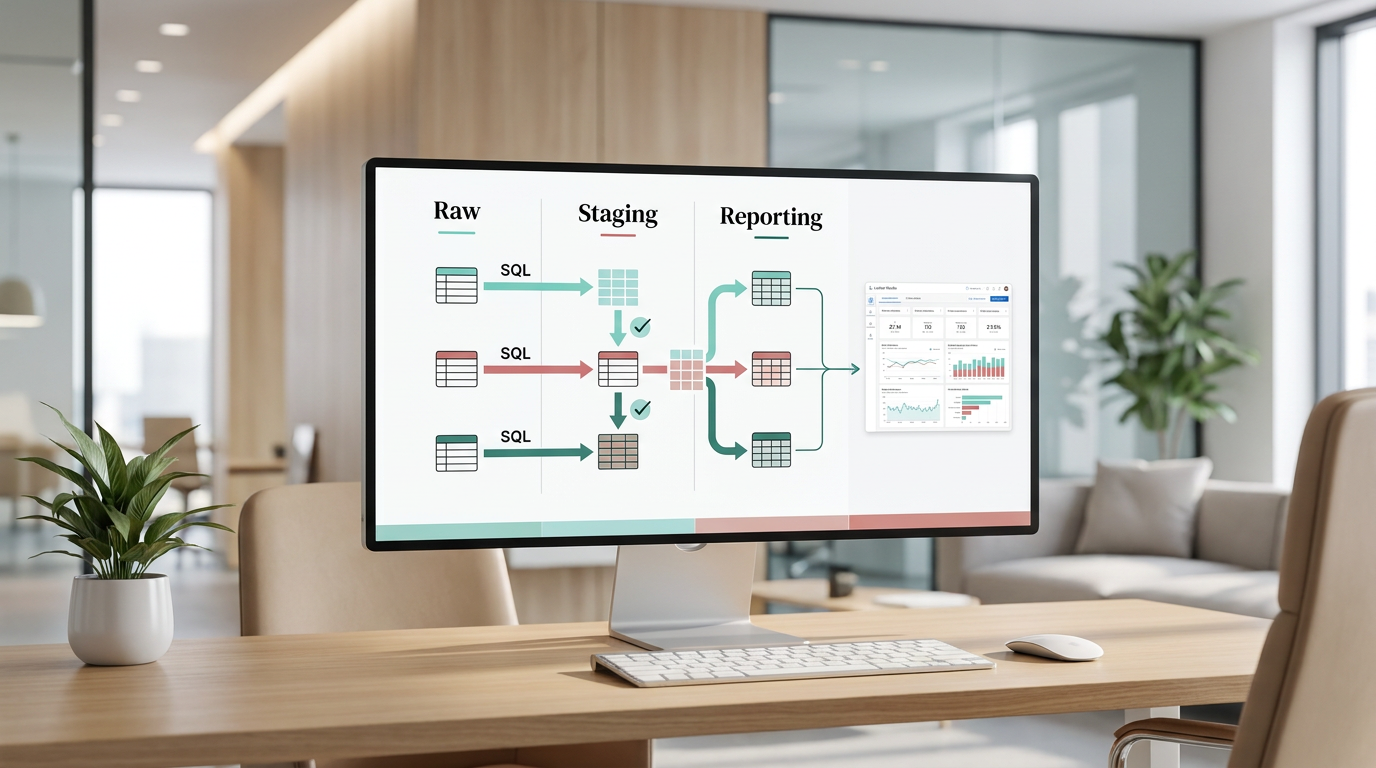
One of the most useful habits early on is separating raw, staging, and reporting tables. That structure makes it easier to validate totals, standardize fields like dates or campaign names, and keep the dashboard layer simple for non-technical teammates.
A Tool I Often Use to Send Marketing Data into BigQuery
## Windsor.ai
When I need to move marketing data from ad platforms into BigQuery or Looker Studio, I often use Windsor.ai.
It saves a lot of time because it can automatically pull data from platforms like Facebook Ads, Google Ads, TikTok Ads and send it straight into your reporting stack.
If you decide to try it, they also offer a 10% discount with the promo code gaillereports.
How to use this bigquery data warehouse tutorial in a real marketing workflow
The easiest way to make a warehouse useful is to keep the process simple and repeatable.
A practical setup usually starts by bringing data from your main sources into BigQuery. For a marketing team, that often means data from GA4, ad platforms, CRM systems, and CSV exports. The goal is not to make everything perfect on day one. The goal is to get the raw data into one central place so you can stop rebuilding reports from separate files every time you need an update.
Once the raw data is loaded, the next step is to clean and transform it with SQL. This is where you standardize the fields that usually create reporting problems, such as dates, campaign names, channel naming, and conversion fields. Instead of fixing those issues separately in each dashboard, you fix them once in the warehouse and reuse that logic across reports.
After that, you create reporting-ready tables that are easier for dashboards and non-technical users to work with. This is the layer that should stay as clean and simple as possible. If someone opens Looker Studio or another BI tool, they should be able to use trusted fields without digging through raw source tables.
From there, dashboards can connect to curated BigQuery tables, and refreshes can be automated through ETL or ELT-style workflows so reporting does not depend on manual copy-paste work.
A simple table structure that works well
For many teams, one of the most useful habits is separating tables into three layers:
- Raw tables for source data as it arrives
- Staging tables for cleaned and standardized data
- Reporting tables for dashboard-ready outputs
This structure helps in a few very practical ways. Raw tables give you something to validate against when numbers look off. Staging tables let you clean up inconsistent fields without changing the original data. Reporting tables make it easier to keep dashboards simple and consistent.
If you are used to spreadsheet reporting, this setup often feels like moving from many separate tabs with custom formulas into one organized system with clear layers.
Step-by-step workflow marketers can apply
A useful bigquery data warehouse tutorial should make the workflow feel manageable, not overly technical. In practice, the process often looks like this:
1. Collect the source data
Start with the platforms that matter most for reporting. Research from the draft points to common sources like GA4, ad platforms, CRM systems, and spreadsheet or CSV data. If your reporting is spread across these places, bringing them into BigQuery creates the base for a more reliable workflow.
2. Keep the raw layer untouched
When data arrives, keep a raw version separate from your cleaned models. This makes validation much easier later. If totals do not match what you expect in a dashboard, you can compare the reporting table back to the original raw data instead of guessing where the issue started.
3. Clean the fields that usually break reporting
Use SQL in the staging layer to standardize the fields that tend to create confusion across channels. The research draft specifically highlights dates, channel names, campaign names, and conversion fields. Cleaning these fields early helps keep reporting logic more stable later on.
4. Validate totals against the source platform
Before a table becomes the source for a dashboard, check the totals against the original platform. This is one of the most practical quality checks in any warehouse workflow. It helps catch logic issues before they spread into reports used by the wider team.
5. Build a simple reporting layer
The reporting layer should be designed for reuse. Instead of every dashboard calculating its own business logic, create curated tables that already reflect the definitions your team wants to use. This makes it easier for marketers and stakeholders to trust what they are seeing.
6. Connect dashboards and automate refreshes
Once the reporting layer is ready, connect it to Looker Studio or similar BI tools. Then automate the refresh process through ETL or ELT-style workflows so updates happen regularly without manual exports. This is where the time savings become much more visible.
The simpler your reporting layer is, the easier it is for everyone else to trust the numbers.
Tools that support the workflow
BigQuery is usually strongest when it sits inside a wider reporting stack rather than working alone.
- GA4 helps provide website and app event data for central reporting.
- Google Sheets can still be useful for light analysis, QA checks, or small working tables before data is pushed into a warehouse.
- Looker Studio works as a dashboard layer on top of curated BigQuery tables.
- Looker and LookML can support more governed semantic modeling and reusable metrics.
- Make.com can help with simple automation workflows that move data between apps.
- Marketing data connectors can help pull data from ad platforms and other sources into BigQuery or a staging layer.
In practice, these tools play different roles. Connectors and automation tools reduce manual collection work. BigQuery stores and organizes the data. Dashboard tools make the final output easier for the rest of the team to use.
How this helps automate marketing reporting
Many reporting problems are not really dashboard problems. They start earlier, when teams rely on repeated exports, spreadsheet copying, and report-specific logic.
With BigQuery as the central warehouse, the reporting process becomes easier to automate because the data pipeline is more structured. Instead of exporting from each platform every reporting cycle, you bring the source data into BigQuery, transform it into reporting-ready tables, and let dashboards read from that curated layer.
This approach also makes long-term analysis easier to maintain. Historical data from multiple sources can live in one analytical system built for reporting and trend analysis, instead of being scattered across separate files.
That does not mean spreadsheets disappear. Google Sheets can still be useful for quick checks or small working tables. The difference is that Sheets no longer has to act as the main reporting database.
BigQuery data warehouse tutorial tips for keeping things manageable
If you want the setup to stay useful over time, a few habits matter more than complexity.
- Keep raw, staging, and reporting tables clearly separated.
- Standardize important fields with SQL before they reach the dashboard layer.
- Validate totals before sharing reports widely.
- Use partitioning when tables become large so queries are easier to manage.
- Keep the reporting layer simple for non-technical teammates.
- Document metric definitions, especially for conversions, revenue, and attribution.
These habits are not flashy, but they solve many of the daily issues that make reporting slow or inconsistent.
Additional resources and tutorials
If you are building out your reporting stack, it helps to keep learning from practical examples and repeatable workflows. Additional tutorials or resources can be useful for topics such as:
- connecting marketing data sources into a warehouse
- organizing raw, staging, and reporting tables
- building Looker Studio dashboards from curated data
- using SQL to standardize campaign and conversion fields
- automating recurring reporting workflows
Final takeaway
A good bigquery data warehouse tutorial is not really about complexity. It is about building a reporting system that is easier to trust and easier to maintain.
When marketing data lives across GA4, ad platforms, CRM systems, and spreadsheets, BigQuery gives you a central place to bring that data together for analysis. By separating raw, staging, and reporting tables, validating your numbers, and keeping the dashboard layer simple, you create a much stronger foundation for reporting.
If your current workflow depends too much on manual exports and spreadsheet fixes, this is a practical next step. Start with a small, clean structure, standardize the fields that cause the most reporting issues, and build reports from a trusted model instead of from scattered files.
