Explain how pivot tables help summarize large datasets.

If you’ve been looking for a google sheets pivot tables tutorial, chances are you’re dealing with the same reporting problem many marketers face: too many rows, not enough clarity. A raw export from ads platforms, GA4, a CRM, or a spreadsheet can quickly become hard to use when you need fast answers about campaign spend, conversions, revenue, or results by month.
This usually happens because marketing data is stored at a very detailed level. You might have one row per click, lead, order, campaign, or date. That level of detail is useful, but it makes analysis slow when you’re trying to spot trends or build a dashboard view. It gets even harder when data has been copied manually, appended from multiple sources, or updated over time without a consistent structure.
A pivot table helps solve that problem by turning raw rows into a summary table. Instead of scanning everything manually, you choose which fields should appear in rows, columns, values, and filters. Google Sheets then reorganizes the data into a more compact view without changing the original table.
Google Sheets Pivot Tables Tutorial: What It Helps You Do
In practical marketing workflows, this is useful when you want to answer simple but important questions quickly: Which channel drove the most conversions? Which campaign spent the most? How did results change by month?
Good reporting starts with a clean table and a simple summary.
That’s why the first step is not building the pivot table itself. It’s preparing the source data properly.
Start with one consistent table and make sure the first row contains clear headers. Remove blank rows and blank columns inside the dataset. If the source data is messy, the pivot table will be harder to work with and the summary will be less reliable.

Once the source is clean, begin with a simple setup. Add one dimension to Rows such as campaign, channel, or region. Then add one numeric metric to Values, like spend, clicks, revenue, or conversions. In many cases, Google Sheets will use a default summary such as sum for numeric fields.
This simple structure is often enough to turn a large export into something readable. From there, you can start narrowing the view with filters, especially when you only want to look at one date range, one country, or one channel.
A Tool I Often Use to Pull Data into Google Sheets
A tool I’ve used many times for marketing dashboards is Supermetrics.
It helps pull data from different marketing platforms into tools like Google Sheets, BigQuery, or Looker Studio so your reports can update automatically.
Google Sheets Pivot Tables Tutorial: Build the Summary Step by Step
Once you have the basic setup in place, the next step is to make the summary more useful for actual reporting. A good google sheets pivot tables tutorial should not stop at adding one row and one value. The real benefit comes from adjusting the view so you can answer reporting questions faster.
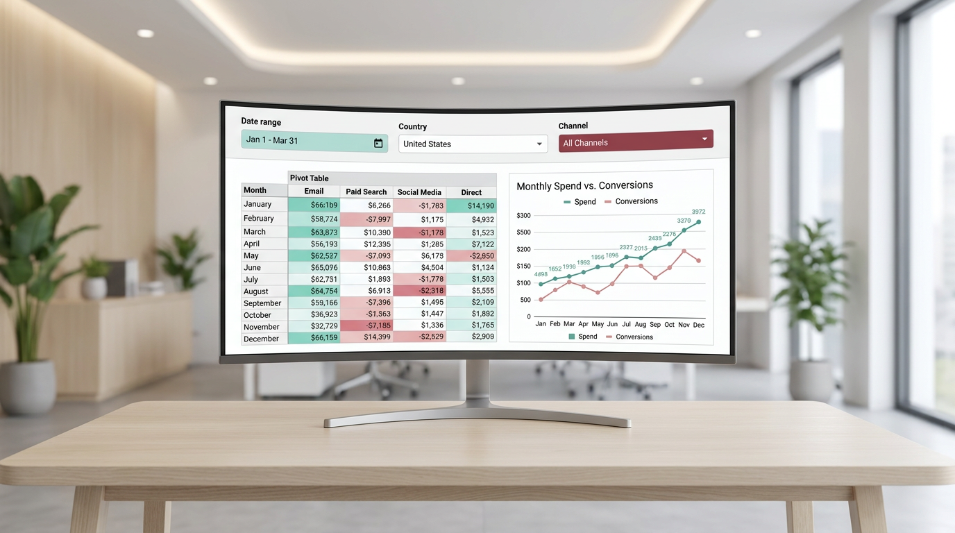
A simple example is a marketing export with columns such as date, channel, campaign, country, spend, clicks, conversions, and revenue. Instead of reviewing the raw table row by row, you can reshape it into a summary that matches the question you need to answer.
Start with rows and values
Begin with one field in Rows. For marketing reporting, that could be channel, campaign, region, or country. Then add one numeric field in Values, such as spend or conversions.
This gives you a clean first summary. For example, if you place channel in Rows and conversions in Values, you get a quick view of which channels generated the most conversions.
Keeping the setup simple at the start makes it easier to check that the numbers look right before adding more fields.
Add columns when you need comparison
Columns are useful when you want to compare one category across another. If Rows contains channel, adding month or country to Columns can make the summary more useful for trend analysis or cross-segment comparison.
This is often where a raw export starts to become a reporting table. Instead of one long list of records, you now have a compact grid that is easier to scan and discuss with a team.
Use filters to narrow the view
Filters help when you only want to analyze part of the dataset. This is especially useful in marketing workflows where one spreadsheet may include multiple countries, channels, or time periods.
You might use filters to show:
- one date range
- one channel
- one country
- one campaign group
That way, the same source table can support different questions without changing the raw data.
Use Date Grouping for Monthly Reporting
Dates are one of the most useful fields in a pivot table, but they are also one of the most common places where reports stay too detailed. If your source data includes daily records, grouping dates into months or years makes trend reporting much easier.
For marketers, this matters because many reporting questions are time-based. You usually do not need to look at every individual date when the goal is to understand monthly performance.
Grouping dates can help you summarize results such as:
- spend by month
- conversions by month
- revenue by year
- channel performance over time
This turns a detailed export into something much closer to a dashboard-ready summary.
A pivot table works best when the summary matches the question.
Change the Calculation When Sum Is Not the Right Answer
One common mistake is assuming every metric should be totaled. In many cases, Google Sheets uses sum as the default calculation for numeric fields, but that is not always the right choice.
Depending on the field, you may need a different calculation type such as:
- sum for spend, revenue, clicks, or conversions
- count when you want to know how many records appear in a category
- average when you want a mean value instead of a total
This is an important part of a practical google sheets pivot tables tutorial because the structure of the pivot table can look correct while the summary logic is still wrong. If the calculation type does not match the metric, the report can become misleading very quickly.
Common Pivot Table Workflow for Marketing Data
In daily reporting work, the process is usually less about one perfect pivot table and more about building a quick summary that answers one business question at a time.
A practical workflow often looks like this:
- clean the source table so headers, rows, and columns are consistent
- insert the pivot table on a new sheet
- add one dimension to Rows
- add one metric to Values
- check whether the default calculation makes sense
- apply filters to narrow the data
- group dates into months or years when reporting trends
- rename the pivot output clearly so it is easy to find later
This approach works well because it stays readable. For most marketers and analysts, the goal is not to create a complex spreadsheet structure. The goal is to turn a large export into a summary that can support a decision, a dashboard, or a regular report.
Why putting the pivot table on a new sheet helps
Keeping the pivot output on a separate sheet makes the file easier to work with. The raw data stays untouched, and the summary view is easier to read and share internally.
It also reduces confusion when the source table gets updated later. You can keep the detailed export in one place and the reporting view in another.
When Pivot Tables Fit Into a Bigger Reporting Workflow
Google Sheets is the main tool here, since pivot tables are built directly into it. But in many marketing analytics workflows, the pivot table is only one step in a larger process.
For example, teams often start with source data from tools such as GA4 or spreadsheets, then summarize that data in Google Sheets, and later use the summarized output for reporting in Looker Studio. When the dataset becomes too large or needs more robust querying before summarization, BigQuery may be part of the workflow instead.
Some teams also use automation tools or marketing data connectors to collect and refresh data before it is reviewed in Sheets. That does not replace pivot tables, but it helps make reporting more consistent when the same summaries need to be updated regularly.
In other words, pivot tables are often the fastest analysis layer between raw exports and dashboard reporting.
What to Check When the Pivot Table Stops Being Useful
Even a well-built summary can become unreliable if the source data changes. This is a common issue in real reporting workflows, especially when data is copied manually or new rows are added over time.
If the pivot table no longer looks right, check these points first:
- the source range still includes the newest rows
- the headers are still clear and consistent
- there are no blank rows or blank columns inside the dataset
- the data types are still consistent
- the date field is grouped in a way that matches the report
These are small checks, but they usually explain why a pivot summary starts to feel off.
Additional Tutorials and Resources
If you want to keep improving your reporting workflow, it helps to go beyond the pivot table itself and build a more structured process for collecting, cleaning, and summarizing marketing data.
- tutorials on organizing raw marketing exports before analysis
- resources for building cleaner reporting workflows in Google Sheets
- guides for moving from spreadsheet summaries to Looker Studio dashboards
- practical examples of working with GA4, BigQuery, and automated data collection workflows
Conclusion
A pivot table is one of the simplest ways to make large marketing datasets easier to understand. With a clean source table, one clear row field, one useful value field, the right filters, and proper date grouping, you can turn a raw export into a summary that is actually usable.
That is why a solid google sheets pivot tables tutorial matters. It helps you move from scrolling through thousands of rows to building a report that answers real questions by campaign, channel, date, or region.
If your current workflow still depends on manual scanning or repetitive formulas, start with a simple pivot table and build from there. In many cases, that one change is enough to make your reporting faster, cleaner, and much easier to use in everyday analytics work.