
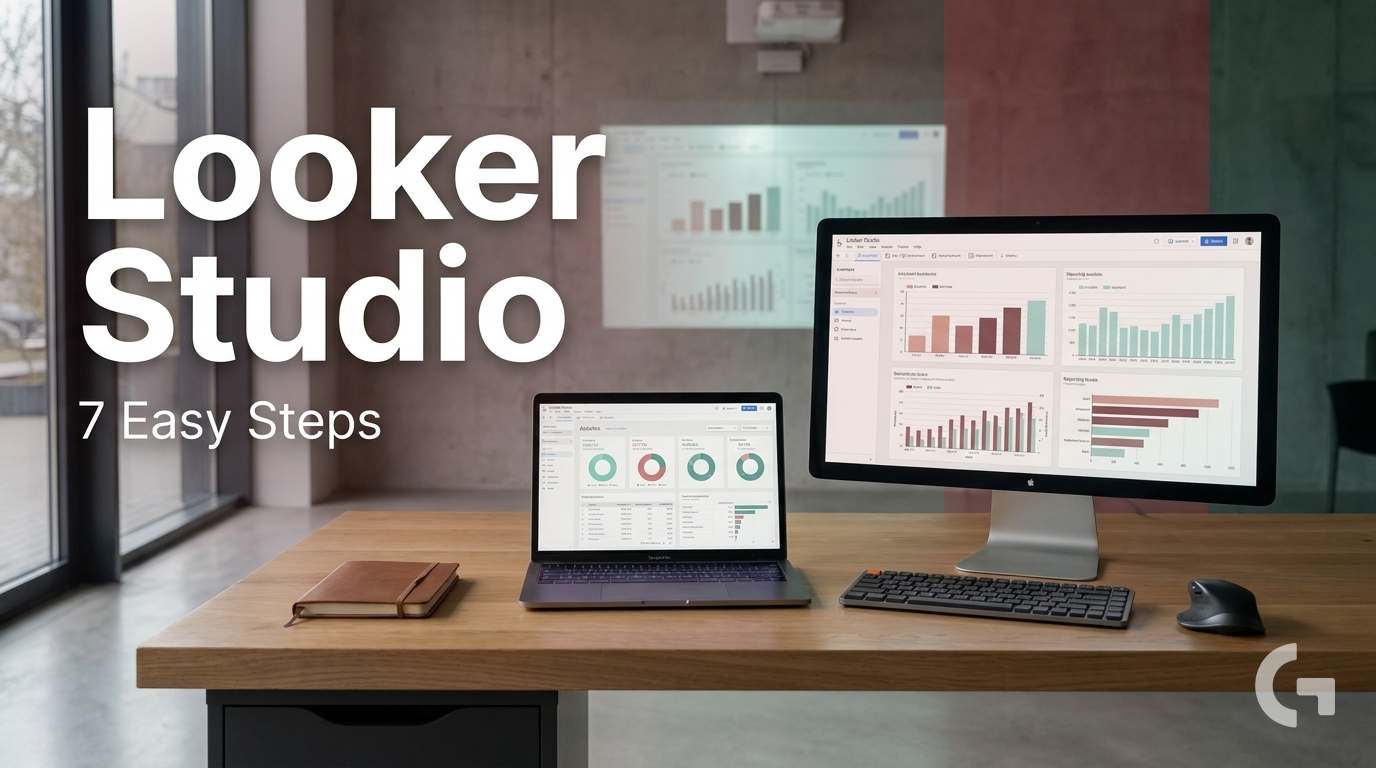
Explain the basics of Looker Studio and how marketers can start using it for reporting.
If you’re searching for looker studio for beginners, you’re probably dealing with the same reporting problem many marketing teams face: too much data spread across too many tools. One week you’re pulling numbers from GA4, Google Ads, a CRM, and Google Sheets, and the next you’re copying everything into a spreadsheet or slide deck again.
This gets messy fast. The issue is not only that there is a lot of data. It is that the data lives in different systems and is rarely organized around one clear reporting goal. GA4 shows website behavior, ad platforms show campaign performance, CRM tools track leads, and Sheets often holds manual inputs or calculations. When all of that is disconnected, reporting becomes slow, repetitive, and hard to trust.

That’s where Looker Studio becomes useful. Looker Studio is Google’s reporting and dashboarding tool. It helps you connect data sources and turn raw data into charts, tables, scorecards, and dashboards that are easier to read and share.
Looker Studio for Beginners: Start With the Reporting Question
A common beginner mistake is opening the tool first and trying to build a dashboard right away. That usually leads to cluttered reports, confusing charts, and too many filters.
A dashboard works best when it answers one question clearly, not when it shows everything at once.
A better approach is to start with one practical question, such as:
- How is website traffic changing?
- Which channels bring the most conversions?
- What happened to leads this month?
- Which campaign generated the best engagement?
Once you know the question, the report becomes much easier to structure.
What a Simple Beginner Setup Usually Includes
For most marketers, a simple Looker Studio setup starts with one primary data source. GA4 is often a practical first choice because it covers traffic and user behavior. From there, you can add other sources only when they are actually needed.
It also helps to define your main KPIs before designing anything. That might include:
- users
- sessions
- conversions
- revenue
- cost
- CTR
- leads
Then build the report from overview to detail. A clean flow often looks like this:
- top-level scorecards
- trend charts
- channel or campaign breakdowns
- detailed tables
This makes the dashboard easier for teammates, clients, or founders to understand. Filters can help too, but for beginners, a few clear ones like date range, channel, or campaign are usually enough.
A Tool I Often Use for Looker Studio Dashboards
## Windsor.ai Looker Studio Connectors
If you're building dashboards in Looker Studio and need data from ad platforms, this is something I personally use quite often.
Windsor.ai connectors for Looker Studio let you pull marketing data directly into your reports so everything updates automatically.
If you decide to try it, they also offer a 10% discount with the promo code gaillereports.
How to Use Looker Studio for Beginners Without Overcomplicating It
Once the basic structure is clear, the next step is to turn that plan into a report people can actually use.
A practical way to do that is to keep the workflow simple:
- collect data in GA4, ad platforms, or Google Sheets
- connect it to Looker Studio
- build a dashboard with a few key views
- share it with stakeholders
- improve the report over time
This approach works well because it avoids a common beginner problem: trying to solve everything at once. You do not need a complex setup to build a useful report. In many cases, one clear data source and a few well-chosen views are enough to create something valuable for a team or client.
Step 1: Start with the data source you trust most
If your main question is about website traffic or user behavior, GA4 is often the most practical place to begin. If your reporting depends on manual inputs, budgets, or small datasets, Google Sheets can also play a useful role.
The key idea is to begin with the source that best matches the question you want to answer. This keeps the report easier to check and easier to explain.
For example:
- use GA4 for traffic and website performance questions
- use Google Sheets for manual lists, calculations, or small supporting datasets
- use other connected sources only when they are truly needed
Step 2: Choose metrics and dimensions carefully
Beginners often add too many fields too early. A better approach is to separate what you want to measure from how you want to break it down.
In simple terms:
- metrics are the numbers you want to track, such as users, sessions, conversions, revenue, cost, CTR, or leads
- dimensions are the categories that help explain those numbers, such as channel, campaign, country, or device category
That distinction helps you build clearer charts and tables. Instead of showing every field available, choose only the ones that support the reporting question.
Step 3: Build the report from summary to detail
A clean dashboard usually works best when it moves from high-level performance to more specific breakdowns.
A simple structure often looks like this:
- scorecards for top KPIs
- trend charts to show change over time
- breakdowns by channel or campaign
- detailed tables for closer analysis
This layout helps viewers understand the story faster. A founder may only need the top numbers and trend. A marketing analyst may want to keep scrolling into the detail table. A good report supports both without feeling crowded.
A useful first report is better than a polished one that nobody understands.
Practical Reporting Workflows for Marketers
Looker Studio often becomes more useful when it is part of a simple reporting workflow rather than treated as a standalone dashboard tool.
For many marketing teams, the process looks like this:
- collect performance data from GA4, ad platforms, CRM tools, or Google Sheets
- organize the reporting around one goal
- connect the necessary sources to Looker Studio
- create a small set of charts and tables
- share the report and review what stakeholders actually use
This matters because reporting is not only about visualizing data. It is also about reducing repetitive work and making performance easier to explain.
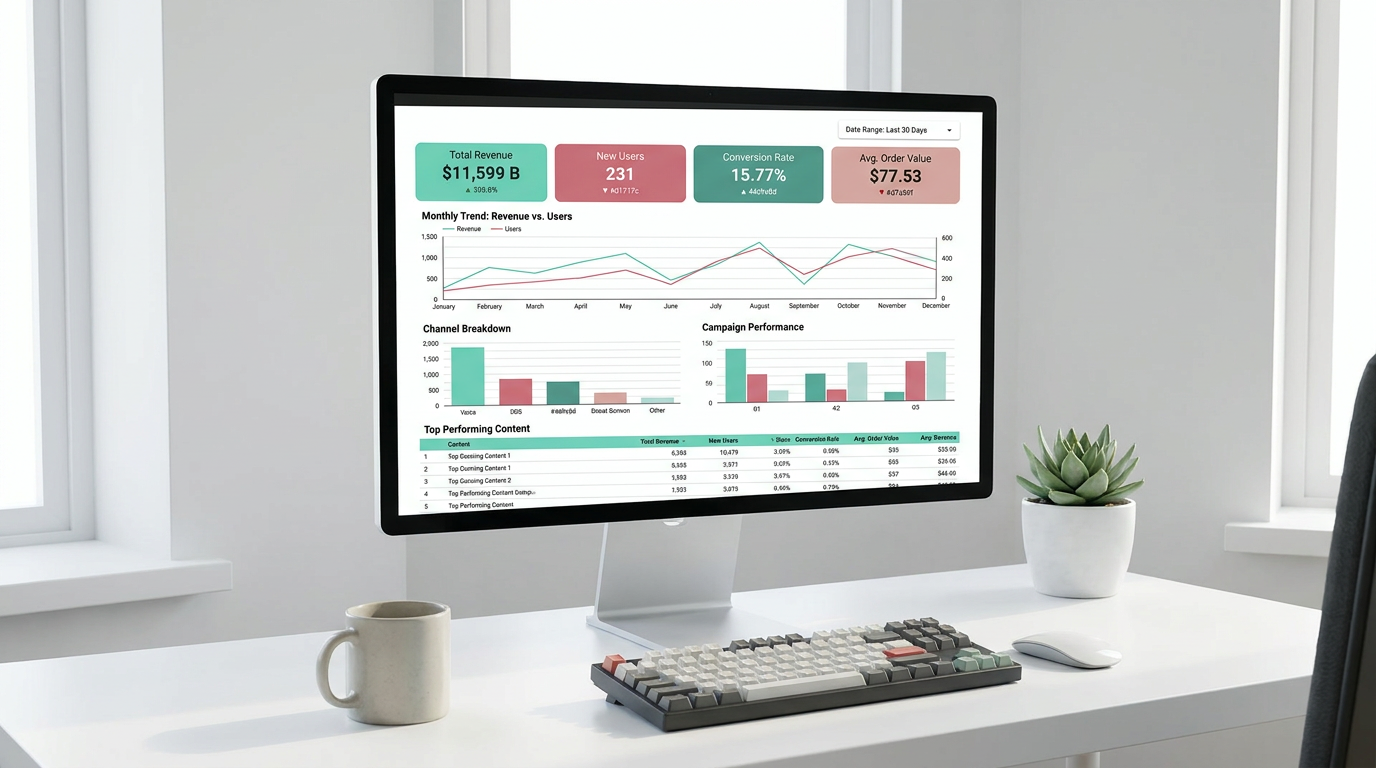
Example: a simple website performance dashboard
Let’s say the reporting goal is to understand how website traffic is changing.
A beginner-friendly setup could include:
- scorecards for users, sessions, and conversions
- a trend chart showing change over time
- a channel breakdown table
- a date range control
That is enough to answer a clear question without turning the report into a full marketing command center.
Example: a lead reporting view
If the goal is to understand what happened to leads this month, the report should stay centered on lead-related KPIs rather than adding unrelated traffic views.
That might mean focusing on:
- leads
- time trends
- channel or campaign breakdowns
- supporting data from CRM tools or Google Sheets when needed
This is a good reminder that dashboards should follow the business question, not the other way around.
Tools That Support a Beginner Looker Studio Setup
Looker Studio can be useful on its own, but it often works best as part of a simple analytics stack.
Based on the workflow in this article, the tools that commonly support it are:
- GA4 — for website and app behavior data
- Google Sheets — for manual inputs, calculations, and small datasets
- BigQuery — for larger or more structured data workflows
- marketing data connectors — to pull data from ad platforms and other systems
- Make.com — for basic automations, such as moving data between tools
- Looker / LookML — for more advanced analytics setups, usually beyond beginner reporting
Not every team needs all of these. For many marketers, GA4, Google Sheets, and Looker Studio are enough to build the first useful dashboard. More advanced tools become relevant when the reporting process grows or the data becomes harder to manage.
Where automation starts to help
Manual reporting usually becomes a problem when the same steps are repeated every week or month. That is where a more organized workflow helps.
For example, if data is already being collected in source systems and moved into a place where Looker Studio can read it, the dashboard becomes easier to maintain. Instead of rebuilding reports each time, the team can spend more time reviewing results and less time copying numbers.
You do not need to automate everything at once. Even a basic reporting flow can reduce repetition if the data sources are connected clearly and the dashboard is built around a stable structure.
Common Beginner Mistakes to Avoid
Most reporting issues do not come from the dashboard tool itself. They come from unclear planning or too much complexity too early.
Some of the most common beginner mistakes are:
- building the dashboard before defining the question
- tracking too many metrics at once
- choosing charts before understanding the data structure
- using too many overlapping filters
- connecting the wrong fields
- sharing a report before checking whether the numbers make sense
A simple review before sharing can prevent a lot of confusion. Check that:
- the correct data source is connected
- metrics match the source system
- date ranges are set correctly
- the report is readable in view mode
That last point matters more than many beginners expect. A report can look fine while editing but still feel confusing to the person who needs to use it.
Useful Habits for Looker Studio for Beginners
If you want your reports to stay clear as they grow, a few habits help a lot:
- keep one report focused on one goal
- use simple titles for charts and scorecards
- start with a clean layout and add detail later
- avoid too many colors and visual styles
- add notes or labels when a metric needs explanation
- test the report from the viewer’s perspective
These habits may seem basic, but they often make the difference between a dashboard that gets opened once and a dashboard that becomes part of a real reporting workflow.
Additional Resources and Next Steps
If you want to keep improving your reporting process, it helps to learn step by step instead of trying to master everything at once.
Additional tutorials or resources can be useful for topics like:
- connecting marketing data sources
- organizing KPIs for dashboards
- simplifying marketing reporting workflows
- using Google Sheets in reporting setups
- building clearer dashboards for stakeholders
Conclusion
For most marketers, looker studio for beginners is not really about learning every chart or control. It is about building a reporting workflow that is easier to manage, easier to share, and easier to trust.
The best place to start is small: choose one reporting question, connect the right data source, define a few important KPIs, and build from overview to detail. Once that structure works, you can improve it over time instead of rebuilding the report again and again.
If your current reporting still depends on copying numbers across tools, this is a practical next step. A simple, clear dashboard can already save time and make your marketing analysis much easier to explain.

Leave a Reply