
How to build a marketing dashboard in Google Sheets.

If you’re still building reports by copying weekly exports into spreadsheets, a google sheets dashboard can save you a lot of time. Instead of checking GA4, ad platforms, and store data in separate files, you can bring key marketing metrics into one view inside Google Sheets.
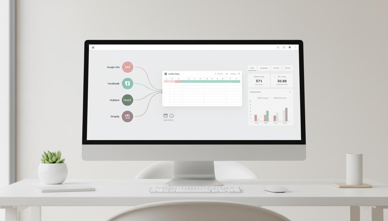
This problem is common because marketing data usually lives in too many places at once. You might have traffic data in GA4, spend in Google Ads and Facebook Ads, leads in HubSpot, and sales in Shopify. When that data is handled through downloaded CSVs, reporting quickly turns into a mess: duplicated files, broken formulas, outdated numbers, and too much time spent preparing updates instead of analyzing them.
For many teams, the issue is not just the volume of data. It’s also the workflow. Platforms do not always sync automatically, and more advanced reporting tools can feel too complex if you just want a practical dashboard that works. That’s why so many marketers stay stuck in manual reporting longer than they want to.

Why a google sheets dashboard works for marketing reporting
A google sheets dashboard gives you a simple way to organize marketing data without leaving a tool your team already knows. In practice, it usually means one dashboard tab that shows your most important metrics through charts, tables, and filters, while separate raw data tabs store the source data from tools like GA4, Facebook Ads, or Shopify.
Good reporting starts when raw data stays separate from the dashboard people actually use.
That setup matters because it makes weekly reviews much easier. Instead of building a new report every time, you create a structure once and update the data automatically or on a schedule. Sheets also gives you native tools to work with that data, including charts, slicers, and formulas like SUM, SUMIF, and QUERY.
A practical starting point is to separate your spreadsheet into clear tabs. Keep raw imports in tabs like _GA4_Data, _FacebookAds_Data, or _Shopify_Data, then use another working tab for calculations or pivot tables. After that, your dashboard tab can pull in the final numbers you actually want to track, such as sessions, spend, and conversions.
This approach is especially useful when you need to compare channels in one place and give stakeholders an interactive view they can filter by date, campaign, or channel. Once that foundation is in place, the next step is choosing how your data gets into Sheets and how to turn those tables into a dashboard people will actually use.
A Tool I Often Use to Pull Marketing Data into Sheets
A tool I’ve used many times for marketing dashboards is Supermetrics.
It helps pull data from different marketing platforms into tools like Google Sheets, BigQuery, or Looker Studio so your reports can update automatically.
How to get data into your google sheets dashboard
Once your tabs are structured, the next decision is how the data will arrive in Sheets. This is the part that turns a spreadsheet from a one-off report into a repeatable reporting system.
A simple setup is to use separate raw data tabs for each source and send data into those tabs on a schedule. Based on the research draft, marketers often use connectors such as Supermetrics, Coupler.io, Coefficient, or Make.com to pull data from sources like GA4, ad platforms, and CRMs into Google Sheets.[1][2]
If your reporting is still manual today, even moving to a daily or hourly refresh can make a big difference. Instead of exporting CSV files every week, you keep the same spreadsheet structure and let the source tabs update in place.
- Create one raw tab per source, such as
_GA4_Data,_FacebookAds_Data, and_Shopify_Data - Connect each source to the correct tab
- Set a refresh schedule that matches how often the data changes
- Leave the raw tabs untouched and do calculations elsewhere
That last point matters more than it seems. If someone edits imported data directly, formulas and charts can become unreliable very quickly. A cleaner workflow is to treat raw tabs as inputs only, then use a separate working tab for transformations, summaries, or pivot tables.
A practical workflow for automated reporting
For example, if you want to review paid performance every morning, you could pull GA4 traffic data into one tab and ad spend data into another, then summarize both in a working tab. From there, your dashboard tab can show sessions, spend, and conversions side by side.
This makes it much easier to compare channels in one place instead of switching between platforms.
How to build a google sheets dashboard that people actually use
The dashboard tab should be simple. In most cases, it helps to make it the first tab in the spreadsheet so stakeholders land on the summary view immediately.[11]
A practical starting point is a small table with your core metrics. The research draft recommends focusing on metrics like sessions, spend, conversions, traffic by channel, CAC, and ROAS rather than trying to show everything at once.[1]
For most marketing teams, 5 to 7 metrics is enough for a useful first version.
Step 1: Add your key metrics
Use formulas like SUM, SUMIF, or QUERY to pull totals or grouped values from your raw and working tabs.[15] This gives you a stable metrics block that can power the rest of the dashboard.
You might include:
- Sessions from GA4
- Spend from ad platforms
- Conversions
- Revenue by campaign
- Channel-level summaries
The goal is not to create the biggest dashboard possible. The goal is to make weekly reviews fast and clear.
Step 2: Turn the data into charts
After your summary table is ready, highlight the data range and use Insert > Chart in Google Sheets.[3] The draft specifically points to line charts for trends such as daily sessions, and bar charts for comparisons such as spend by channel.[3]
A simple structure could look like this:
- A line chart for traffic trend over time
- A bar chart for spend by platform
- A small table for conversions or revenue by campaign
This is usually enough to answer the most common stakeholder questions quickly.
Step 3: Add filters people can actually use
Static reports are one of the main reasons spreadsheet reporting becomes frustrating.[13] If someone wants to see a specific date range or campaign, they should not need a new version of the file.
Google Sheets slicers help solve that. According to the draft, you can add slicers through Data > Add a slicer and use fields like date, campaign, or channel.[1][13] This allows users to filter the dashboard without breaking formulas or editing the raw data.
A useful dashboard answers questions without creating more reporting work.
If you are building for executives or non-technical teammates, keep the view easy to scan. The draft recommends using big fonts, a limited color palette, and slicers for mobile-friendly views.[2]
Useful tools and workflows for scaling your google sheets dashboard
Google Sheets works well as a practical reporting layer, especially when your team already uses spreadsheets every day. As reporting grows, a few supporting tools can make the workflow more reliable.
- Supermetrics or Coupler.io: used to pull GA4, Google Ads, and Facebook data directly into tabs.[1][2][14]
- Make.com or Zapier: used for scheduled sync workflows.[1]
- Windsor.ai: offers free templates for multi-platform marketing views.[6]
Templates can also speed up setup. The research draft mentions templates from HubSpot, Smartsheet, Growth Business Templates, and Coupler.io as useful starting points for marketing reporting layouts.[2][4][5][10]
If your reporting needs become more complex over time, the draft also notes that teams may move data into BigQuery and query it into Sheets, or switch to Looker Studio for more polished sharing.[2] That does not mean you need to start there. For many teams, Sheets is the easiest place to build the first version that actually gets used.
Practical tips to keep the dashboard clean and reliable
Even a simple dashboard can become hard to maintain if the structure is loose. A few small rules make a big difference.
- Keep raw data tabs untouched and only reference them in formulas.[1]
- Use a working tab for cleanup, calculations, and pivot tables.[1][5]
- Focus on 5 to 7 important metrics instead of adding every available KPI.[1]
- Match your refresh schedule to the source: daily for ads, weekly for CRM if needed.[1]
- Test the dashboard with real data so formatting issues show up early.[5]
- Share the dashboard in a simple format teams can access, including web view or embedded views where appropriate.[13]
The draft also mentions AI prompts in Coefficient for quick chart creation, such as asking for a line chart of sessions from a raw GA4 tab.[1] If you are already using that workflow, it can help speed up the chart-building step.
Conclusion
A good google sheets dashboard gives you one place to track marketing performance without rebuilding reports every week. The most effective setup is usually simple: separate raw data tabs, a working layer for calculations, a dashboard tab for charts and KPIs, and scheduled data refreshes where possible.
If you are stuck in manual exports today, start with one report you update often. Bring the data into Sheets, keep the structure clean, and build a dashboard around the few metrics your team actually uses. That small system can save hours of reporting time and make analysis much easier week after week.

Leave a Reply