
Pivot charts in Google Sheets tutorial for beginners

It is impossible to imagine data analysts working without pivot charts. If you’re not familiar with them, here I am with my new article – Pivot tables in Google Sheets tutorial for beginners. I would like to tell you about how pivot charts function and how to create them.
Check out the video-tutorial:
Creating a pivot table
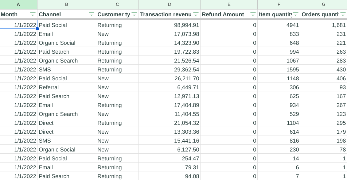
Initially we have sales data that is taken from Shopify and Google Analytics. As we can see, this table contains month, channel, customer types, transaction revenues, refund amounts, item quantities and orders quantities. However, we cannot see how many clients and orders we have every month. Here is when the pivot table comes in!
What we should do now is to select all the columns, click Insert and find Pivot table in the list of the menu. It is really important to select the header of each row as well. So, in the little settings window that appears after you choose the pivot table, you can select your data range and place the pivot table on the same or on another tab.
Setting up the pivot chart
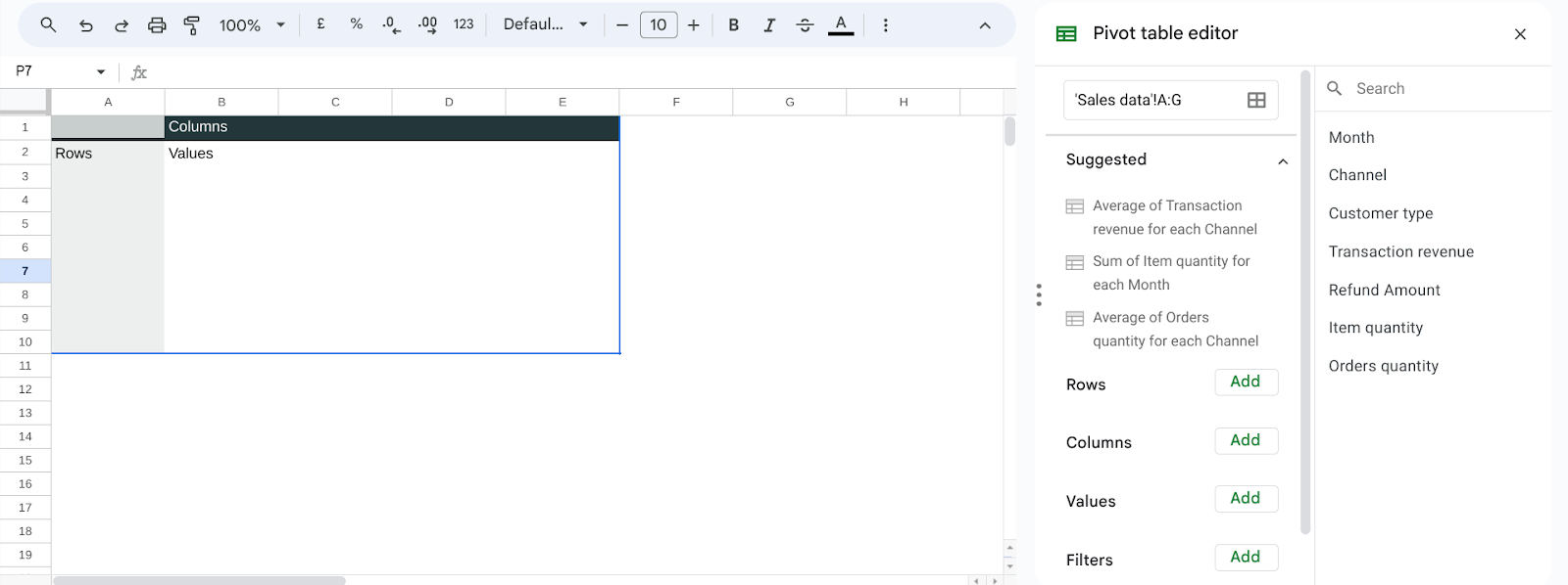
Here is how the pivot table on a new page looks like. We can see some hints inside the pivot table to understand the logic of it. Besides that, there are suggestions in the pivot table editor, but personally I never use them. Pivot table is where you select the data to be shown in the rows, columns, values, and also you can set up the filters here. In the very right panel you can see the list of the fields you can select.
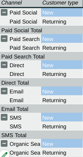
For example, I want to show Channel in rows and split it by Customer type, so I add both of these fields. It will look like this:
Besides that, you can change the order of sorting from ascending to descending and vice versa, and show or remove totals.
But if you want to add your customer type to columns, it will change the look of the table. Let’s add to this table Orders Quantity as a Value.

There is an empty column, so I will just delete it. To do this, I add a filter for Customer type and remove blanks. Or, you can filter by the condition “is not blank”.
Having added the value, we can change sorting to the summary of orders quantity, consequently, it will be sorted by Grand Total.
Summarized by and show as
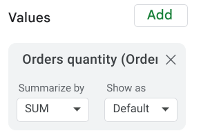
Talking about values, one more interesting thing I would like to tell you about is “SUM” or “summarized by”. There are many options like summary, count, count unique, average, max, min and other things.
In our case, when we use the number of orders, it makes sense to use summary. In other cases, when you have User IDs, for instance, probably, it would be better to count unique.
Besides that, there are options on how you can present your value. It can be default (number) or percentage – % of row, % of column and % of grand total. You can present your date in a couple of view modes at the same time. Leave one value default, for example, and add the same value but present it in percentage. I think that it is really useful.
Theme and conditional formatting

In the Format menu you can change the Theme of your pivot table. You can choose any default theme or create a custom theme manually.
One more thing I would like to add to this table is conditional formatting. I want to apply it to the grand total column. To do it, I open the Format menu and click Conditional formatting. Now I am able to select a color scale to mark the results. It allows us to see which channel brought us more orders and which brought less.
If you want to know more about Looker Studio, get practical skills and theoretical knowledge about data visualization, I invite you to my Data Visualization in Looker Studio course! You can read more about and join the course by the link.
Hope you liked this article about pivot charts in Google Sheets! Share your impressions in the comments section and don’t forget to follow the newsletter.
Check out my blog in Medium