
Conditional formatting in Google Sheets for beginners

Let’s talk about one useful function in Google Sheets – conditional formatting. I will show you how to set it up using a pivot table (read the article about creating a pivot table here).
Check out the video tutorial here:
How to do conditional formatting in Google Sheets?

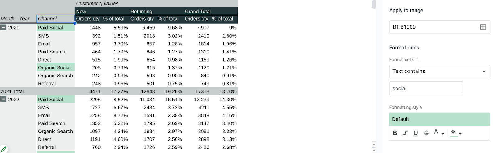
In this table we have different channels and different years. It is already good-looking. But to improve the table and make it easier to read I will use conditional formatting.
Firstly, you need to go to the Format menu and click on conditional formatting. On the right side of your screen you will see a panel that looks like this:

On this screenshot I’ve already set up a condition “If the cell is not empty, make it green”. Clicking at a tiny square in the “Apply to range” field, you can select a data range you want to apply conditional formatting to. I’ve selected the B:B data range.

You can see that empty cells are gray and the cells that contain data are green.
It is very simple, let’s make more advanced conditional formatting.
Conditional formatting in Google Sheets. Text-based
There are different kinds of rules, for example:

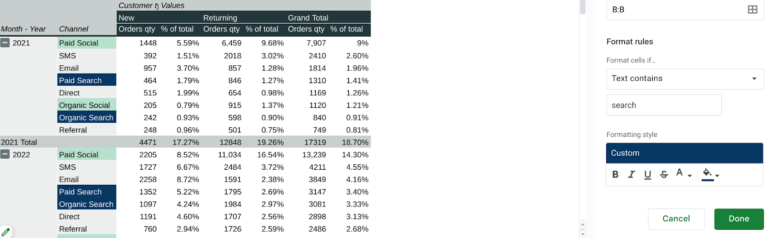
Let’s use the rule from the first section that is based on the text – Text contains. Right below the rule we will have an input field where you need to write the word or value you want to format the cells by. As you can see on the screenshot below, I want to select the fields containing the word social and make them green, for example.
Obviously, you can add more than one condition. After setting up the previous condition, click Done and right there in the panel click “Add another rule”. We will use the same rule “Text contains” but in this case “Search”.
Conditional formatting in Google Sheets. Numbers
Talking about the numeric cells, it makes no sense to use text-related rules here. Let’s use the condition “Less than or equal to” instead.

In this case, conditional formatting allows us to see what values are less than 300, which is going to mean that we didn’t have many orders from those channels.
Also we can use the rule “Is between” and mark the range you want your data to fit in. For example, between 300 and 700. It’s a normal, not an outstanding result, so let’s make the cells that match this condition – yellow.

Using the same logic we can use green color to highlight perfect results owing to the rule “greater than or equal to”.
Using color scales
To use color scale, we just need to select a column, click in the right panel Add a rule, then Color Scale. There are different options of color schemes but I use a green-to-red one.

But here, as you can see, fields in green contain the least numbers and we need the contrary.
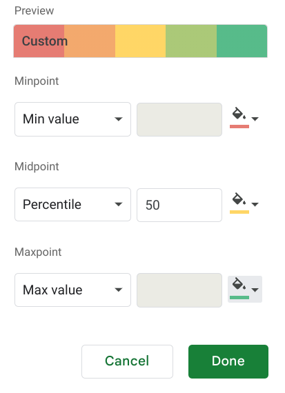
Above you can see the settings – minimum numbers will be red, maximum ones – green. Though, as the maximum is 100%, only this number will be green. What do we need to do in this case?
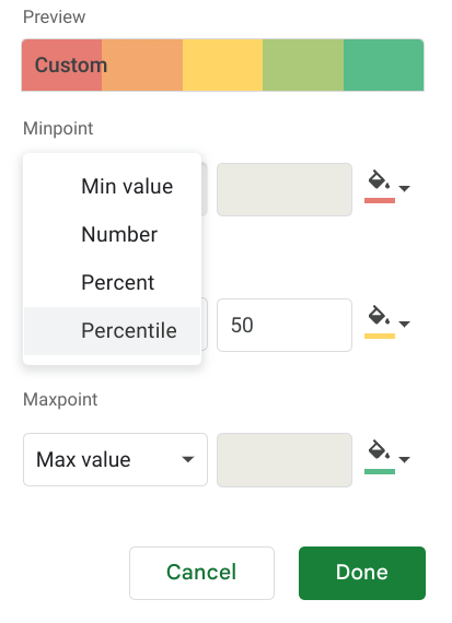
We can choose between number, percent and percentile. Percent and percentile are a bit different, percentage shows the rate, number or amount, whereas percentile indicates the position or standing of a person.
We can use numbers. For example, for minpoint – 0.0, midpoint – 0.05, maxpoint – 0.2.

Looks better, I guess! It’s a bit more complicated to set up, but I believe it’s easier to understand.
If you want to apply this rule to another data range, you just have to click that square with a data range, “Add another data range” and select the column.
Hope you liked this article! Leave your impressions about conditional formatting in the comments section!
Read more articles of mine in Medium.