
Show examples of ready-to-use marketing dashboards.
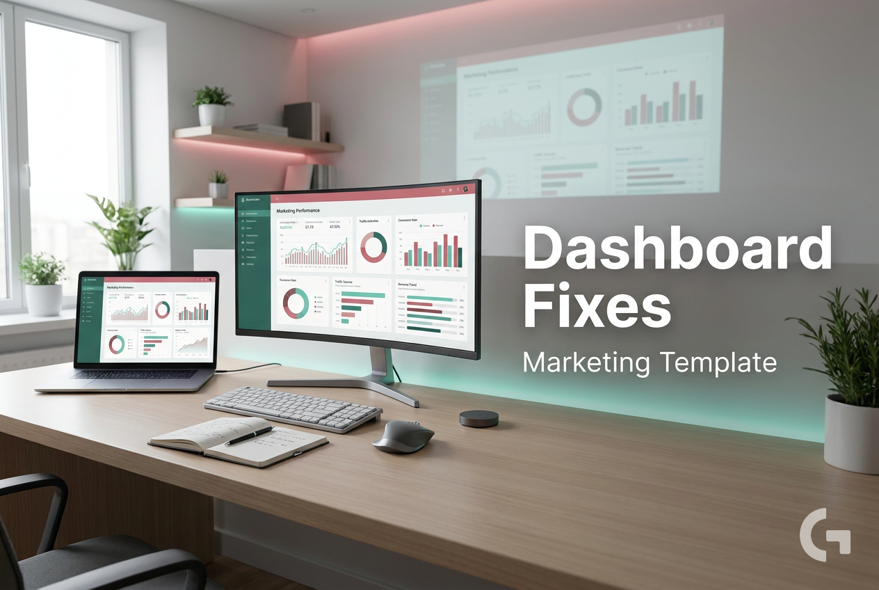
A marketing dashboard template gives you a faster way to build reports without starting from a blank page. If you’ve ever pulled numbers from ad platforms, GA4, spreadsheets, and CRM tools just to answer a simple performance question, you already know why this matters.
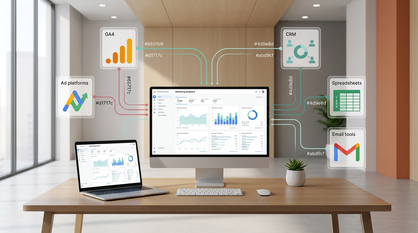
A lot of marketing reporting becomes slow not because teams lack data, but because the data lives in too many places. Paid media metrics sit in ad platforms, website and conversion data lives in analytics tools, and other performance numbers may be tracked in email tools, CRM systems, or spreadsheets. By the time everything is combined, the report is already outdated or too messy to be useful.
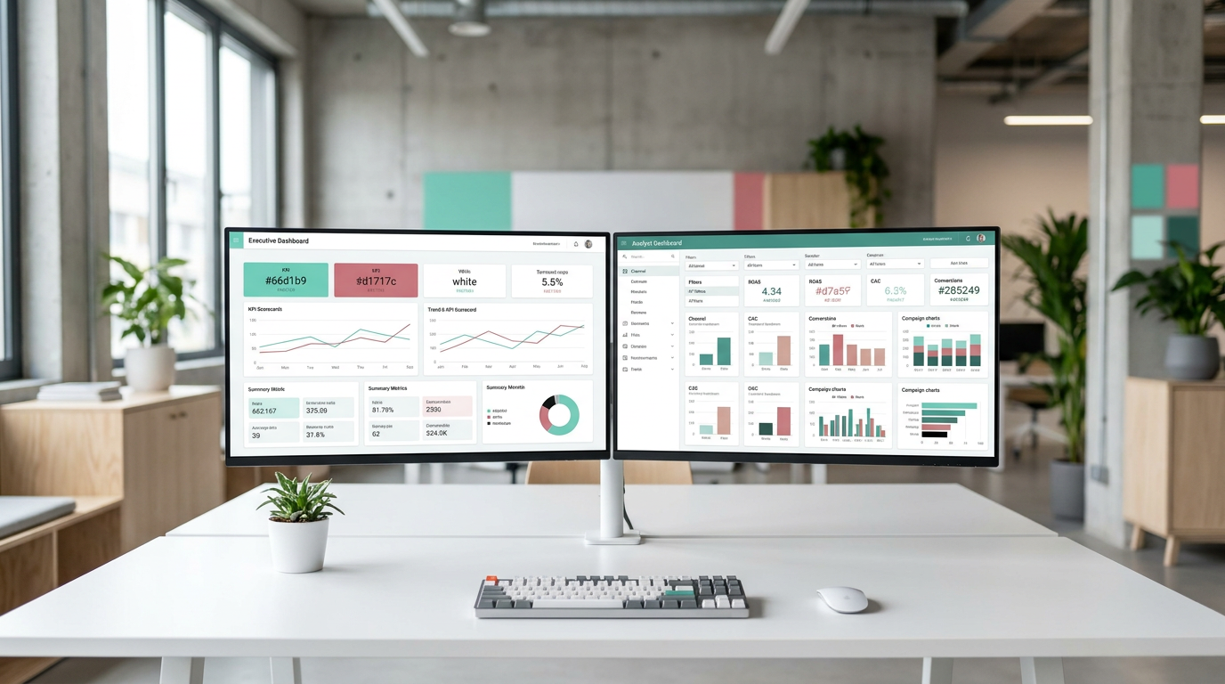
This is also why many dashboards fail. They try to show everything at once instead of helping one specific audience answer one specific question. Executives usually need a high-level view, while analysts and channel managers need more detail. When both needs are pushed into one dashboard, the result is often cluttered and hard to act on.
Why a marketing dashboard template helps
A marketing dashboard is meant to bring key metrics into one place so teams can track performance and make decisions faster. A marketing dashboard template is the ready-made version of that dashboard, built around a common use case like paid media, SEO, content, or executive reporting.
That starting structure is what makes templates useful. Instead of building every chart from scratch, you begin with a proven layout and then adapt it to your reporting goal.
A useful dashboard does not show all available data — it shows the metrics that support a decision.
In practice, the best approach is to pick one dashboard per use case. For example, a paid media dashboard might focus on spend, clicks, conversions, ROAS, and CAC. A funnel dashboard would use a different structure and focus on leads, MQLs, SQLs, and revenue.
Start with the use case, not the tool
Before choosing Google Sheets, Looker Studio, BigQuery, or connectors, it helps to define the question your dashboard should answer. That question shapes the KPIs, filters, comparisons, and level of detail.
A simple workflow usually looks like this: choose a template for the reporting use case, connect the needed data sources, map the KPIs and breakdowns that matter, and customize the visuals for the audience. It also helps to include comparison periods like week over week or month over month, because trends are easier to interpret when change is visible.
A Tool I Often Use to Pull Data Into Dashboard Templates
A tool I’ve used many times for marketing dashboards is Supermetrics.
It helps pull data from different marketing platforms into tools like Google Sheets, BigQuery, or Looker Studio so your reports can update automatically.
How to use a marketing dashboard template in practice
Once the use case is clear, the next step is to make the template work for your reporting process rather than treating it like a finished dashboard.
A good marketing dashboard template gives you structure, but the real value comes from choosing the right inputs, keeping only useful KPIs, and adjusting the level of detail for the people who will use it.
1. Choose one reporting purpose
It helps to keep each dashboard focused on one job. That usually means creating separate dashboards for separate reporting needs instead of trying to combine everything into one screen.
- Use one dashboard for paid media reporting
- Use another for SEO or content performance
- Use a separate dashboard for funnel or pipeline reporting
- Keep executive reporting high level
- Keep operational reporting more detailed
This makes the dashboard easier to read and easier to maintain over time.
2. Connect the data sources you actually need
Most marketing teams work across several systems, so the dashboard usually needs inputs from more than one place. Depending on the reporting setup, teams may use Google Sheets for lightweight reporting, Looker Studio for visual dashboards, BigQuery for a stronger data layer, GA4 for website and conversion data, or marketing data connectors to bring platform data into the reporting layer.
The important part is not using more tools. It is choosing the data sources that support the question the dashboard is supposed to answer.
For example, if the dashboard is meant to explain paid campaign performance, the key data may include ad platform metrics and conversion data. If the goal is website performance, GA4 may be one of the main sources. If reporting depends on several channels, a connector or automated workflow can help reduce manual updates.
3. Map the KPIs and breakdowns before building visuals
One of the easiest ways to make a dashboard messy is to start with charts before deciding what should be measured.
Before customizing the template, define the KPIs and the breakdowns that matter most. These should connect to actions or decisions, not just fill space.
A paid media dashboard may focus on:
- spend
- clicks
- conversions
- ROAS
- CAC
A funnel dashboard may focus on:
- leads
- MQLs
- SQLs
- revenue
This is also a good point to decide which filters are useful, such as channel, campaign, date, or audience segment.
4. Customize the layout for the audience
The same underlying data may need to be shown differently depending on who reads the dashboard.
Executives often need a simpler summary with a small number of business-level KPIs. Analysts and channel managers usually need more detail so they can understand what changed and where to act.
That is why templates work best when they are adapted after the data is connected. Labels, filters, chart order, and metric groupings should match the audience, not just the tool.
Another useful approach is to group metrics by business outcome instead of by platform. That keeps the dashboard closer to the questions teams actually ask.
A template saves time only when the report stays focused on decisions, not just data collection.
Tools and workflows that help keep reporting current
Templates solve the layout problem, but they do not solve reporting delays on their own. If the dashboard still depends on manual copy-paste work, it will quickly become outdated.
That is why many teams combine a template with a repeatable workflow for pulling, organizing, and reviewing data.
Use Google Sheets for lightweight reporting
Google Sheets is useful when the reporting process is simple, manual analysis is still part of the workflow, or the team wants a lightweight template that is easy to adjust.
For many marketers, Sheets is also the first place where KPIs are cleaned up and checked before being turned into a dashboard.
Use Looker Studio for visual dashboards
Looker Studio is commonly used for dashboard templates because it can connect multiple sources and present visual reports. This makes it a practical option when the goal is to share a dashboard with stakeholders in a readable format.
Use BigQuery when the data layer needs to be stronger
When marketing data becomes larger or harder to combine, BigQuery can be useful as a stronger data layer before reporting. This is especially relevant when teams need to bring together larger marketing datasets before sending them to the final dashboard.
Use GA4 as a reporting source
GA4 is often used as a source for website and conversion data in marketing dashboards. That makes it relevant for templates focused on traffic, engagement, or conversion reporting.
Use connectors and automation when manual updates are too slow
Marketing data connectors such as Supermetrics, Windsor.ai, or similar tools are used to bring ad and marketing data into Sheets, Looker Studio, or other reporting layers. Make.com can be useful for automating data movement or report workflows when manual updates take too much time.
This matters because repeatable reporting is not just about having a dashboard. It is about reducing the amount of manual work needed to keep that dashboard useful.
A simple workflow for building a repeatable dashboard
If you want a practical starting point, this process is usually enough:
- choose a template based on the reporting use case
- connect the required data sources
- map the KPIs and breakdowns you actually need
- customize labels, filters, and visuals for the audience
- review the dashboard regularly and remove metrics that do not support decisions
This workflow works well because it keeps the template tied to a real reporting goal. It also helps prevent the common habit of adding more and more charts until the dashboard becomes hard to use.
Practical ways to keep dashboards useful over time
Even a strong template can become cluttered if nobody reviews it. Dashboards tend to grow as teams add extra requests, new channels, and one-off metrics.
A few habits usually make a big difference:
- keep executive dashboards high level
- separate reporting by purpose, such as acquisition, content, or pipeline
- use only metrics tied to a real action or decision
- include week-over-week or month-over-month comparisons
- standardize the layout across teams or clients to reduce confusion
- add filters only when those views are genuinely useful
Comparison periods are especially important because they make change easier to interpret. A metric on its own says less than a metric shown against a previous week or month.
Additional resources for building your reporting workflow
If you want to go further, it helps to keep learning from practical examples and implementation guides.
- tutorials on building dashboard structures for different marketing use cases
- resources on connecting marketing data sources into one reporting layer
- practical guides for automating recurring marketing reports
- examples of simplifying KPI layouts for executives and channel teams
Final thoughts
A marketing dashboard template is most useful when it gives you a faster starting point without locking you into a generic report. The template should support one use case, connect the right data sources, and highlight only the KPIs that help someone make a decision.
If your current reporting feels slow, cluttered, or too manual, start smaller. Pick one reporting goal, use a proven template structure, connect the needed data, and review the dashboard regularly. That approach usually leads to clearer reporting and a workflow that is much easier to maintain.
