
How to Blend CRM Data in Looker Studio for Better Reporting

Blending data lets you create charts, tables, and controls based on multiple data sources. I’ve already posted several articles about blending data. In one of them I showed how all the types of joins work and in another one – how to blend data from Google Analytics in Looker Studio.
In this article I am going to show you how to blend CRM data in Looker Studio. It will be useful in Sales Analysis for SaaS businesses.
Check the video tutorial here:
Data source
I’ve created a table with random CRM data that could possibly look real in Google Sheets.
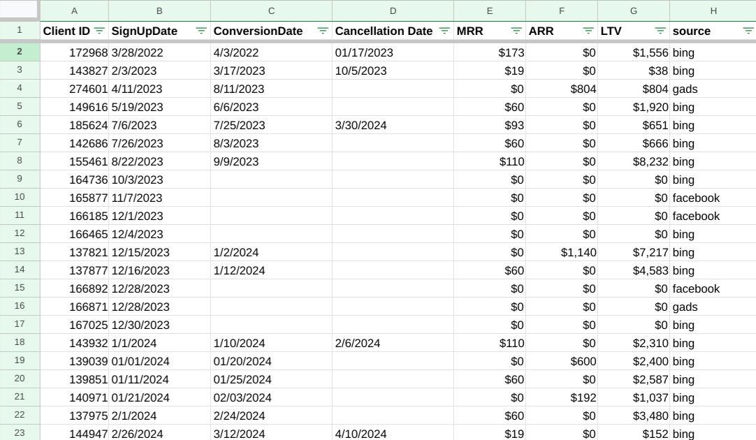
So, as you can see, we have Client ID, Sign Up Date, Conversion Date, Cancellation date (if there is one), MRR and ARR, LTV and source. Let me explain what they particularly mean:
Conversion date – date of the client’s first payment
Cancellation date – date of subscription cancellation
MRR – Monthly Recurring Revenue – revenue from a client in case of monthly subscription
ARR – Annual Recurring Revenue – revenue from a client in case of annual subscription
LTV – how much money certain user has spend all over the time
We need to connect this tab to Looker Studio. You can do it like this:
- Click “Add data”
- Select Google Sheets from the connectors list
- Select your document
- Select the needed tab
Pre-setup
Having added a data source, let’s create simple tables for our dates in Looker Studio, as they give us a multilateral image of the situation
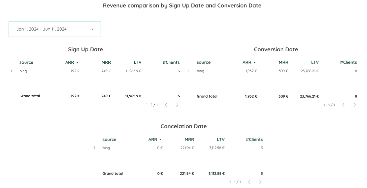
Date Range Dimension: Sign Up Date / Conversion Date / Cancellation Date
Dimension: Source
Metrics: ARR, MRR, LTV, #Clients (Number of Clients)
Enable the summary row
What is the number of clients, considering we don’t have such a column in our data source data?
Using the Client ID metric, we can count an exact number of clients for each of the tables. It’s very easy to do, just like this:
- Edit the Client ID metric field
- Choose the Count Distinct aggregation
That’s it! However, we need to make some adjustments to LTV, MRR and ARR data format. Instead of numbers, I want to present it as a currency.
It’s enough to create one table of these and just copy it, changing Date Range Dimensions depending on the case.
What do these tables show us?
First of all, the Sign Up Date table shows us the number of clients and corresponding revenues depending on how many clients brought us money on the day of their registration.
Conversion Data shows us the number of clients and revenue we got from them throughout the year.
Cancellation Data presents the number of clients who canceled the subscription and the revenue they brought until the cancellation date.
How to show all the data in one table
Our task now is to present all the data in one single table. Certainly, it would be much easier to use.
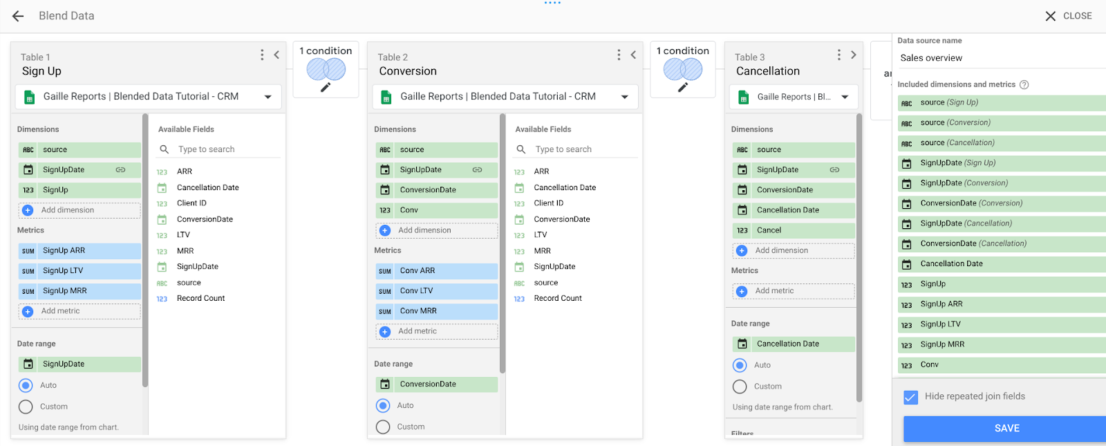
In this case we need data blending, and firstly, we create a blended data source. We want to present all the data corresponding to Sign Up Date, Conversion Date and Cancellation date.
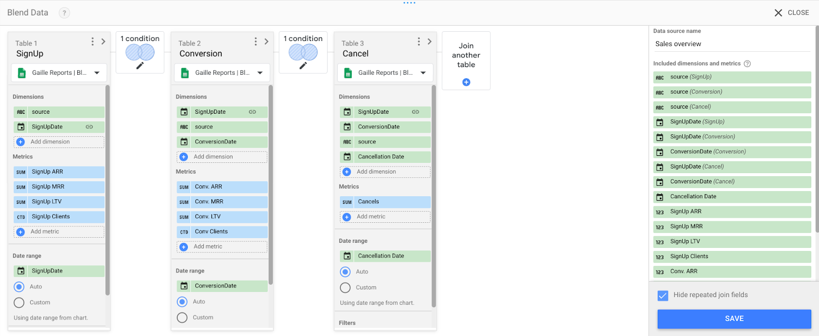
So, here we add three tables. Let’s start with a Sign Up one.
Dimensions: Source, Sign Up Date
Metrics: rename MRR, ARR, # Clients and LTV into SignUp ARR, SignUp MRR, SignUp #Clients and SignUp LTV
Date range: Sign Up Date
I usually name everything so as not to get confused later.
Later on, we need to work on our second table – Conversion.
Dimensions: are the same as in the previous table but we also add ConversionDate
Metrics: are the same, and you will have to perform the same trick with renaming fields not to get confused
Date range: Conversion Date
As a type of join between all the tables, I choose Full Outer Join. We will blend data based on Sign Up Date.
For Cancellation Date table:
Dimensions: are the same as in the previous tables but we also add CancellationDate
Metrics: # Clients
Date range: Cancellation Date
Here is the table we get based on our blended data source. However, as we can see it’s not really accurate.
Fixing errors
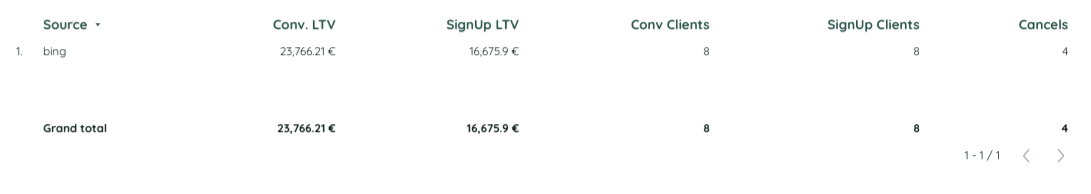
Let’s make some adjustments to our blend.
If you take a look, you can notice that I’ve deleted a number of clients from each metrics section and I’ve added Clients to the Dimensions. I named it simply SignUp, Conv., Cancel.
Having added them, we go back to our table, and in the right panel settings we have to add these fields to metrics and change their aggregation to Count Distinct.
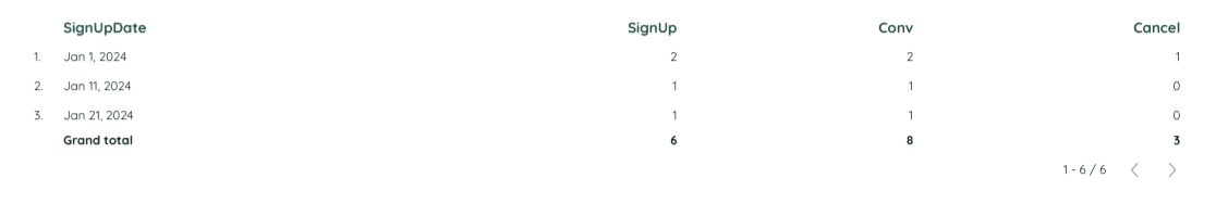
Here is what we got. Now you can compare the results from the source tables, table with an error and this one.
There is one more mistake I’ve noticed (check it out in the video) – when we select source as a dimension, we will have only bing and null in the list. We need to get rid of null using a formula:
IFNULL (source (Conv.), IFNULL (source (SignUp), source (Cancel))
Calculated metrics trick
Based on this case, I can say that you can not only show blending data, but also perform additional calculations.
For example, you can count Cancellation Rate right in the table.
- Add a new custom metric field
- Write a formula:
Count_distinct (Cancel) / Count_distinct (SignUp)
- Change the data format to Percentage
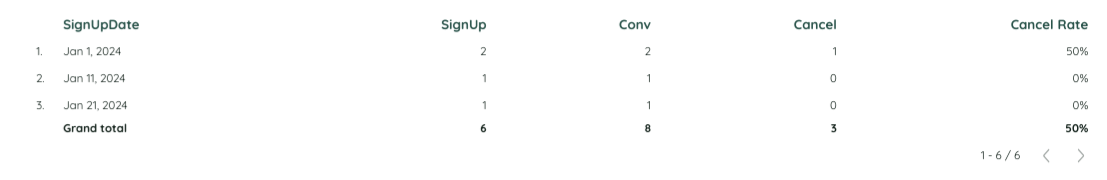
And that’s it! You can see what our table looks like now.
Using the chance, I would like to remind you that if you are a SaaS owner or manager, you may like our Cohort Analysis Template. LTV and Customer Retention. The results of Cohort Analysis contain essential data you surely need to successfully run your business!
Hope you enjoyed the article! Share your impressions in the comments section.