
Looker Studio Quick Start: 2023 Looker Studio Tutorial For Beginners
Looker Studio is a data visualization tool made by Google. It is a free instrument to analyze your data. I use it to create reports with visualized data, so you can check out Looker Studio report templates here.
In this article “Looker Studio Quick Start” I am telling you all the necessary steps you need to take to start your journey in data visualization.
Check out the youtube video about Looker Studio Quick Start:
Starting to work
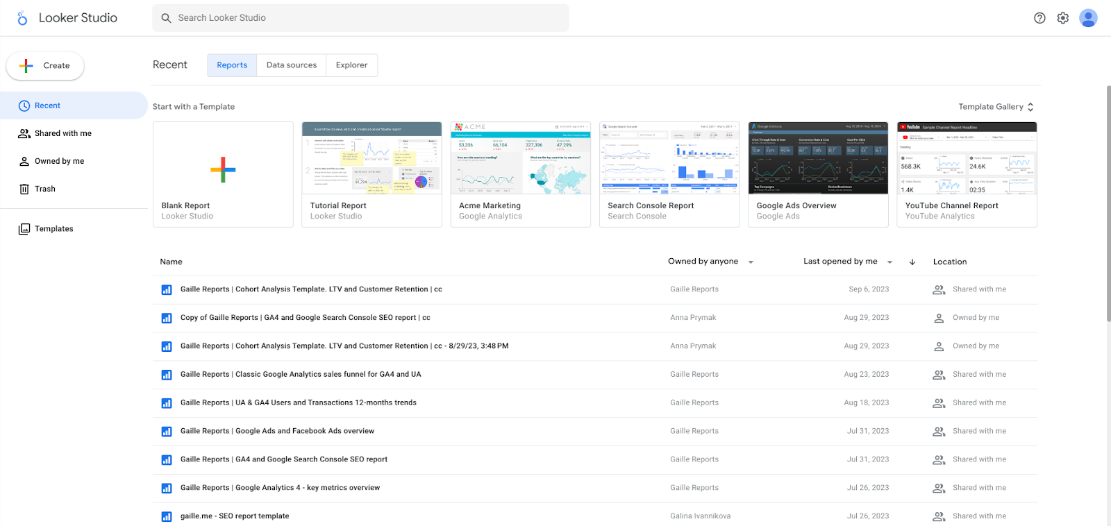
This is the page you see once you log in. I have a list of recently opened dashboards – if it is your first time working with Looker Studio you will have nothing here.
Above the list of the dashboards we can see different templates that you can use or there is a button “Blank Report”. Beside that, there is a button “Create” in the left panel that also allows you to create not only the report but also create and explore a data source in two different modes.
In the left panel, we have sections like Recent, Shared with me, Owned by me, Trash and Templates.
Creating a blank report.
When you create a blank report the first thing you see is a menu “Add data to report”. This button allows us to connect the place where we keep our data to Looker Studio. Basically, here you can choose any connector available – there are 23 free connectors provided by Google and more than 800 partner connectors, they may be paid or free. Under each name of partner connectors there is a name of the provider.
Let’s start with Google Analytics connector by Google. Primarily, it is the tool commonly used by the marketing managers. Secondly, it is free and you can use Google Analytics demo-account (check out the instructions and connect it here).
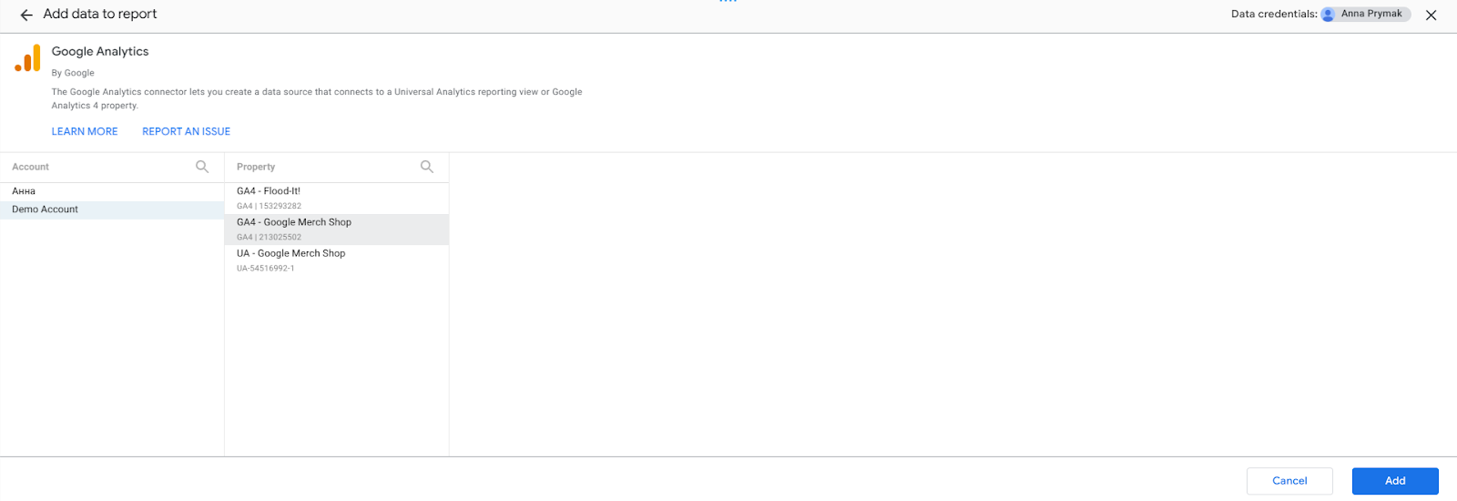
Different properties have different sets of fields and data. Choose one of them and let’s start observing the interface!
Observing the interface
Right after connecting the data source, Looker Studio automatically adds a table with some data to the canvas. We don’t need it now, so I deleted it.
This white space is actually the place we do everything at. We can add tables, charts, images, texts and so on.
Usually I start with renaming the report in the upper left corner. Under the name we have various menus – File, Edit, View, Insert, Page, Arrange, Resource and Help. Under these menus we have fast access menus that are easier and faster to use.
As you can see on the image, there are three panels on the right side. Let’s start with the panel with only two buttons – Data and Properties. If we click Data, a list of fields from the current data source will appear in the middle column. Properties is the first column and it contains the settings of a selected element.
Creating the first section. Title and scorecards.
When I work with the dashboards, the first thing I usually add is the title. I just clicked the text button and wrote the text in the field. You can easily change the box size, font, font size, colors and other settings of this text field.
I named this section “Google Analytics 4 overview”. Let’s add the content to this section.
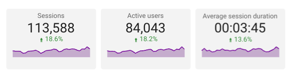
Usually I start the reports with a general overview and then more specialized. So I would like to add some scorecards with this report’s key metrics. After adding a scorecard, we see different settings in the properties menu. Firstly, the data source (we can also use a blended data source), then the metrics. May our first score box present a number of active users – I just need to set Active users as a metric.
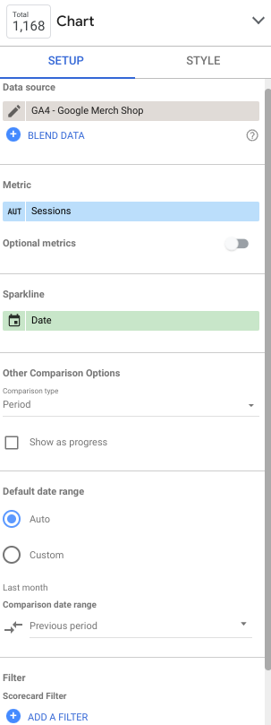
Beside that, you can add a sparkline to the scorecard to present a selected metric in dynamic or compare this number with a previous period. Most importantly, you need to set up a date range. If you do not have a date range picker that sets up a default date range for the dashboard, you need to set up the date range manually in settings for each object.
Followingly, you can set up what to do with missing data.
When you select an object, click “Ctrl+C” and “Ctrl+V”, this object will be duplicated. I want to show Active Users, Sessions and Average Session Duration so I need three scorecards.
Time series chart
Basically, having added a time series chart, let’s take a look at the settings. The dimension by default is date, but we can also add a breakdown dimension, for example, Default Channel Group. Besides metrics, we have an option to add metric sliders and optional metrics. Again, you can set up your date range and then you can create a filter.
For instance, if you want to show only organic traffic, you need to create a filter and write a condition “Include Default Channel Grouping contains Organic” and that’s it.
Then you can set up styles of the chart – colors, change lines to bars, reference lines, axes and so on. There are separate settings for each of the lines.
That is how my time series chart looks like:

Controls
There are various controls in Looker Studio like drop-down list, fixed size list, input box, advanced filter, slider, checkbox, preset filter, data range control, data control and button.
Let’s observe data range control and a drop-down list.
After adding data range control, by default it will show you the last month, but you can set it up. You can set any date range and all the elements with default date range will be updated according to it. Though when you refresh the page, everything will be back to the default date range.
Drop-down list is also a useful control in Looker Studio. As a control field we can use a Channel Group and Session as a metric. This control helps us filter the sessions on the page.
This is how these two date ranges look like:

Sharing
To share the dashboard, you click a Share button in the upper right corner.
o
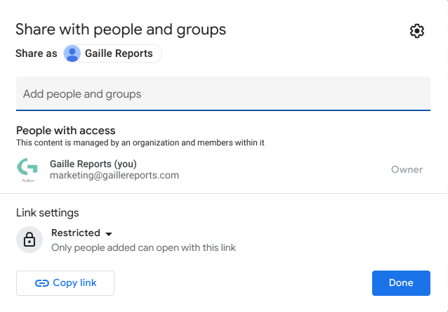
You can change the permission for the usage for each of the added people – you can give access to someone in the role of editor or viewer. The rest of the functions are the same as in other tools by Google.
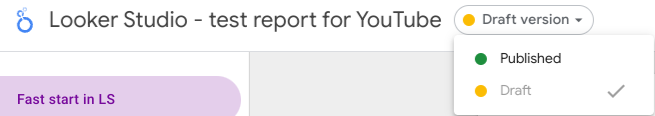
But there is one interesting thing I want to share with you. In the File menu you can find Publishing settings. This way you turn on the manual publishing to control when changes are shown to users. When manual publishing is off, changes to the report will be automatically shown to users.
Consequently, here you have a draft and published versions.
If you want to know more about Looker Studio, get practical skills and theoretical knowledge about data visualization, I invite you to my Data Visualization in Looker Studio course! You can read more about and join the course by the link.
Hope you liked this article about Looker Studio Quick Start! Share your impressions in the comments section and don’t forget to follow the newsletter.