
Weekly Customer Cohort Analysis – Google Data Studio Template Overview

Today I would like to review my Google Data Studio template that is called Weekly Customer Cohort Analysis.
To clarify, let me explain what cohort analysis is.
Firstly, Cohort Analysis is a type of analysis where we can see different customer cohorts and see how they behave and how long they stay with us. It is more usual for the companies to make a monthly customer cohort analysis but in our case we have weeks. You can choose which cohort you need depending on your business. I have run the analysis for one of my clients and let’s see what cohort analysis is in practice.
Here is the link to the template page in the store.
(I have also recorded a tutorial, here it is, enjoy!)
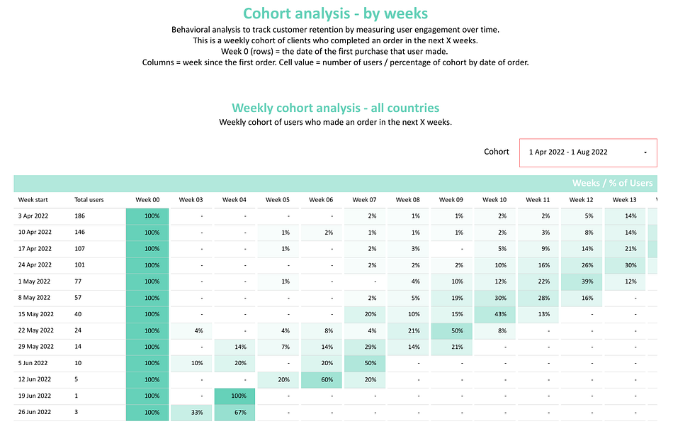
Here we see the title of the report, some subtitles with some explanation of what we have, and the first part with a number that’s called weekly customer cohort analysis.
Below we have the same analysis split by countries.
On this pivot table we can see that, for example, on the weeks it started on 20th of March, 2022, we’ve got 2 new users. 100% of them have made a purchase on Week 0, and it’s normal, because we count the users who have the first purchase during this week and further we can see that some of them have made the last purchase on Week 7, some of them have made on Week 13, etc. By this number we can know how long the users stay with us — when they did the first purchase and when they did the last purchase. It is an interesting metric. I mean, when we open new offices, when we launch new products or try out marketing hypotheses or when we work with a lifetime value, , it is interesting to observe whether it has any influence on our clients or not.
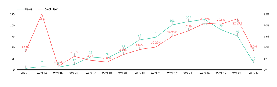
Here we have charts that show the repeat data we have in a pivot table, but actually we have 2 metrics here. For example, this one shows the percentage during the period we had and the quantity of users — 771 users. As we can see, 10 percent of users have made their first purchase during the last 10 weeks. But we do not know exactly how many of them. So here we have 9.08% that means 67 users.
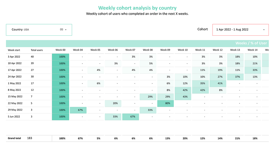
Now we can see the same charts but splitted by countries — we have country filters and we can choose certain countries and observe how users behave in different countries. I’ve chosen a country, but in your case the filter can be ‘managers’. It lets us see, for example, how long the user stays with a certain manager. The filter can also be ‘stores’, ‘regions’ or any other parameter that you want to split your customers into.

The same chart is as the one above but for the exact country.
What do we have in the back-end?
There are two data-sources connected to our report. We can find them by clicking Edit — Resource — Manage Added Data Sources. Both of the data-sources are Google Sheets.
Let’s take a look at the first one.
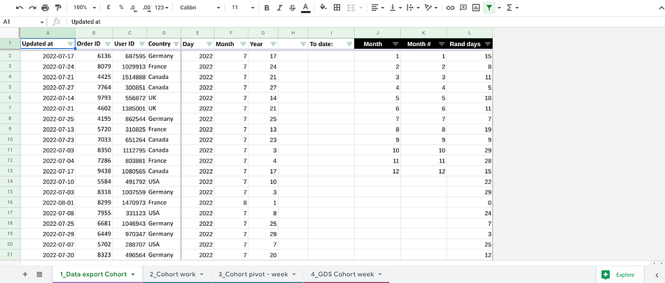
The sheet consists of 4 tabs.The first tab is the most interesting for us, because here we have the raw data and with the help of that we can create this kind of report. The data, actually, is super simple — just order’s date, ID, User ID and the country (or any other parameter, as I’ve mentioned before).
You can pull this data from Google Analytics or CRM system and it absolutely depends on the data you just have to upload the data to Google Sheets. Then we work with this data and do some calculations.
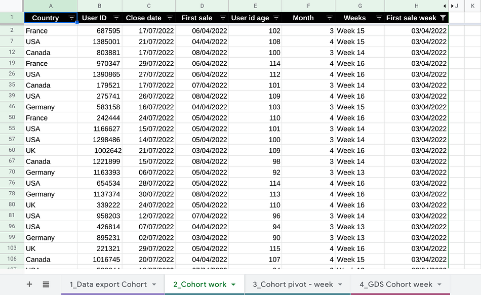
That’s how our second tab looks like. The Country and User ID are the same. We do some calculations — we count the unique Country and User ID, and for each User ID we calculate the first day of purchase and the last one. Based on this data we can calculate User ID age (how long did the user stay with us — in weeks and in months).
We choose the unique User ID by formula:
=UNIQUE(‘1_Data export Cohort’!C:C)
To calculate close date we use the formula:
=if(B2=””,””,MAXIFS(‘1_Data export Cohort’!$A:$A, ‘1_Data export Cohort’!$C:$C,B2))
First sale is being calculated by formula:
=if(B2=””,””,MINIFS(‘1_Data export Cohort’!$A:$A, ‘1_Data export Cohort’!$C:$C,B2))
This formula helps us find the dates of the first and the last purchase of each user.
Then we create a pivot table based on this data.

On the next stage we are going to work with our 4_Cohort pivot — week and 4_GDS Cohort week. On tab 4 we make some transformations. We count users for week 0 and join it to the data of other weeks.
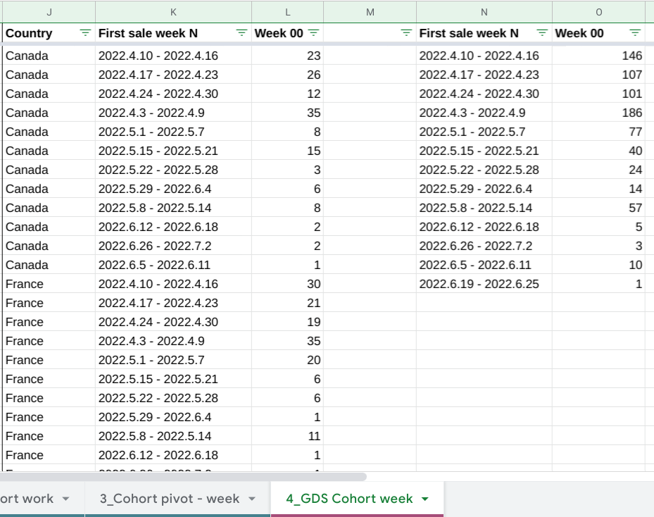
Besides, we create two tables that we can upload to Google Data Studio. It is the first table with a country column and this is the second one, without a country column. There are some points why we cannot do it in the same table. If you do it in the same table, you will get a wrong percentage. It’s better to make two separate tables and it will work more accurate iin this way.

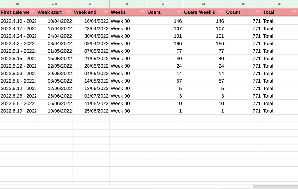
That’s it. We connect this table to google data studio, from AC to AJ, and this table with country background from R to Z. The formulas that I use in this Google sheet you can find by the article.
Hope you liked the review! You can find a video-review by the link . Also, you can read my other articles here. Here is the link to the template page in the store. By the way, check out the article about Weekly Cohort Analysis for beauty and health industry.
It is interesting to know, do you use cohorts in your business and how?