
Spend Tracking Overview Template
When you work with paid ads you can check cost and revenue every day. For this case I created a nice Google Data Studio template called Spend Tracking dashboard. Data in template is random and it may be far from reality but the main idea is to explain the logic of the report. I am going to overview the template.
If you prefer video format, here is it:
The Spend Tracking dashboard has three pages: Total Ads page, Ads by type and Ads by platform.
Total Ads Page
Usually I recommend starting a report from the main KPIs. In this case it is the Total Monthly budget. There is a date range picker in this report — separate for the year and the month. It is really comfortable to use both of them at the same time.
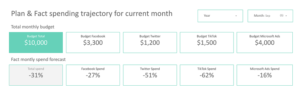
Total Monthly Budget is our planning budget and, as we can see, it is $10,000 as for September 2022. We see that our budget is split into Facebook, TikTok, Twitter and Microsoft Ads.
The second row means that if we keep on spending on the ads the way we do it now, at the end of the month we see that we will spend 31% less than we should. We will spend 27% less for Facebook, 51% less for Twitter and so on. On one hand, it’s a good thing, but on the other hand, it’s out of plan, so I would review the strategy.
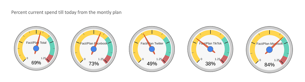
Then I have Percent current spend till today from monthly plan. This means that till now, till today we spent 69% of our monthly budget, it means we’ve spent 6900$ until today. The radar shows us how much money we’ve already spent.
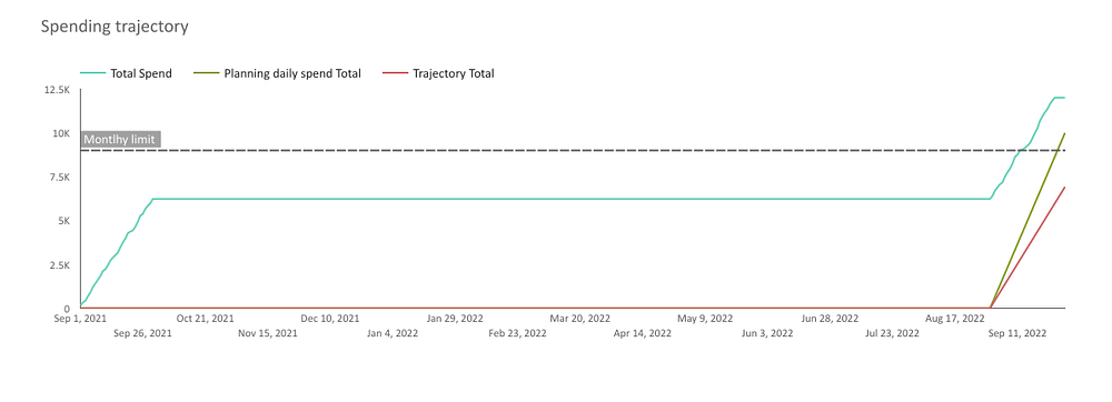
The next object we have in the review is the Spending Trajectory chart. It contains Total Spend, Planning daily spend total and trajectory total. The black line above is the planning monthly limit that shows us how much we can spend. This line is current spending, so how do we spend money till today. The dark green line means Planning daily spend. So, according to the plan, it would be better if the light green line would stay closer to our dark green line, it would mean that we are on a budget. This type of chart shows us the real current situation with your ads and I find it very useful.
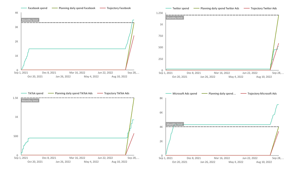
As we have different platforms, I’ve decided to place the same charts but split by the platform. The logic is absolutely the same.
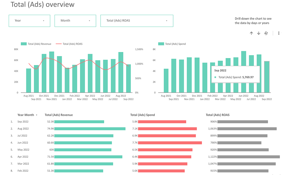
When you scroll down you will find the section called Total Ads Overview. Here we can see our data month by month, so how our ads go on during a long period. These charts involve only the main metrics of our report — revenue, spend and ROAS. We can compare revenue to ROAS and see that some months it goes up, some months it goes down and it is really nice to see.
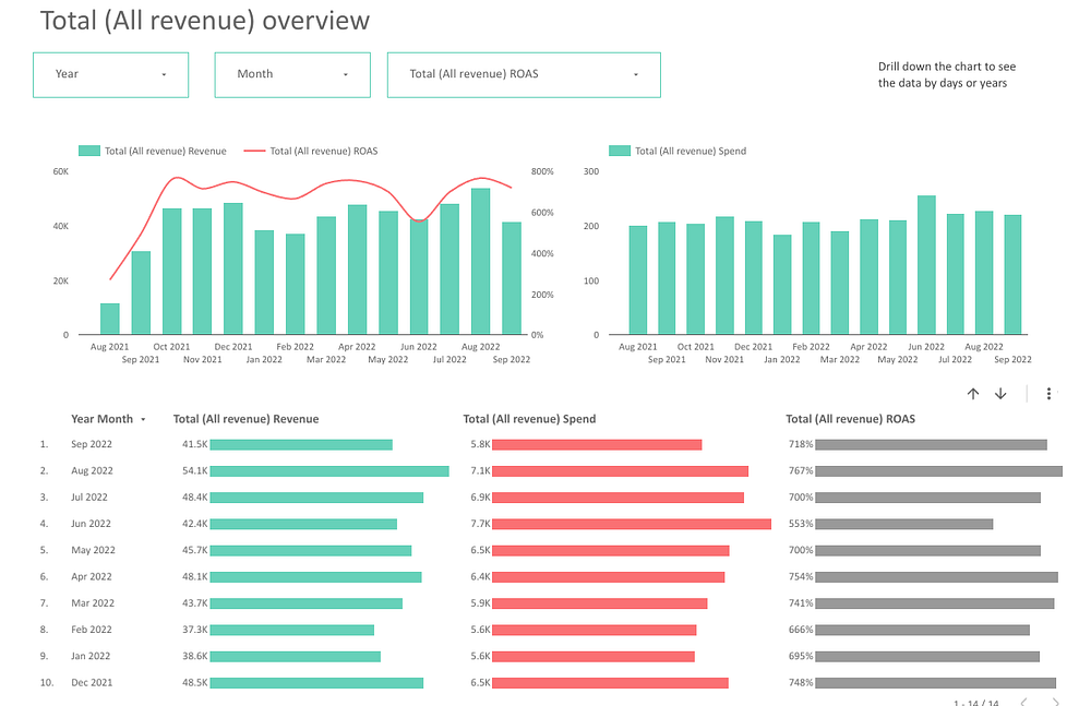
The next thing we see is the table with the same data that is in the charts, but presented in the way of the table. Sometimes it is nicer to see the data in the tables, because you can see the numbers in spite of the charts. I need to highlight that the charts in the Total Ads Overview section take the revenue from Google Analytics from only the channels we use in the report, whereas the next section Total Revenue Overview, takes revenue from all the channels.
Campaign type comparison
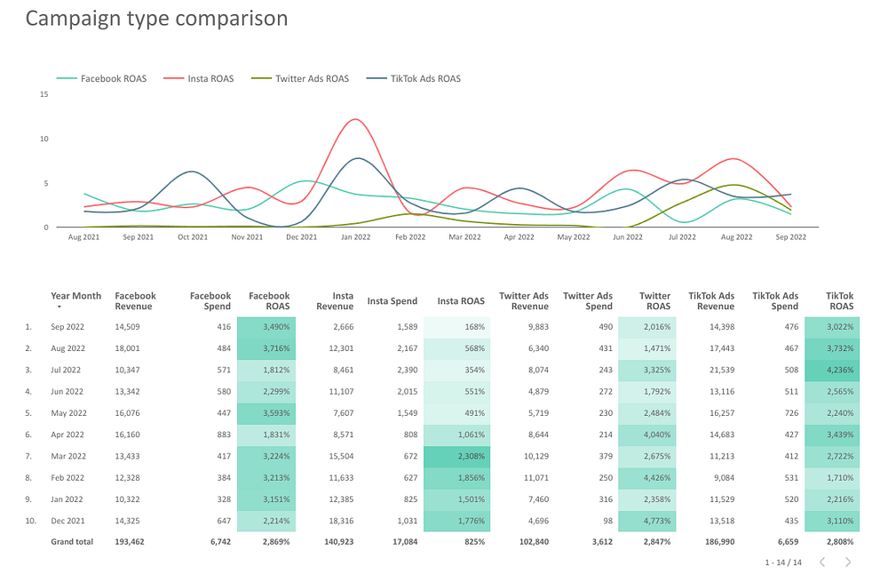
The second page makes us go deeper into the details. Here we can check ROAS by platforms and see a detailed table with different channels. Then we have two separate sections with Facebook and Instagram, though we didn’t split it on the separate page. Besides these, we also have Twitter only and TikTok only sections.
Ads by platform
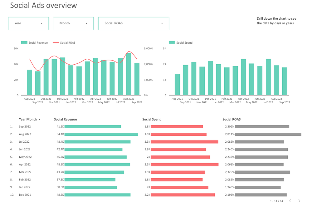
On the third page we continue to review our channels and in the beginning we can see a comparison plan/fact for all the social ads and for Microsoft Ads. So we split our ads channel into social media platforms and paid per click platforms. This is the common data for social ads and this is for the Microsoft ads.
Then, as we did before, we run the analysis for the social ads platforms together and Microsoft ads platform.
What’s under the cover?
To create this report I’ve used Google Sheets that contains several tabs:
- Budget — a tab where we have all the budgets and a place, where we make some calculations like split budget, percentage, daily budget and planning daily budget.
- Pivot — a pivot table that takes data from the Total Ads tab. I’ve created this pivot table just to compare data to the Google Data Studio.
- Total Ads is our working table where we merge data from different platforms, such as Facebook, Instagram, Twitter etc.
- Social — a tab for social media platforms.
Then we have some tabs with data from different sources and in our case it’s from Google Analytics about revenue, data from Ads Campaigns and so on. We use supermetrics add-on and pull the data from different campaigns, different platforms and combine them in this tab and connect this tab to Google Data Studio.
***
If you have any questions left, don’t hesitate to write them in the comments. That is it for today. Hope you liked the article!
You can find my other articles in my blog.