
New and Return customers growth Looker Studio report template overview
In this article I am going to present to you the template e-commerce owners and directors cannot miss! All you need to know about your customers growth in one place – New and Return customers growth template.
Before reading the article, check out the video overview:
Looker Studio report
This is a two page report – very easy to use. It will take you up to 10 minutes to set up your data source and start analyzing your dashboard.
Customer base growth
The first section of the report is dedicated to the report’s main KPIs.

As we can see, here we have the number of unique customers, new customers, returning customers, lost customers, total active customers as well as your net growth. Most of the KPIs have a comparison with a previous month and a previous year so that you could see the performance compared to other time periods. Beside that, here you can see the explanation of each of the KPIs.

The next section is about Customer base growth month over month. We can see here New customers, Lost Customers and Net growth. It’s really important to see how things are going now compared to each month of the past year.

This chart is supported by the following table where we can see full data in numbers. Thus we can count the difference and make some adjustments for the number of new and returning customers to prevail over the number of lost customers.
There are columns with “running” customers. It is a summary of a number of customers during the current month and previous months.
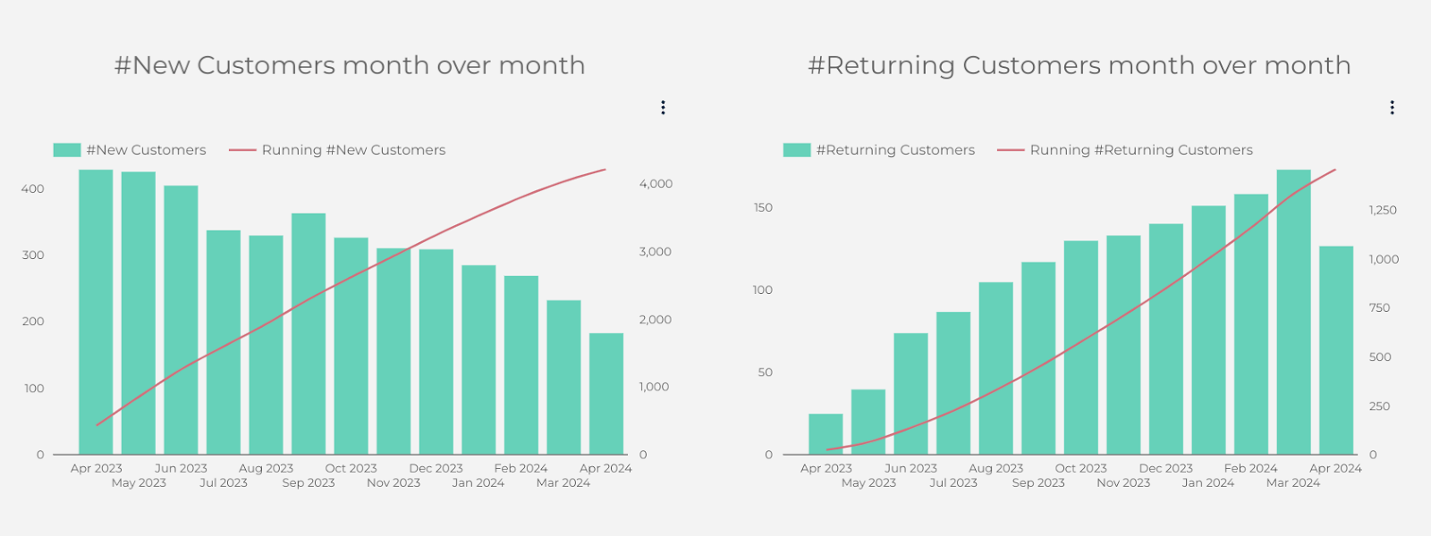
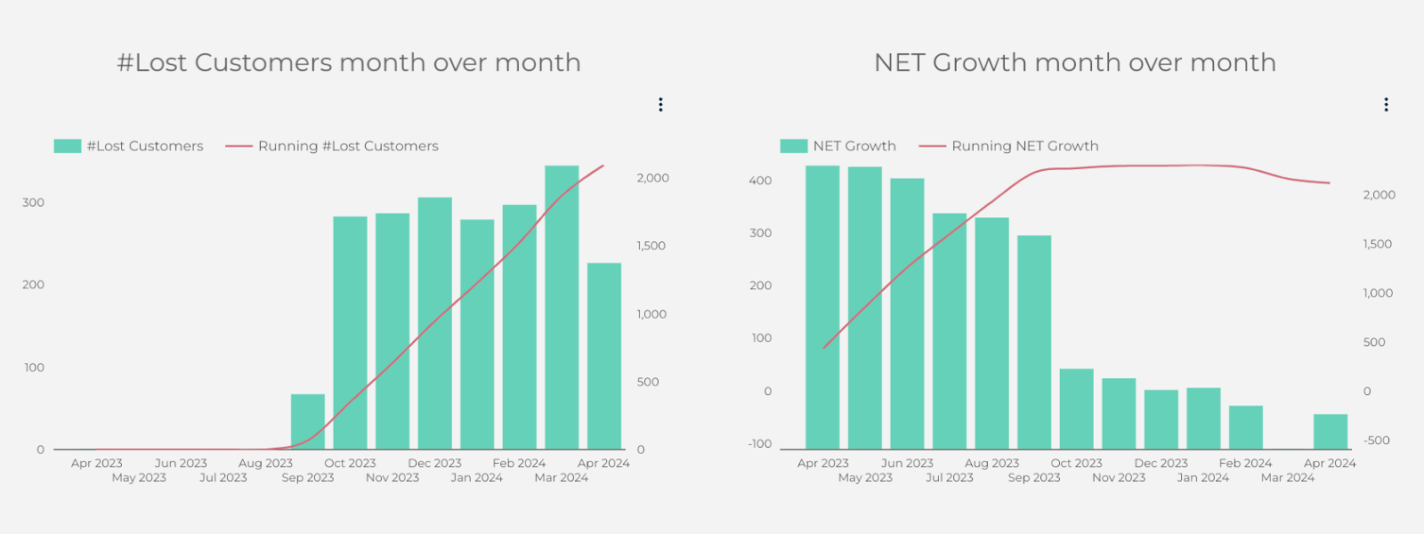
Followingly, we have specific charts for each category of our customers and net growth.
Revenue overview
The next page of the dashboard is dedicated to revenue.

It starts with KPIs like Total revenue, Revenue from New customers, Revenue from Returning Customers, Number of Purchases, New purchases and returning purchases. Similarly, you can see an explanation for each of the KPIs and a month over month and year over year comparison.
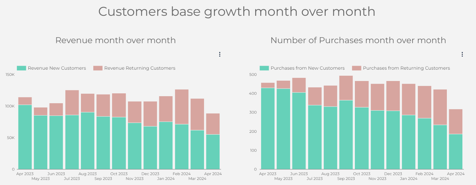
Then we have two charts where we can see revenue from new and returning customers month over month, and a number of new and returning purchases month over month.
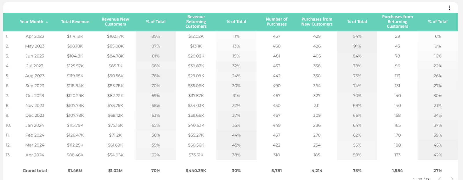
Below there is a table with detailed information.
In addition, there is a section with one more important KPI – Average Order Value.

It contains scoreboxes with AOV from both new and return customers and separately from new and returning. There is an additional table for you to see how AOV changes from month to month.
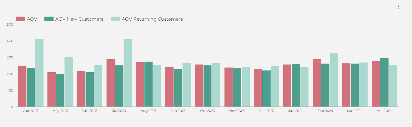
Additionally, there is a chart so that you could easily visualize the difference in AOVs in dynamic.
Google Sheets
The dashboard is based on Google Sheets. So when you purchase this template from the template store, you will receive not only the dashboard but also a Google Sheets connected to the dashboard. You will need to insert your data to the yellow cells, simply speaking. But let me explain it to you more precisely.
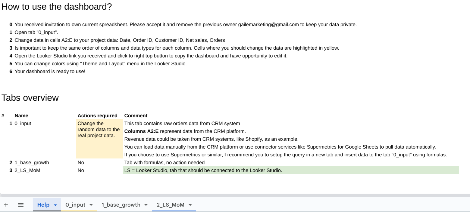
The first tab of the dashboard contains all the info you need to know to start working with the Sheets. It has the explanation of each of the tabs and my recommendations about the connectors you may use to automate your report even more. If you need the report for one time only or once a certain period of time, you can pull up the data manually. But if you intend to use it more frequently, it is better to use add-ons.
These are the add-ons I use the most – Power My Analytics, Supermetrics or Windsor.ai. By the way, using my promo code gaillereports you can get 10% off any Windsor.ai subscription plan. Enjoy it!
There is also a configuration section in the first tab. If you want to show the number of customers that weren’t active during not 6 months (by default) or during any other period, you can change it in Configuration by just inputting a number of months.
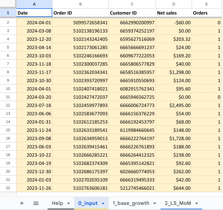
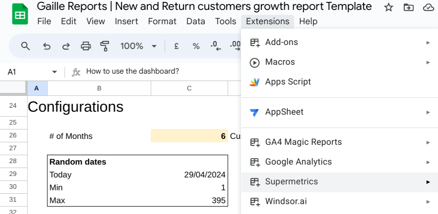
The second tab is where you need to input your data. You need to pull up the dates, Order IDs, Customer IDs, Net sales and number of orders.
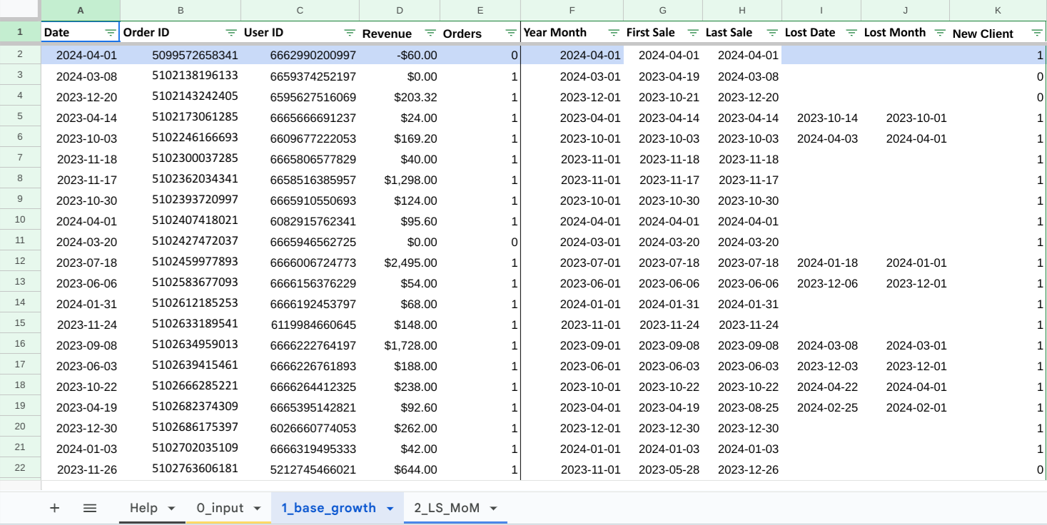
The next tab contains formulas and the data pulled up from the previous page to make the calculations. If the number of the rows in the input tab is not enough, you can add as many rows as you need. But make sure to add new rows here and apply existing formulas for First and Last sale by extending them.

The last tab contains already transformed data and this tab is connected to the Looker Studio dashboard.
Summary
This report is a perfect match for people who work with ecommerce. It gives a full image of your new and return customers, net worth and revenue. You can check out this template in our template store!
Hope you liked this overview!