
Looker Studio GA4 Key metrics

For many marketers the transition to GA4 is pretty painful after all those years of work with Universal Analytics.
In this article I would like to make an overview of one of my templates called Looker Studio GA4 Key metrics. It is a basic report that will be suitable not only for ecommerce, but for every kind of business.
If you prefer video format, check out my video:
Dashboard overview
This dashboard is based on “GA4 – Flood-It!” demo account that you can connect easily to Looker Studio. This template has 7 pages – Overview, Traffic, Events, Conversions, Pages & Screen, Geography and Demography.
Overview

This is the first section of the overview section. Here we have a brief key metrics overview – Active users, New users, Avg. engagement time, Event count, Conversions and Event count per user. As we can see, the score boxes are updated and contain a sparkline to see the dynamics of the metrics.
Besides that, on the first page we have an instrument to compare two periods of time.

Time series charts that are under the metrics allow us to add optional metrics, to compare them in the same chart or one by one. Besides that, there is a date-month-year-breakdown.
Traffic
On this page we can see where our users come from. First of all, we can see the main metrics of this section and a time series chart with traffic sources.
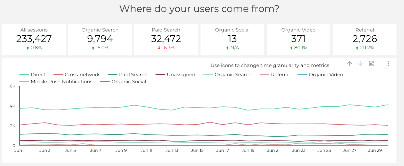
To create the score boxes with traffic sources, I’ve applied filters to some of them.
The time series chart also has breakdown dimensions and optional metrics for an easier use.

In this table you can see the dynamics month by month for each session channel. I find this chart very useful.
Events

This section shows us how users interact with our page. There are basic events metrics presented by score cards, time series chart with different events and a bar chart that helps us to get the detailed data in visual comparison. Talking about the bar table with events, I would like to remind you to choose the metrics relevant for your business.
Again, at the end of this section we have a pivot table where we can see all the events in dynamics month by month.

Conversions. Pages and screen
We have more or less the same page in the Conversions section, but the second one doesn’t contain KPIs score boxes.

Considering pages and screen section, here we can see what pages are the ones most opened by users. It also contains a time series chart, a bar chart and a pivot table.

Geography

In the Geography section we have pretty much the same. The time series chart allows us to add optional metrics. The pivot table has a country breakdown and it’s really handy to analyze the results. By clicking the arrow, you can switch the table to languages breakdown.
Demographics

In this section we get to know the ages, genders and the interest of our audience.
Let me know if you liked this template! Creating this report took a significant amount of time – even though it is pretty basic but really complex. To save your time, you can just buy this report template in my store. Check it out here.
Check more articles of mine in Medium.