
Looker Studio GA4 e-commerce report template overview

In this article I am going to overview an ecommerce report template created specially for e-commerce based on Google Analytics 4 demo account that you can easily replace with yours.
Check out the video overview here:
Page 1
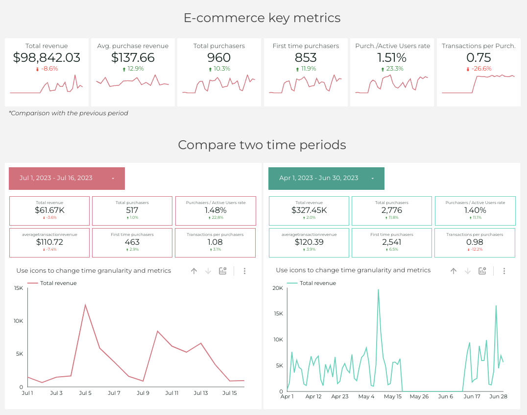
That is how the first page of the report looks like. It contains main KPIs and of the key metrics’ two time periods.
As you can see, the KPI scorecards contain the number and a sparkline describing it. Among KPIs we have: Total revenue, Average purchase revenue, Total purchasers number, First time purchasers, Purchasers/Active Users rate and Transactions per purchaser.
Subsequently, talking about two date ranges comparison, as you can see, we can use optional metrics to present all of the KPIs using the timeline chart. I find it really useful to see the performance of your website.
Page 2. Sales funnel
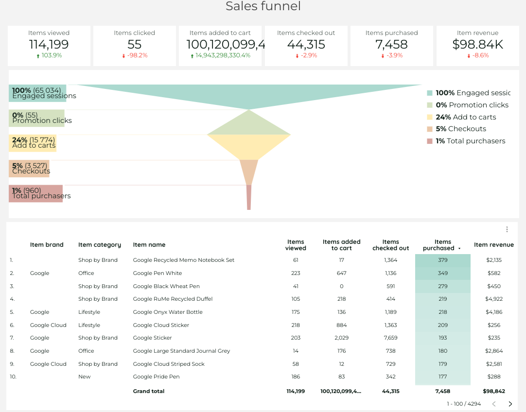
Sales funnel is super different in Universal Analytics and GA4, but this one is based on GA4.
Obviously, here we have scorecards presenting the number of items viewed, clicked, added to cart, checked out, number of items actually purchased and item revenue.
Then we see a funnel that presents the number and percentage of engaged sessions, promotion clicks, add to carts, checkouts and total users, but you can change these sections, if you want. Consequently, there is a table where we can see which item, from which item brand and category was viewed, added to cart, purchased etc.
Page 3. Traffic channels
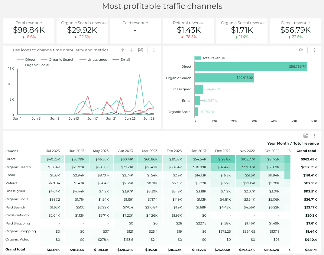
On the third page we can see the overview of the most profitable traffic channels. In the top of the section we have the scorecards with KPIs which I created using some filters, to apply them or not – it’s up to you.
Then we have a timeline chart with a revenue day by day split by traffic channels. There is a possibility to use optional metrics to present other KPIs. After that, we have a bar chart with a revenue comparison split by traffic channels.
In the end of the page there is a pivot table containing information about revenues split by traffic channels and month/year.
Page 4. Popular brands.
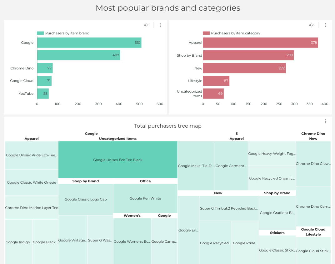
In brief, this section contains bar charts containing the data about the purchases by item brand and purchases by item category and a total purchases tree map. It allows you to visually see the most popular items in different categories.
Page 5. Audience
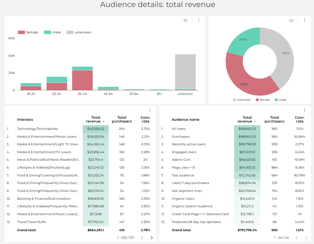
Basically, audience section lets us see the data about the purchasers, like who purchases more – men or women, which age category is purchasing the most ets. Then there are two tables – one containing interests of the purchasers, their number, conversion rate and the revenue, and another one is showing basically the same but split by audience name like organic users, all users, purchasers and so on.
****
I hope you liked the dashboard. If the report interests you but you don’t want to waste much time setting everything up, you can just buy it in my template store! Check more information about it here.
Check out more articles of mine in my Medium.