
Google Data Studio dashboard: Conversions, blog, and Facebook Ads template overview
This time I would like to review my Google Data Studio dashboard that works well for websites with blogs and is called Conversions, blog, and Facebook Ads report template. This template also includes some basic data about Google and Facebook ads, but generally speaking it is a great solution for blog and content websites.
Here is the video-overview of Google Data Studio dashboard, if you prefer this format.
Google Analytics conversions overview
We start from Google Analytics conversions overview. As You can see from the title, it is a Google Analytics data and I used a default connector to Google Data Studio and connected Google Analytics demo account.

On the first chart we see our goals split by month. It’s pretty good to see the performance and useful to see the website performance in dynamic.
In my templates I used not real conversion names, such as a “Goal 1”, “Goal 2”, etc. But, of course, on your real report you will add conversions that you are interested in. As an example: “Contact us”, “Download prices”, “Subscribe to newsletter” and so on.
Below the month by month breakdown you can find the chart with the last month data splitted by channel so we can see that mostly all our goals came here from direct traffic.

Here again we have the same conversions, but let’s take a look a bit deeper on them. For example, we have charts for each conversion and we have a big number that represents the last month’s data in comparison to the previous period.
For example, now it is August so this will be July data compared to June. And also we have some charts with 12th month data where we see how this goal is dynamic.
Also we have a Traffic Source filter and we can select any traffic sources we are interested in.

This chart gives us a bit of understanding who our visitors are and for a content website it is really nice to see how many new and returning visitors we attract. Here we have 12 months.
Google Ads snapshot

The next chart on the first page is Google Ads’ last month overview with campaign breakdown. To connect Google Ads data to Google Data Studio I used the default connector to GDS. Here we have campaigns, impressions, clicks, cost per click, and all conversions data: only key metrics.
Inquiries pivot table

The last element on the first page is a table of inquiries month by month. This date comes from Google Sheets and it was my client’s custom request, and I like it.
You can add your custom information to Google Sheets and pull it to Google Data Studio. In my example we have a Total inquiries for each type of channel and also a month breakdown for different sources and types of inquiries.
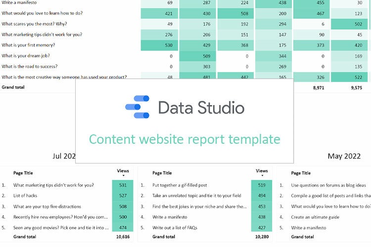
Detailed blog overview

The second page observes our blog. Data comes from the default Google Analytics connector to Google Data Studio.
The first table observes top blog pages from the last 12 months. Here we have a pivot table that contains a page title column, and the grand total of page views. I find it interesting to see pageviews in dynamics, because some posts become popular, other ones – no…

The next table gives us more information about our blog. We can see the last 9 months, and we can see the top five articles from our blog for each month. So, we can see when a certain article became popular. That helps us analize what topics are more interesting for our readers.
Traffic by channel

The first table on our page is a Google Analytics traffic by channel month by month.
Last 12 months, traffic came from Direct, Paid Search, Display and Affiliates. But this is a really nice overview of our traffic, though it is difficult to understand the exact numbers. That’s why I added the table below where you can see information month by month, but already with the exact numbers.
Facebook ads overview

Looking at the first upper part of our section we check the key metrics for the paid ads – Cost, Clicks, Conversions (but in this case we haven’t set up conversions so we just stay with clicks), Cost per click, Reach, Cost per mile and 3-second video plays.
Below we have a chart with information month by month to see data in dynamic. Here I used clicks but if you have a conversion setup, of course it’s better to change it to conversions.

When we work with Facebook ads it is very important to pay attention to the platform that works better and which place works better, so we show some information about a publisher platform and a placement for the last month and in dynamics.
We cannot pull this data using the default free connectors and you have to buy some third-party connectors. It could be Supermetrics for Google Sheets or Power My Analytics, for example. In this case we used Power My Analytics. It’s quite nice to work with and we just connect Facebook data using this direct connector to Google Data Studio without any Google BigQuery or Google Sheets.
***
That’s it for today. Hope you liked the Google Data Studio dashboard review. Other reviews can be found here.
Also, you can find a video tutorial by the link.
Share your opinion about this kind of template below the post! Would you like to use it for your website?