
When to use what type of chart in Google Data Studio (Looker Studio)?
How to know what kind of chart is going to be the most appropriate to show a certain type of data in Google Data Studio (Looker Studio)? Don’t worry, I am going to explain it now!
I have recorded a video tutorial, so check it out:
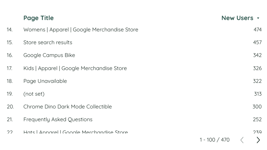
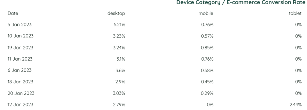
Chart tables in Google Data Studio (Looker Studio)
Tables can be used for any kind of data. The thing that is different here is the type of the table – regular one, heatmap table or bar table. You choose the type of the table depending on your goal and what you want to show.
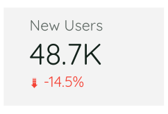
Scorecards
Scorecard can show only a certain metric. I recommend you to use the scorecards to show the main KPIs of your report and to compare the metric value with other periods values. There are also 2 kinds of scorecards – the regular one and the one with the compact numbers. Basically, they are the same.
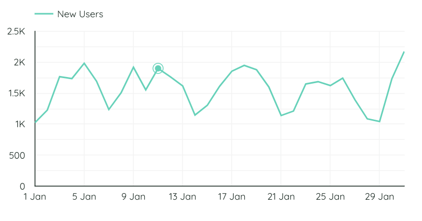
Time series charts
To show the metric in dynamic (the changes of the metric relating to the dimension). The specific feature of this chart is that the dimension has to be related to the time – year, month, day etc.
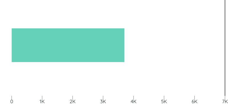
Bar chart
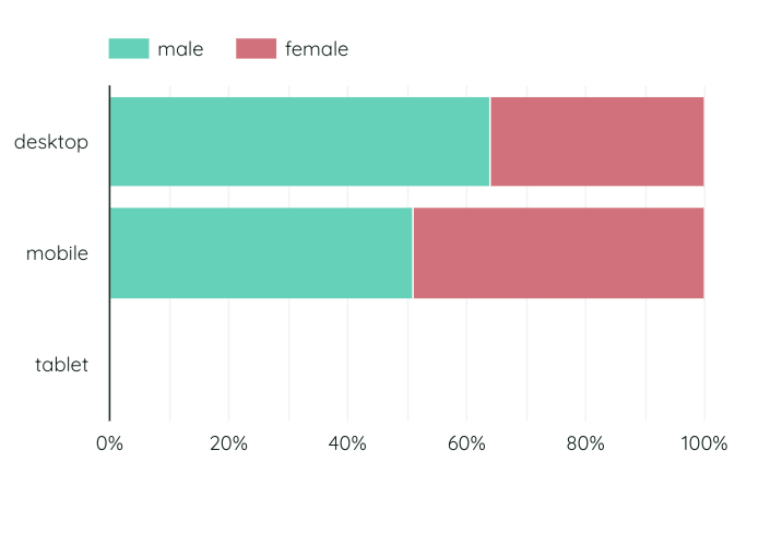
For example, we need to split users by device categories – the most suitable chart for this would be a bar chart. It can be vertical or horizontal. When you need to show the number of purchases of a certain product, it is better to make the chart horizontal so that the product names can be seen fully.
Stacked bar chart in Google Data Studio (Looker Studio)
Stacked bar chart is a subtype of a bar chart. The specific feature of this chart is that we can use it when we have two dimensions. You can enable 100% stacking – this option is very useful to see the difference of the values.
Pie chart
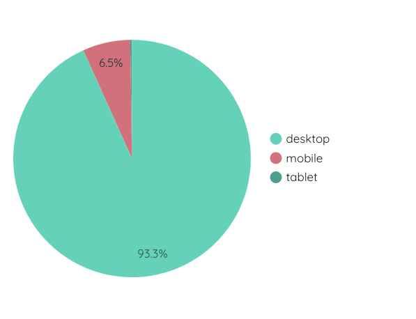
This chart in Google Data Studio (Looker Studio) is usually used to show the proportions of the elements when you have less than 5 segments to compare. This chart shows the percentage – how many percent from 100% does some segment take.
Google Maps and Geo chart in Google Data Studio (Looker Studio)
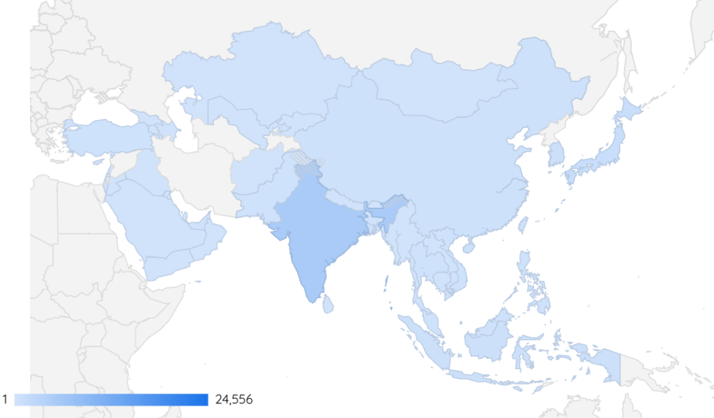
When we have some geo data, it is very nice to show it using Google Maps chart or Geo chart.
Combo charts in Google Data Studio (Looker Studio)
Lines and bars
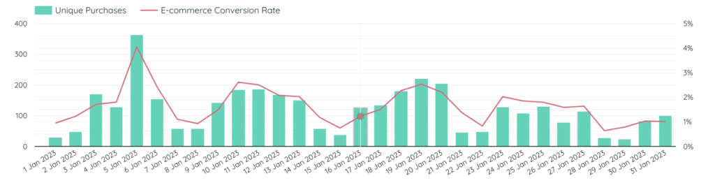
When you have two metrics that cannot be compared, usually it is a right sign to use a line chart. One of the metrics will be shown as bars and the second one – as a line.
Area chart
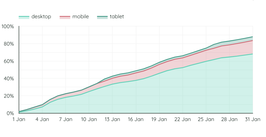
Area chart is a nice chart to use, for example, when we want to show the increasing of the revenue day by day splitted by a certain device category.
Scatter chart
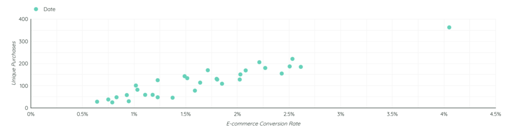
When we have two different parameters and we want to show the dependance one from another, it’s nice to use a scatter or bubble chart.
Pivot table
It is a frequently used table and its difference from a regular table is that we can split the data by many metrics and parameters simultaneously.
Treemap chart
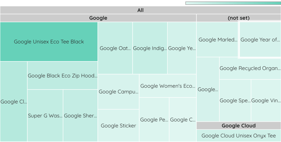
I use this chart to show the percentage of categories. The logic is the same with a pie chart, but the only difference – here you can show as many categories as you want (remember that a chart has to be easy to read though!)
Streamup charts in Google Data Studio (Looker Studio)
Gauge chart
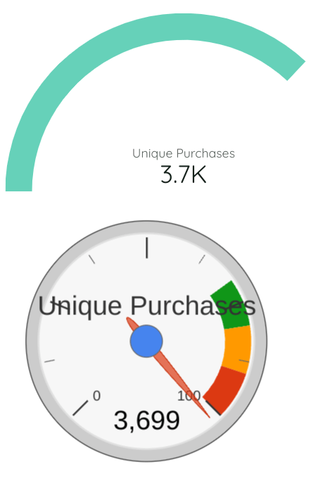
This chart is a great thing when we are dealing with targets. If we select cost as a metric, it will show how many percent of the budget were spent. Another style of it can also be found in community visualizations. I like much more the one that is in community visualizations.
Bullet chart
It is also a chart to show the target, but I don’t use it often in my work. You just input the number that serves as a target and the actual numbers that you have.
Hope this article was interesting for you! If you have any questions, feel free to ask them in the comments section.
You can find this article and other articles on my Medium or read other articles in my blog!